October 13, 2026
Turquoise Complementary Color: A Practical Guide
Discover the turquoise complementary color, explore hex codes, color theory, and styling tips for fashion, beauty, and brand merchandising palettes.
A merchandising lead is reviewing a seasonal assortment when turquoise emerges as the hero color. Someone asks the obvious question: what is turquoise's complementary color? The color wheel seems to offer a quick answer, usually coral or warm red. Then the production details appear. The turquoise on the approved screen proof isn't quite the same as the fabric swatch, the coral looks energetic on a campaign image but harsh on packaging, and the combination loses clarity in a mobile product card.
That's why a useful turquoise complementary color strategy needs more than a single label. Turquoise belongs to a family of blue-green hues, and its best partner changes with the exact hue, saturation, value, material, customer, and channel.
Why One Complement Is Rarely Enough
The first production question shouldn't be “Which color is opposite turquoise?” It should be “Which turquoise are we using, and what job must its complement perform?”
A commonly cited digital turquoise is RGB (64, 224, 208), also represented as #40E0D0, but turquoise can shift toward cyan, green, or blue. Those small changes move its mathematical opposite. A greener turquoise may call for a warmer red-orange, while a bluer turquoise can sit comfortably beside coral or a more muted terracotta. The general relationship stays recognizable, but the practical swatch changes.

Start with the product, not the wheel
A color-wheel answer describes a relationship. Merchandising requires a usable palette.
On a silk dress, a vivid coral can create a resort-led story. On a beauty package, the same pairing may need a softer coral, brushed metal, or warm cream to look refined. On a furniture collection, terracotta and sand may create more depth than a direct red-orange. The material changes how light reflects, how saturated the color appears, and how close the pairing feels to the customer.
The channel matters just as much. A high-energy turquoise and coral combination may work in a campaign image, yet overwhelm a product-grid thumbnail or make small labels difficult to read. A production-ready palette must survive photography, compression, print, lighting, and different screens.
Practical rule: Treat the complementary color as a controlled range, not a single paint-chip name.
A better briefing question
Instead of asking a supplier for “turquoise and coral,” specify the hero turquoise, the complement family, the intended finish, and the role of each color. For example, a team might brief a blue-leaning turquoise with muted terracotta for apparel, or turquoise with sand and antique gold for a premium home collection.
This approach preserves the visual identity of the hero color while allowing controlled variants across accessories, packaging, e-commerce imagery, and regional campaigns. It also prevents a common mistake: approving a palette because the swatches look attractive side by side, without deciding where each color will appear.
The right complement is therefore a merchandising decision. It must support the product's material, the customer's expectations, the campaign's mood, and the channel's technical limits.
The Color Theory Behind Turquoise
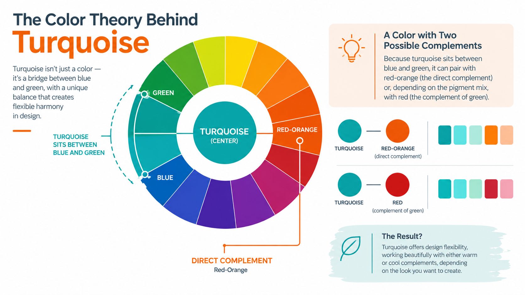
A complementary relationship places hues opposite each other on a color wheel. The purpose is contrast. When a cool blue-green sits across from a warm red-orange family, each hue appears more vivid beside the other.
That description is useful, but it becomes unreliable when teams treat turquoise as a fixed point. The commonly cited digital reference RGB (64, 224, 208), also written as #40E0D0, is one anchor, not a universal standard. Other turquoise references move toward cyan, green, or blue, and the opposite hue shifts with them. The result may be described as coral, warm red, red-orange, or terracotta, depending on the system and the visual context.
Hue, saturation, and value
Hue is the color family itself. It tells you whether the turquoise leans more toward blue or green, and whether its partner should lean toward coral or a deeper orange-red.
Saturation describes intensity. A highly saturated turquoise beside a highly saturated coral creates a loud, immediate pairing. Lower the saturation of either color, and the relationship becomes quieter. This is often the difference between a youthful seasonal assortment and a restrained premium collection.
Value describes lightness or darkness. Pale turquoise with a deep terracotta has a different hierarchy from jewel-toned turquoise with a pale peach. If both colors sit at a similar value, the pairing can feel flat or visually busy. If one color carries more depth, the assortment gains a clearer focal point.
Use these three qualities when reviewing physical swatches. A hex code can guide a digital starting point, but fabric, coated paper, glass, lacquer, metal, and natural materials won't reproduce the color in the same way. The team should compare the actual production surfaces, not rely on a screen approximation.
For a broader grounding in how hue relationships affect interiors and coordinated spaces, Vinson Fine Furniture design resources provide useful color-theory context. The same principle applies to retail assortments: the relationship matters, but the surface and surrounding colors determine how customers experience it.
Two designers can name different complements and both be right if they're working from different turquoise references. The production question is not whether one label wins. It's which hue relationship produces the intended contrast at the intended scale.
Three Practical Complement Families
A merchandising team needs more than theory. It needs a decision tool that translates color relationships into assortment roles. For turquoise, three complement families cover most production situations: the direct hue complement, a split-complementary group, and warm neutrals.
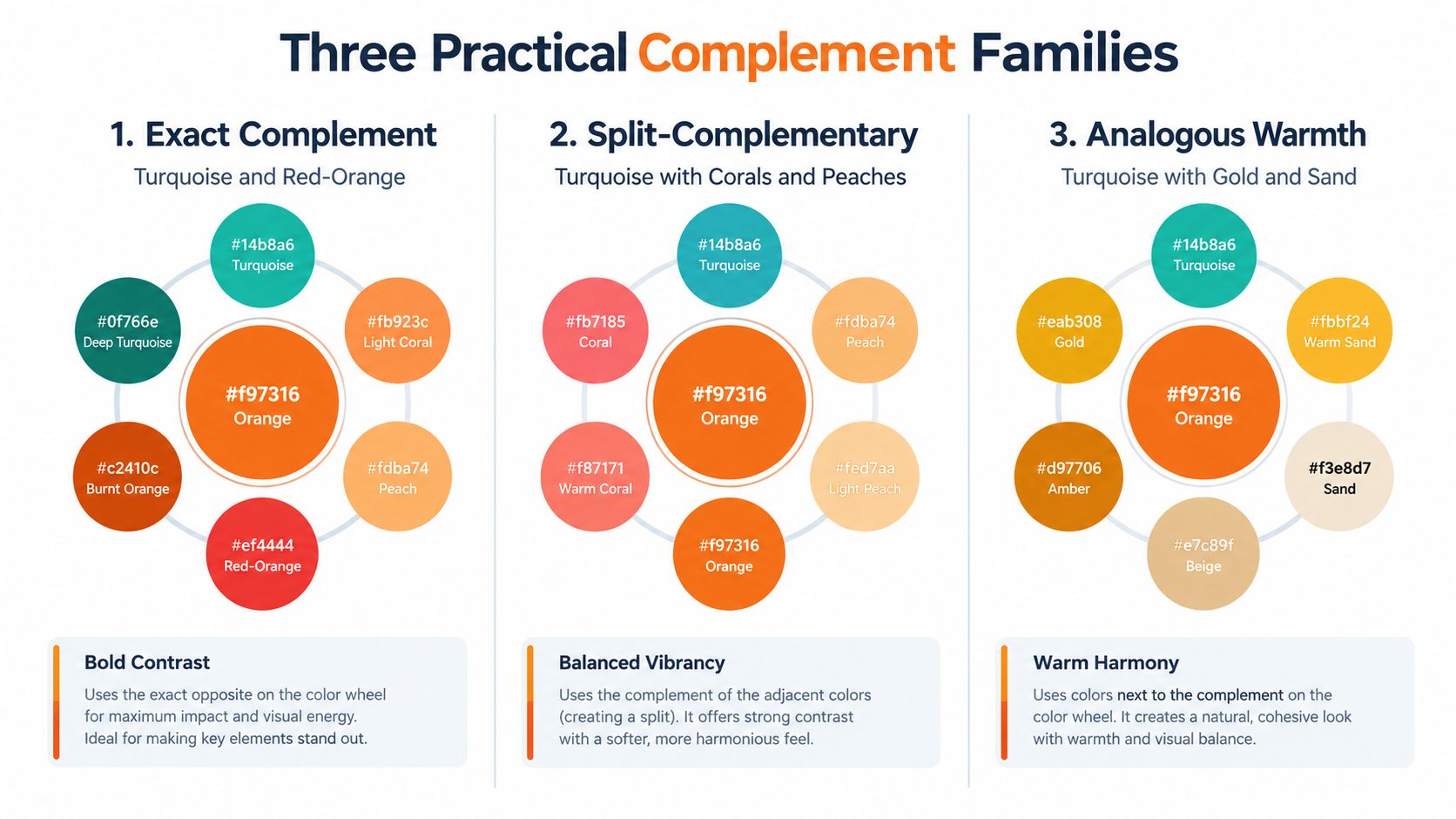
Exact hue complement
The direct complement sits opposite the selected turquoise on the color wheel. In practical palettes, that often lands in the red-orange, coral, or warm red family.
Choose it when the assortment needs maximum contrast and a clear visual signal. A swimwear story, festival capsule, social campaign, or high-impact window display can benefit from this directness. Keep the role controlled. If both turquoise and its complement occupy large, equally saturated surfaces, the pair may compete instead of creating hierarchy.
Split-complementary combinations
A split-complementary palette keeps turquoise as the anchor, then uses neighboring warm hues rather than the exact opposite. Coral and peach, or coral and terracotta, can soften the contrast while retaining warmth.
This family suits editorial styling, premium packaging, and assortments that need variation across several SKUs. It gives the creative team more room to build a story without forcing every item into the same turquoise-red-orange opposition.
Warm neutrals
Sand, cream, tan, muted gold, and related warm neutrals don't behave as literal complements in the strict color-wheel sense. They're practical partners when a direct red-orange feels too aggressive.
Use them for home goods, refined accessories, beauty packaging, and collections where turquoise should feel calm or polished. Gold can add warmth and reflection, while sand creates space around the hero color. The neutral family also gives a team a stable base for photography and typography.
| Complement Family | Example Colors | Mood | Best For |
|---|---|---|---|
| Exact complement | Turquoise with coral or red-orange | Energetic and high contrast | Resort, seasonal, promotional, and statement assortments |
| Split-complementary | Turquoise with coral, peach, or terracotta | Layered and editorial | Fashion stories, beauty collections, and premium campaigns |
| Warm neutrals | Turquoise with sand, cream, tan, or gold | Calm and refined | Home, lifestyle, packaging, and understated merchandising |
Combining families without losing focus
A single collection can use all three families if the roles remain clear. Let turquoise lead, use coral or red-orange for selected accents, and assign sand or gold to backgrounds, hardware, packaging interiors, or supporting products.
The mistake is giving every color equal weight. A complementary palette works best when the team knows which color attracts attention, which one creates warmth, and which one gives the eye a place to rest.
Styling Turquoise in Fashion, Beauty, and Home
A turquoise complementary color changes personality when it moves from one category to another. The pairing doesn't arrive with a fixed mood. Fabric, finish, scale, lighting, and surrounding neutrals shape the result.
Apparel needs movement and proportion
For apparel, begin with the garment that carries the hero color. A turquoise silk blouse paired with a coral accessory can feel light and resort-oriented because silk reflects light and moves with the body. The same turquoise in a matte knit may need a softened terracotta or peach to avoid looking overly bright.
Use proportion deliberately. A turquoise dress with a small coral bag creates a different hierarchy from a coral jacket over a turquoise base. The first keeps turquoise dominant. The second makes the warm complement the visual lead.
Saturation also affects perceived age and category. Bright turquoise with bright coral can feel playful and youthful, while dusty turquoise with muted clay can feel more refined. That doesn't make one version better. It makes each version suitable for a different customer and assortment story.
Beauty packaging has less room for noise
Beauty packaging compresses color decisions into small surfaces. A turquoise jar with a coral lid may look distinctive in a campaign photograph, but the pair can become busy when the logo, ingredient information, and regulatory text are added.
For a premium presentation, consider a less saturated turquoise, a terracotta accent, and a warm neutral field. Metallic gold can support the story through a cap, foil detail, or fine border, but it shouldn't compete with essential product information. A saturated coral may work better as a product shade cue or limited accent than as the entire package background.
The physical finish matters. Gloss can intensify color and reflections, while uncoated paper softens the appearance. Review packaging under the lighting used in retail photography, not only under a design monitor.
Home and lifestyle collections need atmosphere
Home products give the palette more space. Turquoise upholstery, a terracotta cushion, and sand-colored walls can create a balanced room story. A turquoise vase with warm flowers can make the complement feel organic rather than graphic.
For catalog imagery, coordinate the setting with the intended customer mood. Pale wood, linen, stone, and warm white help turquoise feel relaxed. Dark wood, charcoal, or aged metal can make it feel more dramatic. Keep the complement visible enough to establish the relationship, but don't let props turn the product image into a color experiment.
The strongest palette isn't the one with the most contrast. It's the one that gives each material a clear role.
Brief lookbooks and product shoots with the surface in mind. Note whether the complement appears on the product, in styling, in the background, or only as a small accessory. That specification helps creative teams reproduce the intended story across SKUs instead of improvising color balance from image to image.
Making the Pairing Work in Digital Commerce
A complementary relationship can be visually correct and still fail as an interface. Contrast on a color wheel isn't automatically usable contrast on a screen.
Highly saturated turquoise beside saturated coral can create visual vibration, and white text on bright turquoise or coral often fails accessibility checks at smaller interface sizes. For essential text and controls, reserve high-contrast neutrals and validate the actual foreground and background pair, as advised in this dark turquoise color guidance.
Assign color by function
Use turquoise and coral primarily for large surfaces, product accents, decorative blocks, and imagery. Keep buttons, navigation labels, prices, form states, and essential product information on backgrounds that provide dependable separation.
A practical interface allocation might look like this:
- Hero surfaces: Use turquoise for banners, editorial panels, or large product areas where the hue can be experienced at scale.
- Accent moments: Use coral for badges, decorative details, selected accessories, or secondary campaign elements.
- Essential controls: Use a high-contrast neutral for text, icons, buttons, and focus states.
- Product distinctions: Add labels, names, patterns, or icons when color communicates size, shade, status, or variant.
Color-only merchandising signals create problems for shoppers with color-vision differences. If a product filter marks availability only through turquoise and coral dots, include text labels or another visual indicator. If a beauty range uses color to identify shades, pair the swatch with a shade name and a clear product image.
Test the complete asset
Check the pairing in product photography, email modules, mobile product cards, print inserts, and dark mode. A color that looks balanced in a large campaign image may become too intense in a narrow mobile component. A coral button that works on a light background may disappear or vibrate against a dark theme.
The test should include the actual font size, weight, interaction state, crop, and background. Don't approve a palette from isolated swatches if customers will see it beside photography, price text, ratings, badges, and promotional copy.
For teams producing large volumes of product imagery, product visualization software can help organize consistent visual outputs across assortment views and commerce assets. The color decision still belongs to the brand team, but the workflow should make it easier to inspect repeated applications before launch.
Regional and Cultural Considerations
Turquoise doesn't carry one universal emotional meaning. Cultural associations, local retail conventions, climate, seasonal timing, and category expectations can all influence whether the color feels calming, celebratory, luxurious, youthful, or unfamiliar.
The same complement can therefore support one market and undermine another. A vivid coral may reinforce a warm, festive campaign in one region, while a restrained gold or sand may better support a premium positioning elsewhere. The hero turquoise can stay consistent while the supporting complement changes in a controlled way.
Standardize the anchor, localize the support
A global team should define what must remain fixed and what can vary. The exact turquoise used for a signature product may be fixed. The background, accessory color, campaign accent, or packaging detail may have more flexibility.
Create regional variants deliberately rather than allowing local teams to substitute colors without documentation. Record the approved turquoise, the complement family, the permitted warm neutrals, the image direction, and the channel restrictions. That gives local teams room to respond to customers without fragmenting the brand.
A collection may use coral in one market, terracotta in another, and gold with sand in a third. Those choices can still belong to one system if the turquoise anchor, hierarchy, typography, and product naming remain consistent.
The same discipline applies when building broader color stories. A resource on crimson and cream colors can help teams think about how a strong warm hue and a light neutral divide visual roles. The principle transfers well to turquoise: localize the supporting relationship, not the entire identity.
Building a Production-Ready Turquoise Palette
A production-ready palette begins with a named color, not a mood word. Record the exact turquoise reference used for the product, campaign, or digital system, then note whether the physical material is expected to shift its appearance. “Bright turquoise” isn't precise enough for a supplier, photographer, or regional content team.
Build the palette in operational roles
Select the complement family based on the product and channel. Use the direct hue complement for sharp contrast, split-complementary hues for a layered story, or warm neutrals when the collection needs restraint.
Then assign roles:
- Hero color: The turquoise that identifies the product or assortment.
- Contrast accent: Coral, red-orange, peach, or terracotta used selectively.
- Support neutral: Sand, cream, tan, charcoal, or another approved grounding tone.
- Information color: A high-contrast neutral reserved for text, controls, and essential labels.
- Regional variant: A documented complement change for a specific market or campaign.
- Channel variant: Adjustments for print, mobile, email, dark mode, or product photography.
Before approval, review the palette at SKU level. A turquoise hero item may need a coral accessory, a sand background, and neutral typography. Another SKU may use the same hero with terracotta packaging and no bright accent at all. The system should create variety without losing recognition.
For teams refining interiors or lifestyle collections, this guide to how to pick a room palette offers useful perspective on balancing dominant, supporting, and neutral colors. Apply that same hierarchy to assortment boards and campaign sets.
Finally, store the rules with the creative workflow. A palette guide should show approved swatches on real materials, permitted combinations, accessibility requirements, regional exceptions, and examples of correct usage. A related pink blush color guide can also help when a softer accent is needed beside turquoise and warm neutrals.
Teams that manage many SKUs and channels need more than a static color board. They need a repeatable way to visualize variants, review production constraints, and keep regional adaptations connected to the core assortment.
Sprello helps fashion, beauty, lifestyle, and home teams turn color decisions into production-ready workflows across SKUs, channels, regions, and seasons. Use Sprello to visualize turquoise-led assortments, coordinate complementary variants, and keep campaign assets aligned from concept through delivery.
Related
More to explore
Fresh reads
Salmon Pink and Apple Green: A Practical Color Pairing Guide
A practical guide to the salmon pink and apple green color pairing, with tonal matches, merchandising combos, and seasonal styling tips.

8 Pictures of Indigo in Fashion and Product Photography
Explore eight pictures of indigo across flat lays, lookbooks, swatches, and AI visuals, with lighting notes and campaign ideas for catalogs.
Dark Brown with Red: Styling and Merchandising Guide
Master dark brown with red styling for fashion campaigns. Learn color theory, pairings, textile testing, and merchandising workflows that work.