October 11, 2026
8 Pictures of Indigo in Fashion and Product Photography
Explore eight pictures of indigo across flat lays, lookbooks, swatches, and AI visuals, with lighting notes and campaign ideas for catalogs.

The merchandiser approves an indigo colorway on a calibrated monitor, then the sample arrives and looks darker under warm store lighting. On the product page, the same garment appears flatter because the fabric texture has disappeared. A buyer asks whether the shade changed, while the photography team checks exposure, white balance, and background contrast.
That confusion is normal. Indigo shifts with light, fabric, surface texture, dye system, and surrounding color. A synthetic blue designed for repeatable denim production won't necessarily resemble a naturally dyed textile, and a screen-rendered swatch can't stand in for every physical material. Indigo has also carried visual and commercial meaning for more than four millennia, from archaeological textiles across several regions to long-distance dye trade, so an image can communicate heritage and craft as well as color (historical overview of indigo textiles and trade).
The eight pictures of indigo below each solve a different production problem. Some help buyers compare SKUs. Others explain fit, surface, provenance, campaign mood, or regional relevance. Treat each image as a working asset with a defined job, not as another attractive blue photograph.
1. Flat Lay Product Photography
A flat lay earns its place in an assortment pipeline by making products easy to compare. Shoot jeans, shirts, swatches, and accessories from directly above, keeping camera height, lens choice, framing, and product scale consistent. For indigo, that fixed viewpoint reveals color intensity, weave direction, fading, pocket placement, and pattern detail without the distraction of a model or location.
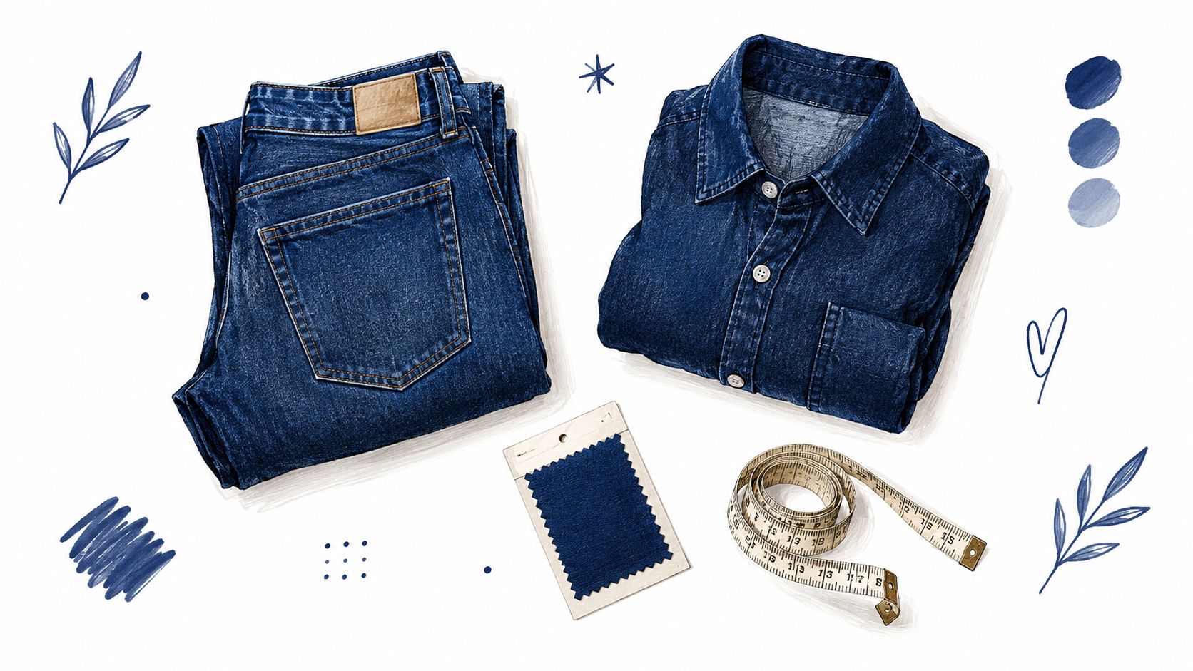
A neutral warm-gray or soft white background usually gives the cleanest catalog read. Pure white can make a deep indigo look heavier by contrast, while a saturated background can contaminate the viewer's perception of the blue. Keep the styling restrained. A folded denim shirt, a pair of jeans, a labeled swatch, and a measuring tape can communicate an outfit and product scale without turning the image into a lifestyle scene.
Practical rule: Use the same camera height, background, light position, and crop for every SKU. Change the product, not the visual conditions.
For assortment planning, create one hero flat and one controlled detail frame for each colorway. The hero frame should show the complete product and its relationship to coordinating items. The detail frame should reveal the fabric's texture, seam construction, or wash pattern. Photographing the same indigo item under cool daylight-balanced light and warmer retail-style light can expose a shift that a single setup hides.
A repeatable flat lay template
- Surface: Use a matte, low-reflection background with a recorded color reference.
- Lighting: Place broad sources symmetrically to avoid one side of the garment reading darker.
- Composition: Keep folds, sleeve angles, and accessory positions consistent across the batch.
- Color check: Include a calibrated target during capture, then remove it from the final frame.
- Metadata: Record fiber content, wash state, dye route when known, and intended channel.
This format works well for e-commerce catalogs, social crops, and internal buy reviews. It also gives AI-assisted batch processing a stable structure. A flat lay of blue denim pieces arranged with a swatch and measuring tape should support a decision, not merely decorate a mood board.
2. Lifestyle and Lookbook Imagery With Indigo Color Stories
A model in an indigo jacket tells a different story from a flat lay. The garment gains proportion, movement, skin-tone context, and a relationship to the environment. Here a blue colorway becomes a seasonal anchor, a heritage cue, or part of a complete wardrobe rather than an isolated SKU.
Levi's can use indigo to connect a new silhouette to denim heritage. J.Crew can position the shade beside seasonal neutrals and tailoring. Cuyana's minimalist styling can make indigo accessories feel quieter and more refined. Those examples don't require identical imagery. They require a clear decision about what the color is doing in the story.
Location has a major effect on perception. Green foliage can push indigo toward a richer, cooler impression. Sand, wood, and warm stone can make it feel more violet or muted. Direct sun creates hard highlights that may exaggerate fading, while open shade preserves surface detail and produces a calmer catalog-to-editorial transition. If the campaign needs both aspiration and product clarity, shoot the hero frame in soft directional light and capture a controlled secondary frame in the same location.
Build a modular lookbook
A useful lookbook has more than a vertical hero image. Capture wide environmental frames, waist-up crops, full-length silhouettes, detail gestures, and clean negative-space compositions for email or paid placements. Keep the model, location, and styling notes documented so the team can refresh the story without rebuilding the visual language from scratch.
Color story beats color matching: Let the environment support the intended meaning of indigo, but confirm the garment separately under controlled light before approving the campaign.
Regional styling can change footwear, layering, or accessories while retaining the same approved indigo family. Record those choices in the production brief. If you're exploring faster editorial variations, an AI lookbook generator for creators can help develop concepts, but final color and fit decisions still need a physical reference or controlled product image.
3. Swatch and Color Palette Close-Up Photography
A swatch image is a decision-making tool. It strips away silhouette, styling, and campaign mood so a design, merchandising, sourcing, or quality team can compare indigo options on equal terms. Photograph the fabric flat, fill the frame with the material, and show enough surface area for weave, nap, slub, and tonal variation to remain visible.
Five blue rectangles arranged from pale to deep may look simple, but the useful version labels each sample. Include fiber composition, treatment state, dye system when known, batch identifier, and intended product category. Cotton denim, linen, silk blends, and coated materials can produce very different highlights even when their nominal color names match.
Indigo has no single stable visual definition across color systems, displays, and physical materials. It may sit toward blue or violet, and actual dyed cloth can differ from an RGB swatch. That's why a gallery of unlabelled pictures often creates more uncertainty instead of resolving it. A stronger swatch library records the material and viewing conditions alongside the image.
Shoot the reference set, not one favorite blue
Use a standardized background, controlled exposure, and a documented illuminant such as D65 when your workflow supports color management. Photograph dry fabric first. If the process involves wet handling or finishing, capture the material in that state as a separate reference because moisture changes reflectance and apparent depth.
- Show variation: Include light, medium, dark, washed, and distressed versions when those are real options.
- Preserve texture: Use soft directional light rather than a flat front flash.
- Separate color from surface: Add a second frame with cross-lighting to reveal weave and sheen.
- Verify digitally: Compare the corrected file with the physical swatch before publishing.
A color name isn't a color standard. Treat “indigo” as a family label until the team defines material, measurement, lighting, and acceptable range.
For teams building broader palette systems, the relationship between indigo and neighboring tones can be documented alongside other color references, including crimson and cream color guidance. Before approving an online fabric purchase, use a documented fabric color verification process, then archive the approved sample with the image.
A clean indigo fabric swatch palette should help a buyer answer, “Which one is the right colorway?” It shouldn't force the buyer to guess whether the difference comes from dye, fiber, lighting, or editing.
4. Detail and Texture Close-Up Photography
A buyer zooms to 200% because the wide frame already did its job. The close-up has a different job. It needs to confirm whether the indigo surface, trim, and construction justify the product claim, and it needs to do that without making the material look harsher or cleaner than it is.
In catalog work, I treat detail shots as inspection frames with styling discipline. Keep the crop tight enough to show selvedge construction, stitch density, copper hardware, uneven dye uptake, brushed grain, and the first signs of wear, but stable enough that the same crop can be repeated across styles and batches. A macro lens works well. A longer focal length also works if it gives enough working distance to keep the camera and operator shadow off the fabric.
A detail frame should answer one production question. Use one shot for seam quality, one for surface character, one for hardware finish, and one for wear, instead of asking a single dramatic close-up to prove everything.
Light decides whether indigo reads as texture or as noise. Broad front light hides too much. Hard light exaggerates too much. For denim, a low soft source from the side usually gives the best read on twill ridges, slubs, and topstitching. Keep fill controlled so pocket bags, seam puckering, and cast shadows do not turn into false defects. If the product is indigo leather, move closer to grain, edge paint, and patina. If it is an artisanal textile, leave the irregularities visible and resist retouching that levels the surface into a generic blue fabric.
A useful template is simple. Shoot a clean seam frame. Shoot a pocket or hem frame. Shoot hardware at matching magnification. Then shoot one wear frame only if the condition is identified clearly.
Close-up consistency matters more than drama. Matching angle, magnification, and exposure lets a merchandiser compare batches, treatments, and product pages without guessing what changed.
Wear photography needs careful labeling. A new versus worn comparison can help a concept review or a quality check, but it should stay descriptive. Indigo can shift with rubbing, washing, oxidation, and weather exposure, and a controlled study of indigo fastness and weathering reported yellower, lighter measured color after weathering as indigo oxidized into isatin.
Texture is evidence. Show the real fabric response, name the condition shown, and do not use retouching to erase material character or create a wear story the product has not earned.
5. On-Model and Ghost Mannequin Product Photography
A product page fails fast when indigo shifts from shot to shot. The front ghost mannequin frame reads navy, the model shot reads washed blue, and the customer starts guessing instead of buying. This category needs two image types because they do different jobs. Ghost mannequin frames standardize shape and construction for comparison. On-model frames show rise, break, sleeve length, drape, and how the indigo sits against real skin and styling.
I run these as one controlled set, not as separate creative ideas. Keep the background neutral. Keep the camera height fixed for each garment type. Light the model and the ghost form with the same broad source, usually large and slightly off axis, so folds show without pushing hot highlights across coated denim or polished hardware.
Assign one job to each frame. Use the on-model image to answer fit and movement questions, and use the ghost mannequin image to keep catalog comparison clean.
The sequence matters. Shoot the on-model hero first while the garment is sitting correctly. Then capture the front, side, and back fit views before the waistband twists or the hem starts drifting. Without touching exposure, move to the ghost mannequin and record the matching front and back. Finish with the construction checks that support the sale or the QA review, waistband, pocket entry, hem, placket, closure, and any wash placement that has to stay consistent across the assortment.
That order keeps the team from solving fit and color as separate problems. It also gives merchandising a repeatable template they can use across colorways and deliveries.
Indigo needs a stable reference path. If pose, crop, or exposure changes too much, teams start reading styling differences as color differences.
Skin tone belongs in the frame, but it is not a correction target. Calibrate the camera, include a neutral reference in capture, and grade for believable context. Do not force every indigo item toward one identical blue. If multiple models are used, keep the set, light, and pose logic unchanged so the fit read expands while the color read stays grounded.
A short on-model and ghost mannequin product photography example is useful for crew alignment before call time. Treat it as a workflow reference. Stills remain the approval standard because motion, compression, and playback screens shift color and contrast.
6. AI-Generated Product Visualization and Mockups
Monday morning, the sample rail is still empty, but the line review is this afternoon. AI mockups can keep that meeting useful. They let a team test whether an indigo overshirt reads better with a workwear pocket, a cleaner collar, darker hardware, or a washed-down finish before anyone books a set or retouches a full batch of imagery.
Use AI images to answer a narrow job. Concept review, range alignment, and early merchandising are fair uses. Final color approval and sell-in accuracy are not.
I treat generated indigo frames as provisional until a physical sample, tech pack, or approved reference confirms them. The failure points are predictable. Seams drift, pocket shapes change, texture gets polished away, and the blue can look convincing while being wrong for the actual fabric or wash. Prompt variation adds another layer of instability, so two outputs that feel consistent may still be equally inaccurate.
A better workflow starts with real inputs. Feed the system reference shots that show the actual material, silhouette, hardware, and approved shade range. Save the prompt, seed, and selected settings with the project files. Then compare any shortlisted output against the sample under the same lighting standard used for product photography.
Indigo has to be checked under repeatable light. If the generated mockup is reviewed in one condition and the sample in another, the team ends up approving mood, not color.
For catalog and concept work, I use a simple shot template: one straight-on hero on a neutral background, one three-quarter angle, one crop on pocket and placket, and one fabric close-up anchored to a real swatch. That mix usually exposes whether the AI is inventing construction or just visualizing a plausible direction.
One textile study on natural indigo cotton showed that treatment and substrate changed both wash performance and measured color strength (natural-indigo cotton color and washing study). The practical takeaway for image teams is simple. “Indigo” is not enough as a prompt. Specify fabric, finish, and treatment state if you want a mockup that survives product development review.
Separate exploration from evidence. Use an AI product image generator workflow to generate options quickly, then pass selected images through merchandising, product development, and color sign-off before they appear anywhere customer-facing.
7. Seasonal Campaign and Editorial Photography Series
A seasonal series gives indigo a role across the entire customer journey. One image may introduce the collection in an editorial setting. Another can carry the color into email, product detail pages, social crops, and paid media. The series works when every frame feels related without becoming repetitive.
Start with the assortment, not the mood board. Lock the approved indigo colorways, hero products, supporting neutrals, and key silhouettes before the creative team finalizes locations and styling. If the campaign treats indigo as a heritage material, use tactile surfaces, workshop details, and process-led framing. If it treats indigo as a modern anchor, use cleaner architecture, sharper styling, and controlled negative space.
The industrial history of indigo explains why modern audiences often connect it with denim, standardized shade management, and large-scale apparel. Synthetic indigo reshaped production in the late nineteenth century, and plant-derived production fell from approximately 19,000 tons in 1897 to about 1,000 tons by 1914 as synthetic production expanded (history of synthetic indigo and denim production). Use that history carefully. A heritage story should identify whether the pictured material is natural, synthetic, or unknown rather than implying that every blue textile shares the same process.
Design the series for reuse
Capture wide hero frames, portrait crops, product-led frames, detail images, and negative-space compositions in one coordinated production. Record styling, lighting direction, location, lens, and retouching decisions. Those notes make future adaptations faster and reduce the risk of a later channel receiving a visually incompatible version.
A storyboard should show not only the final mood but also where the product appears, which frame carries the color reference, and how the series will crop. A storyboard workflow for campaign planning can help connect the brief to production handoffs.
One campaign should produce a family of useful frames, not eight unrelated hero shots.
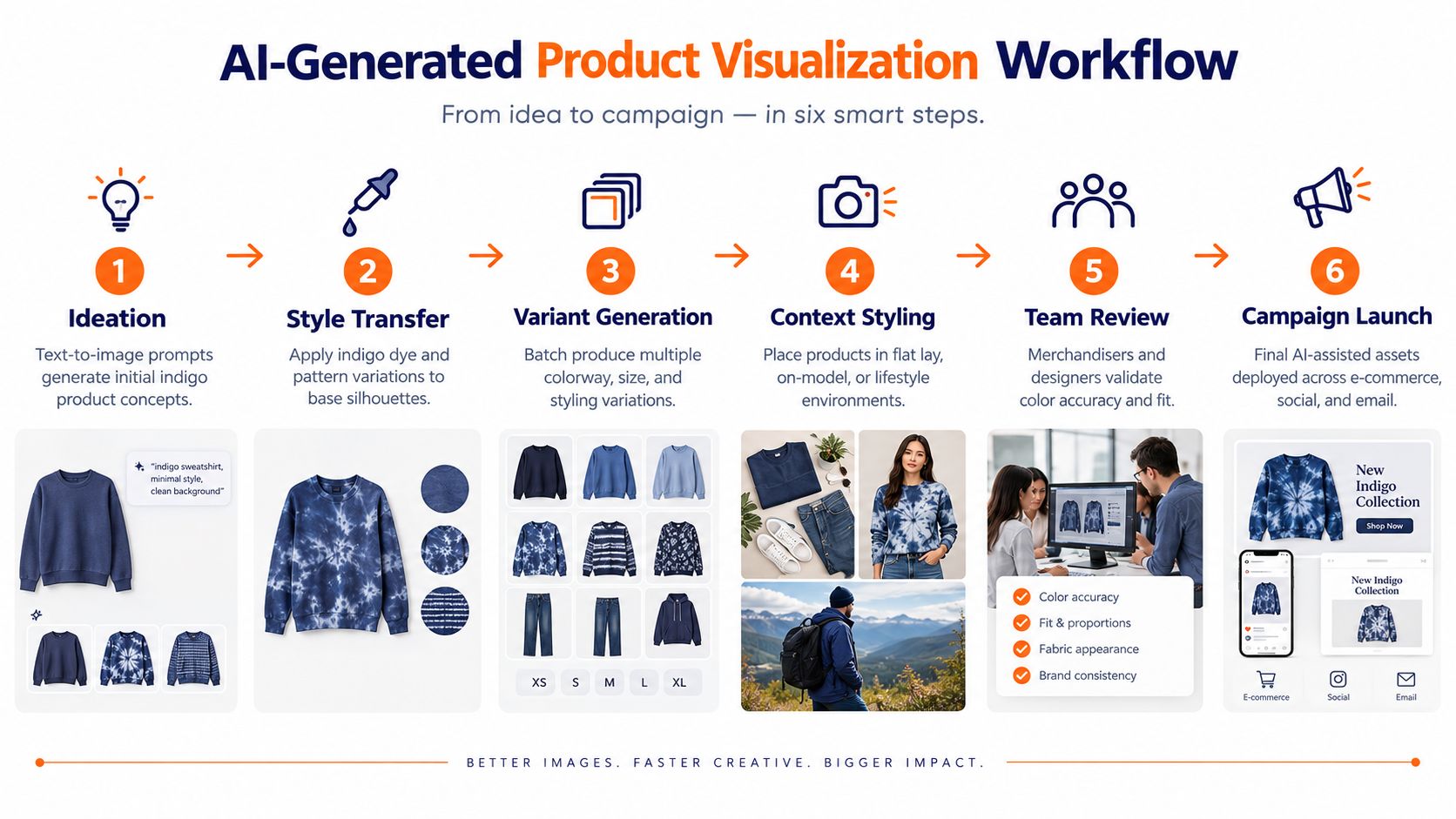
Use the six-step indigo campaign workflow diagram as a planning reference, then adapt the sequence to your actual approvals, channels, and sample readiness.
8. Regional and Channel-Specific Adaptation Photography
Global consistency doesn't mean every market needs the same picture. A core indigo product can retain its approved color, framing, and brand standards while changing model selection, styling, crop, location, or supporting products for a regional audience. That balance protects recognition without forcing one market's fashion language onto another.
Build the central standard first. Define the accepted indigo reference, background behavior, exposure range, retouching rules, logo treatment, and minimum product visibility. Regional teams can then adapt the elements that need local input. A Uniqlo-style global e-commerce system might preserve the product framing while varying models and styling. A Zara or H&M campaign may keep the visual identity but adjust the editorial emphasis by market.
Channel requirements matter as much as geography. A marketplace may require a clean front view. A brand site can support richer editorial context. Social placements may crop aggressively, while email needs clear negative space around the garment. Don't create separate visual libraries without a shared naming and approval system. That produces duplicated work and makes color drift harder to diagnose.
Use a regional adaptation matrix
- Global lock: Color reference, product identity, core lighting, and mandatory views.
- Regional choice: Model, accessories, location, language context, and styling emphasis.
- Channel choice: Crop, aspect ratio, text-safe area, and image sequence.
- Approval record: Region, channel, version, reviewer, and reason for change.
AI-assisted adaptation can reduce reshoot pressure for approved concepts, but it needs strict review. A generated regional image may change the garment's construction or alter the shade under a new background. Compare every variation with the central reference before release.
Local relevance should change the story around indigo, not the product truth.
Indigo Photography: 8-Point Comparison
| Format | Implementation complexity | Resource requirements | Expected outcomes | Ideal use cases | Key advantages |
|---|---|---|---|---|---|
| Flat Lay Product Photography | Low–Medium: simple studio setup, consistent lighting | Minimal studio, tripod, props, photographer; scalable batch workflows | Clean SKU-level visuals, clear top-down color/texture view | E-commerce catalogs, social, assortment comparison | Cost-effective at scale, consistent styling, easy SKU comparison |
| Lifestyle / Lookbook Imagery with Indigo Color Stories | High: multi-discipline creative direction and location work | Models, stylists, location fees, creative director, longer lead time | Aspirational storytelling, shows fit/drape and context | Editorial campaigns, brand positioning, social content | Communicates lifestyle & positioning, higher engagement |
| Swatch & Color Palette Close-up Photography | Low: studio-controlled macro work with color management | Macro lens, standardized lighting, color tools (D65), neutral backdrops | Accurate color references and swatch libraries for decision-making | Assortment planning, color approvals, supplier communication | Precise color communication, supports AI color matching, fast to produce |
| Detail & Texture Close-up Photography | Medium–High: precision lighting and macro skill required | Macro equipment, skilled photographer, time per shot, controlled studio | Highlights craftsmanship, texture, hardware and construction details | Luxury products, craftsmanship storytelling, quality validation | Conveys material quality and heritage, builds premium perception |
| On-Model / Ghost Mannequin Product Photography | Medium: combined model shoots and compositing workflows | Models, studio, retouching/compositing, standardized poses | Accurate fit/proportion visuals with clean catalog presentation | Product pages, size & fit communication, omnichannel catalogs | Shows fit on body while retaining clean catalog look; versatile |
| AI-Generated Product Visualization & Mockups | Medium: prompt engineering, model training, integration | AI tooling, brand training datasets, validation workflows, technical integration | Rapid concept visualization, many variants, fewer physical samples | Early-stage design, assortment ideation, A/B testing of colorways | Fast, scalable, reduces sample waste and speeds decision cycles |
| Seasonal Campaign & Editorial Photography Series | Very High: multi-day shoots with unified art direction | Large creative team, budgets, multiple locations, extended planning | Cohesive seasonal narrative and cross-channel campaign assets | Major seasonal launches, coordinated marketing & merchandising | Strong brand narrative, reusable assets across channels |
| Regional & Channel-Specific Adaptation Photography | Medium–High: coordination across regions and channels | Regional teams/models, localization workflows, asset management | Market-specific assets that respect local preferences while staying on-brand | Global e-commerce, localized campaigns, channel-specific merchandising | Balances global consistency with local relevance; improves engagement |
Turning the Gallery Into a Shot Plan
These eight formats become manageable once each image has one job. Start by naming the decision the image must support. Is the buyer comparing colorways, checking construction, approving fit, selecting a campaign mood, or adapting a global asset for a regional channel? If the job isn't clear, the shoot will collect attractive images that don't resolve the operational question.
Next, lock the reference. Create a swatch library that records the physical material, fiber content, dye system when known, treatment state, batch, lighting condition, and approved digital reference. Don't rely on a hex value or the word indigo alone. Plant-derived and synthetic indigo can carry different visual and production associations, and the same nominal shade can behave differently on cotton, linen, leather, or coated surfaces.
Then build reusable capture templates. A catalog template should define camera height, lens, background, light position, crop, and color-check procedure. An on-model template should define pose, model context, background, and detail frames. An editorial template should specify the location logic, styling palette, and required channel crops. A regional template should identify what stays fixed and what local teams may change.
Use the evidence hierarchy to decide which format gets final authority:
- Swatches: Approve the intended color family and material reference.
- Flat lays: Compare SKUs and coordinate assortments.
- On-model images: Explain fit, proportion, and appearance in context.
- Detail frames: Show construction, texture, and wear.
- AI visualizations: Explore directions before physical samples exist.
- Campaign series: Carry the approved story across channels.
- Regional adaptations: Make the story locally relevant without changing product truth.
Build a review loop that compares the screen image, physical sample, and intended lighting environment. Warm retail light can make a shade read differently from daylight. Weathering and oxidation can shift perception toward lighter and yellower values, so distressed, washed, and new-season versions should have separate labels rather than sharing one generic indigo name.
The most useful production log is simple. Record the shot ID, SKU, material, lighting setup, camera settings, reference target, retouching version, approval owner, and channel destination. For AI assets, add the reference images, prompt, generation settings, and validation status. That record turns a one-off shoot into a repeatable system.
This week, choose one indigo colorway and photograph it under cool daylight-balanced light and warm retail-style light. Place the same neutral reference and fabric detail beside it, record the setup, and ask three colleagues to describe the shade without seeing the other image. Their differences will show you exactly where your current catalog needs better standards.
Sprello helps fashion, beauty, and lifestyle teams turn indigo concepts and reference images into structured workflows for assortment visualization, campaign production, and catalog-scale product imagery. Visit Sprello to explore a shared canvas for managing brand-consistent creative across SKUs, channels, regions, and seasons.
Related
More to explore
Fresh reads
Dark Brown with Red: Styling and Merchandising Guide
Master dark brown with red styling for fashion campaigns. Learn color theory, pairings, textile testing, and merchandising workflows that work.
8 60s Flower Power Looks to Adapt for Modern Collections
Explore 8 60s Flower Power looks: psychedelic palettes, florals, tie-dye, lettering, and vintage styling, with ways to adapt each for modern collections.
Pink Blush Color Guide for Fashion and Beauty Brands
Master the pink blush color for fashion and beauty. Explore hex codes, CIELAB values, inclusive skin tone mapping, and scalable merchandising workflows.