October 12, 2026
Salmon Pink and Apple Green: A Practical Color Pairing Guide
A practical guide to the salmon pink and apple green color pairing, with tonal matches, merchandising combos, and seasonal styling tips.
A mood board lands in the review room, and everyone agrees the salmon pink and apple green combination feels fresh, warm, and distinctive. Then the practical questions begin. Which shade leads the knitwear story? Will the packaging match the product photography? Does the green need to change for a regional campaign? Can customers read the size and availability labels on a pink interface?
Those questions reveal the difference between visual approval and production readiness. Salmon pink and apple green can anchor a memorable collection, but only when the team assigns each color a job, records its specifications, and tests the relationship across materials, screens, lighting, and markets.
Why This Pairing Keeps Showing Up in Brand Work
A buyer sees a salmon knit beside an apple-green accessory. The salmon feels warm and approachable; the green supplies a sharper, fresher signal. That immediate tension attracts attention without making the assortment feel aggressive. The result can read as springlike, playful, nostalgic, or modern, depending on the supporting neutrals, materials, and proportion.
The pairing also gives brand teams clear merchandising roles. Salmon pink can carry the emotional focus in womenswear, beauty, soft accessories, and home products. Apple green can direct attention in active categories, seasonal capsules, packaging details, and smaller accessories. One color can occupy the main surface while the other marks trims, labels, buttons, or campaign accents.
Its staying power has a historical basis, not only mood-board appeal. Salmon pink has documented use across art, apparel, cosmetics, and interiors (Adobe Express' salmon color history). Apple green has been recognized as a color name since 1648 and held an institutional role in New York City's subway color system in 1979 (documented shades of green). Those references give the combination a broader visual vocabulary for brand work.

Start with a merchandising decision
Set the job for each color before choosing swatches. A low-chroma neutral can keep a high-energy pairing controlled and give product photography, packaging copy, and navigation elements room to breathe.
- Warm the collection: Make salmon pink the hero where approachability matters.
- Signal freshness: Let apple green lead a spring assortment, active category, package detail, or accessory story.
- Create contrast: Use the secondary shade for trims, small goods, labels, or editorial accents.
- Preserve sophistication: Give the neutral enough surface area to prevent visual overload.
A color story is ready when the team can specify each color's role, surface area, reproduction method, and channel variation. Ask which shade dominates, which supports it, and which neutral controls the overall temperature. That production system turns a familiar pairing into a repeatable choice across SKUs, campaigns, and seasons.
What Each Color Actually Is in Production
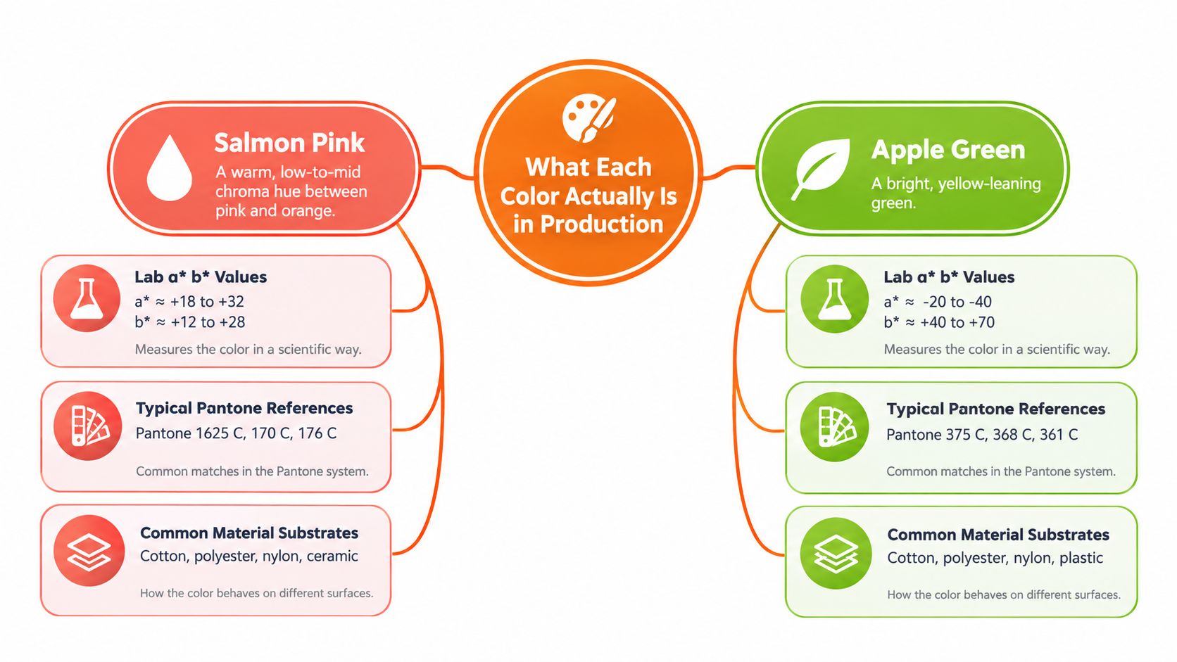
Color names help teams recognize a direction, but they do not establish a production target. Salmon pink generally sits between pink and orange, with a warm, relatively soft appearance. One digital representation is HEX #FA8072. A separate specification lists #F2A8A1, with sRGB values of 242, 168, 161, HSL of 5° / 76% / 79%, and approximate CMYK values of 0% / 31% / 33% / 5% (salmon pink color specification).
These references are useful coordinates, not interchangeable promises. A British Standard salmon-pink reference is reported with CIELAB values of L=77.73, a=18.96, b*=29.23**, demonstrating how one descriptive name can map to a different physical target. Fabric dye, coated paper, cosmetics, display calibration, photography lighting, and viewing conditions can all change the result.
Apple green is more yellow-biased and more chromatic. One digital specification gives HEX #8DB600, equivalent to RGB values of 141, 182, and 0. Another lists #8AB800, with sRGB values of 138, 184, 0, HSV hue of 75°, saturation of 100%, and value of 72% (apple green specification). Use the first value set for one digital reference and the second for comparison, rather than treating either as a universal physical standard.
Build a master color record
A brand team should record more than the names “salmon pink” and “apple green.” Capture the decisions that make each color repeatable across SKUs, suppliers, and channels.
- Screen reference: Record approved HEX and sRGB values for web, social, and digital mockups.
- Physical reference: Store a Lab target, approved physical standard, or measured material sample.
- Material notes: State whether the target applies to knitwear, woven fabric, coated or uncoated paper, packaging film, paint, or cosmetic packaging.
- Tolerance rules: Define acceptable variation before a sample requires review.
- Viewing conditions: Specify the illuminant and viewing setup used for approval.
Add descriptive qualifiers such as light warm salmon, muted salmon, bright apple green, or softened yellow-green. A pink blush color guide can help teams separate a named mood from a controlled production target. Record the dominant color, supporting color, and approved reproduction method before creating the assortment.
Why Warm Pink and Yellow-Green Actually Work Together
The pairing's strength comes from contrast in temperature, hue family, lightness, and chroma. Salmon pink has positive a* and b* values in Lab space, placing it toward the warm red-yellow direction. Apple green moves into a yellow-green family and carries substantially more chromatic energy than a muted sage or olive.
That doesn't mean the colors are automatic complements in every application. Their relationship works because the eye receives two different signals at once. Salmon feels warm and human. Apple green feels fresh, active, and plant-like. The shared yellow influence keeps the combination from becoming disconnected, while the temperature difference gives it definition.
Control the visual volume
Both shades can become demanding when rendered at full chroma across a large surface. A bright apple-green wall beside a saturated salmon-pink product may feel energetic in a campaign image but overwhelming in a retail environment. The solution isn't to abandon the pairing. It's to control scale and intensity.
- Give one color the largest visual area.
- Reduce the chroma of the supporting shade when both appear together.
- Use cream, oat, chalk white, navy, cocoa, or charcoal to interrupt the contrast.
- Test the combination in the actual product grid, not only in isolated swatches.
A useful starting point is warm salmon as the hero, with apple green used for piping, accessories, typography accents, packaging details, or one controlled product group. Reverse the arrangement when the category needs more movement or seasonal freshness.
For teams developing a coordinated wardrobe, practical color theory resources such as how to dress with confidence can help translate contrast into wearable proportions. The same principle applies to merchandising: the pairing succeeds through managed proportion, not equal distribution.
Choosing Tonal Matches That Actually Support the Pair
The supporting palette determines whether salmon pink and apple green feel polished, playful, youthful, or grounded. A soft neutral gives the colors room to breathe. A dark neutral creates structure. A warm accent can connect the pink to a richer seasonal story, while a cool neutral can make the combination feel cleaner and more contemporary.
Use the table as a decision tool rather than a fixed recipe. The HEX values are digital working references, not guarantees for physical reproduction.
Tonal Matches for Salmon Pink and Apple Green
| Role | Color | HEX | Best For | Effect |
|---|---|---|---|---|
| Warm neutral | Muted beige | #D8C7B2 | Premium apparel, home textiles, packaging | Softens the contrast and adds restraint |
| Warm neutral | Oat | #E5D5B8 | Knitwear, lifestyle goods, editorial backgrounds | Makes the palette feel natural and tactile |
| Cool neutral | Chalk white | #F5F3EC | Beauty, e-commerce backgrounds, summer campaigns | Preserves lightness and keeps both colors visible |
| Cool neutral | Soft blue-green | #AFC8C0 | Resort, interiors, wellness packaging | Cools the salmon without fighting the apple green |
| Grounding dark | Navy | #1E3048 | Tailoring, accessories, typography, outerwear | Adds depth and a more polished finish |
| Grounding dark | Deep cocoa | #4A3027 | Autumn campaigns, leather goods, fragrance | Echoes salmon's warmth with stronger weight |
| Warm accent | Terracotta | #B85F4A | Fall apparel, ceramics, woven accessories | Connects to salmon while reducing sweetness |
| Fresh accent | Pale sea-foam | #C8DED2 | Spring campaigns, beauty, resort accessories | Creates an airy, softened green family |
| High-energy accent | Bright lime | #B7D43A | Small trims, sporty accessories, campaign details | Intensifies the seasonal and active quality |
Match by intended impression
For a premium result, choose muted beige, oat, navy, or cocoa. Keep apple green to a smaller area, such as a clasp, scarf, logo detail, or accessory colorway. This approach allows salmon pink to carry the emotional warmth without making the entire assortment look juvenile.
For a lighter seasonal story, use chalk white, pale sea-foam, or a softened apple green. The palette will feel more open, particularly in digital commerce where white space already plays a major role.
For shade matching across extensions, textiles, or physical product components, a specialist resource such as the Conde Professional shade matching guide offers useful context on why visual matching requires more than a color name. Teams can also compare related pairings in this coral and green color guide, while keeping salmon pink and apple green as the controlled core rather than allowing nearby shades to drift without documentation.
Building Merchandising Combos Across Categories
A workable assortment starts with a simple rule: hero, supporting color, grounding element. The hero owns the largest or most important visual role. The supporting color adds recognition and contrast. The grounding element prevents the combination from becoming noisy.
The ratio doesn't need to be mathematically fixed. It needs to be visible in the SKU plan. Mark the role of each color before photography, packaging, and campaign production begin.

Apparel
For a knitwear story, make salmon pink the hero in a cardigan or sweater, then place apple green in a scarf, rib detail, sock, or secondary knit. Add oat or navy for trousers, footwear, or outerwear. This lets the customer read the palette as an outfit rather than two competing blocks of color.
If the collection is more active or spring-led, reverse the roles. Use apple green for a lightweight jacket or performance top, with salmon pink in a cap, bag, or seam detail. Reduce the green's surface area if the fabric has a glossy finish, because sheen can make a bright shade appear more forceful under retail lighting.
Accessories
Accessories are ideal for testing the pairing because they let customers adopt one shade without committing to a full look. A salmon handbag with an apple-green scarf creates a clear focal point. An apple-green belt or shoe can energize a salmon dress while navy or cocoa keeps the outfit grounded.
Photography should show the colors in context. A product cutout may make both shades look clean, while a lifestyle image introduces skin tone, environmental color, and directional light. Approve both views before finalizing the campaign.
Beauty and packaging
For fragrance, skincare, or cosmetics, use salmon pink as the carton or primary vessel and reserve apple green for a cap, side panel, seal, or botanical illustration. The reverse arrangement can work for a fresh or botanical product, but salmon should still appear in a controlled brand cue so the pairing remains recognizable.
Packaging substrates matter. Coated paper, matte board, translucent plastic, and glass won't reproduce the same saturation. Approve a physical sample under the intended store or studio lighting instead of judging only the digital artwork.
Home and lifestyle goods
A salmon cushion, vase, or towel can serve as the hero object, with apple green in foliage, trim, a smaller object, or a secondary SKU. For an editorial interior, a muted apple green may be more successful than the brightest digital reference. A small brass detail or deep cocoa object can supply richness without adding another dominant hue.
Teams planning coordinated stories can use merchandising examples as a prompt for grouping products by use, category, and visual role. The key is to assign the role at SKU level, not after the campaign layout is already built.
Seasonal and Region-Aware Adaptations
A fixed HEX value doesn't guarantee a fixed seasonal impression. The same named color can feel airy in a bright spring campaign, tropical in summer, earthy in autumn, or graphic in winter once lighting, styling, substrate, and surrounding tones change.
Seasonal direction
Spring favors lighter salmon, softer apple green, chalk white, and pale sea-foam. Keep the green yellow-leaning but reduce its visual force through smaller product areas, matte finishes, or generous white space.
Summer can support clearer coral-salmon and livelier green accents. Use the stronger colors in swim, accessories, beauty, and outdoor lifestyle stories, then introduce natural canvas, shell, or warm white to prevent excessive intensity.
Fall benefits from a terracotta-shifted salmon and an olive-tinted or softened green. Cocoa, leather brown, and warm beige make the pairing feel tactile and mature. The identity remains intact, but the palette no longer depends on a pastel reading.
Winter calls for dustier salmon, muted green, charcoal, navy, or deep cocoa. Metallic details can add polish, but keep them subordinate to the two core shades so the assortment doesn't lose its color signature.
Regional adaptation
Regional teams should adapt chroma, value, and supporting tones, not invent unrelated colors. In one market, a pastel combination may read as youthful and cheerful. In another, a more saturated version may feel contemporary, while a muted version may better suit premium positioning.
Review localized product photography, backgrounds, packaging, and digital overlays together. A green that feels balanced against salmon in a neutral studio may become overly bright against a warm regional setting. For a small-format beauty expression, teams can also browse Peela Nails products for inspiration on how color-led products can be presented as coordinated seasonal choices.
Accessibility and Functional Use of the Palette
A salmon pink and apple green assortment can look clear in a campaign image yet become confusing when the same colors indicate navigation, stock status, selection, comparison, or control states. Treat the palette as a production system with separate jobs for identity and function. The colors can carry recognition, while labels, shapes, borders, and typography carry meaning.
Red-green color-vision deficiencies can make distinctions between these hues difficult. Color should never be the sole signal for an important action or status, as explained in Yale accessibility guidance. A customer should be able to tell whether an item is available, selected, or discounted without interpreting a color difference.
Apply contrast requirements before launch
For normal text, use a 4.5:1 contrast ratio. Large text requires 3:1, while informative non-text graphics require 3:1. These thresholds come from WCAG accessibility requirements. Test the actual type size, weight, background, and interface state. A pairing that passes in a large campaign headline may fail in a small filter label or disabled control.
Avoid salmon text on apple-green backgrounds, and apple-green text on salmon backgrounds, unless testing confirms sufficient contrast. Navy, charcoal, or another controlled dark neutral usually performs better for functional text. Keep the signature colors in borders, illustrations, badges, imagery, and nonessential accents, where they can reinforce the brand without carrying the entire message.
Add redundant meaning
Build more than one cue into every important state.
- Availability: Pair color with words such as “In stock” or “Sold out.”
- Selection: Add a border, checkmark, pattern, or clear focus state.
- Product variants: Show written color names beside labeled swatches.
- Charts: Combine color with line styles, symbols, direct labels, or patterns.
- Calls to action: Use a dark button with readable text instead of relying on a bright palette color.
Design principle: Treat salmon pink and apple green as a visual identity palette, not a semantic system.
This protects interpretation across devices, markets, and user needs. It also prevents a common handoff error: placing campaign colors directly into an interface without checking whether they remain legible and meaningful in every functional state.
A Practical Rollout Checklist and One Last Principle
Before approving a salmon pink and apple green collection, confirm that the team has:
- Created a master color record: Include digital references, physical targets, material notes, and tolerance rules.
- Assigned color roles by category: Mark the hero, supporting shade, and grounding element for every relevant SKU group.
- Checked physical reproduction: Review fabric, paper, packaging, and product samples under defined viewing conditions.
- Prepared channel variants: Approve product pages, campaign imagery, email assets, social crops, and packaging together.
- Planned seasonal shifts: Adjust chroma and value while preserving the recognizable relationship.
- Validated accessibility: Test text, buttons, filters, swatches, charts, and status indicators with non-color cues.
The memorable principle is simple: the colors aren't the strategy. Their assigned jobs are. Salmon pink and apple green become dependable only when a team controls proportion, specification, material behavior, channel use, and customer interpretation.
Sprello helps fashion, beauty, and lifestyle teams turn color concepts into production-ready workflows across SKUs, channels, regions, and seasons. Use Sprello to visualize assortments, coordinate campaign assets, and standardize the handoffs that keep a salmon pink and apple green story consistent from first mood board to final product page.
Related
More to explore
Fresh reads

8 Pictures of Indigo in Fashion and Product Photography
Explore eight pictures of indigo across flat lays, lookbooks, swatches, and AI visuals, with lighting notes and campaign ideas for catalogs.
Dark Brown with Red: Styling and Merchandising Guide
Master dark brown with red styling for fashion campaigns. Learn color theory, pairings, textile testing, and merchandising workflows that work.
8 60s Flower Power Looks to Adapt for Modern Collections
Explore 8 60s Flower Power looks: psychedelic palettes, florals, tie-dye, lettering, and vintage styling, with ways to adapt each for modern collections.