October 8, 2026
Pink Blush Color Guide for Fashion and Beauty Brands
Master the pink blush color for fashion and beauty. Explore hex codes, CIELAB values, inclusive skin tone mapping, and scalable merchandising workflows.
The most popular advice about pink blush color is also the least useful for a large brand: match the shade to an undertone, call it “soft pink,” and assume it will look consistent everywhere. That approach can work for a single consumer choice, but it breaks down across a global assortment. The same pink can look fresh on one complexion, gray on another, and noticeably warmer under a different light source.
For merchandising and creative operations teams, pink blush isn't one shade. It's a governed color family shaped by hue, lightness, chroma, opacity, finish, substrate, lighting, and application dose. If those variables aren't documented, teams end up approving inconsistent samples, retouching campaign images, and displaying a product thumbnail that doesn't resemble the item a customer receives.
Redefining Pink Blush for Enterprise Assortments
A seasonal lineup needs a measurable target, not a name like “dusty rose.” Replace the name with a documented variant record that gives product development, photography, regional merchandising, and e-commerce the same Lab* range, finish, and viewing condition.
The record must also state the product format and application state. Powder, cream, fabric, packaging, and screen imagery do not reproduce color in the same way. A cool, pale pink can become warmer in production, lose chroma on an absorbent substrate, or appear more saturated after image correction. Without a controlled reference, each handoff creates another opportunity for shade drift and inconsistent customer expectations.
Treat the category as a controlled family
Keep “blush pink” as the consumer-facing family name, while internal records define approved variants and their production behavior. Each variant should include:
- Hue direction: movement toward blue-violet, red, coral, mauve, or peach.
- Lightness: the intended pale, medium, or deep value against the approved background and complexion range.
- Chroma: the permitted level of vividness or muting.
- Opacity: the amount of base surface or skin visible after application.
- Finish: matte, satin, luminous, shimmered, or glossy.
- Viewing condition: the lighting, display, and surrounding colors used for approval.
- Application state: the amount, layer count, and substrate or skin context represented by the reference.
CIELAB coordinates provide the shared measurement layer, but they do not replace visual controls. Teams should record an approved coordinate range alongside physical swatches, finish references, and application images. The Maybelline guide to choosing blush color supports undertone-based consumer guidance, while enterprise governance must connect that guidance to measurable production and viewing conditions.
Practical rule: Use the shade name for storytelling. Use coordinates, finish, application state, and viewing conditions for approval.
The working question becomes, “Which controlled variant is this, and where is it approved?” That decision structure supports regional colorways, seasonal updates, and campaign adaptations while keeping product, imagery, and merchandising aligned. It also gives teams a clear record to audit when a sample, photograph, or customer-facing swatch falls outside the approved range.
The Commercial Scale of Blush Pink in Beauty and Fashion
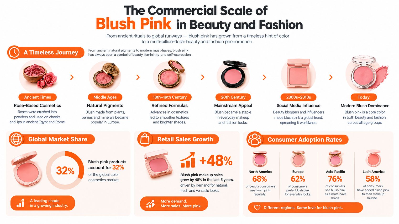
Blush pink is not merely a popular cosmetic shade. For enterprise assortments, it is a color family that must be governed across products, materials, channels, and application contexts. Its commercial value comes partly from a recognizable human association. The English color name “blush” dates to 1590, describing the rosy tone of a flushed face, as recorded in the history of blush as a color). That association connects pink with health, vitality, affection, exertion, and emotional response.
Cosmetic use began long before the modern blush category. Ancient Egyptians applied ochre pigments to lips and cheeks, creating a blush-like effect associated with beauty, love, and sexuality. During the 19th century, synthetic dyes made pink and mauve pigments more accessible and easier to scale commercially. By the 1930s, vivid pink had moved into fashion, packaging, and visual branding, giving the color a broader role across consumer assortments.
Why the category deserves assortment planning
Public sales reporting rarely separates one exact blush color, yet pink and rose tones remain established parts of color cosmetics. Peach-pink and pink-coral shades can suggest a natural flush across different product concepts and consumer groups. That flexibility supports core lines, limited editions, packaging systems, and seasonal fashion stories.
The category also has durable product references. NARS Orgasm blush launched in 1999, combining pink-coral color with gold shimmer and becoming a long-running reference for blush design, as documented in this history of blush. The operational lesson is not to copy a famous shade. A defined hue, finish, name, and visual language can work together as a repeatable merchandising asset.
Use market scale to justify governance
The U.S. color-cosmetics market was valued at approximately $21.52 billion in 2024 and is projected to reach $35.51 billion by 2030, with a forecast compound annual growth rate of 8.8%, according to Grand View Research's color cosmetics market report. These figures cover blush alongside lipstick, eyeshadow, foundation, and other complexion products, so they do not isolate pink blush sales.
They still establish the scale of the operating problem. A pink family can span multiple SKUs, regions, formats, and channels. Without shared CIELAB ranges, finish references, and inclusive application mapping, the same named shade can drift between a compact, a product photograph, a printed card, and an e-commerce tile. That inconsistency weakens recognition and can increase returns when customers receive a product that does not match the approved visual expectation. Governance makes pink scalable rather than incidental.
Technical Color Specs and CIELAB Coordinate Mapping
Hex codes are useful for interface design, mood boards, and early digital exploration. They aren't sufficient as the only enterprise specification for a physical product. A hex value describes an RGB display instruction, while manufacturing, photography, print, and cosmetics depend on how a material reflects light and how people perceive that reflection.
A practical digital reference for muted blush pink is hex #F2B5C4, corresponding approximately to CIELAB L=82.10, a=23.80, b*=3.20**, according to this blush-pink color reference. The value is useful as a starting point, but the CIELAB coordinates give teams a more actionable way to describe the shade.
Specify the variables independently
In CIELAB, L* represents lightness. A high L* value indicates a light color, which is why the reference reads as a pale blush rather than a deep berry. a* describes the red-green direction, and a positive value places the color toward red and magenta. b* describes the yellow-blue direction, so a slightly positive value adds a modest warm bias.
For controlled variants, change one variable at a time where possible:
- Adjust L* to create a lighter or deeper version without immediately changing the family identity.
- Adjust a* to move the shade toward a cooler magenta pink or a redder pink.
- Adjust b* to introduce warmth toward peach, coral, or yellow, or to cool the shade toward blue.
- Track chroma and finish separately, because a more vivid pigment and a glossier surface can both make a shade appear stronger without changing its nominal hue.
- Approve under a defined illuminant and display profile, then validate the physical substrate or cosmetic formulation before release.
| Specification Method | Best Use Case | Limitation for Scale |
|---|---|---|
| Hex code | Web mockups, interface swatches, early mood boards | It doesn't fully control physical reflectance, substrate, lighting, or finish |
| CIELAB coordinates | Variant governance, cross-team comparison, controlled color adjustments | It still requires defined viewing conditions and physical validation |
| Subjective shade name | Consumer storytelling and campaign language | Different teams can interpret the same name differently |
The same principle applies to photography. Color correction can make a product image feel coherent, but uncontrolled grading may hide a physical mismatch rather than solve it. A practical color grading guide from RevelRaw is useful background for teams defining how images should be adjusted without losing the product's intended character.
For an expanded application of color systems in product development, see Sprello's crimson and cream color strategy guide. The operational takeaway is simple: create one source of truth, then connect every approved digital swatch, physical sample, render, and campaign asset to that record.
Pigment Stability and Non-Spectral Color Challenges
Pink blush isn't produced by one isolated wavelength. It's a non-spectral perceptual color, created through combined long-wavelength red and short-wavelength blue-violet stimulation, usually with a reduced green contribution. That means the visible result depends on the reflectance behavior of the full pigment system, not just on a hue label or an RGB value.
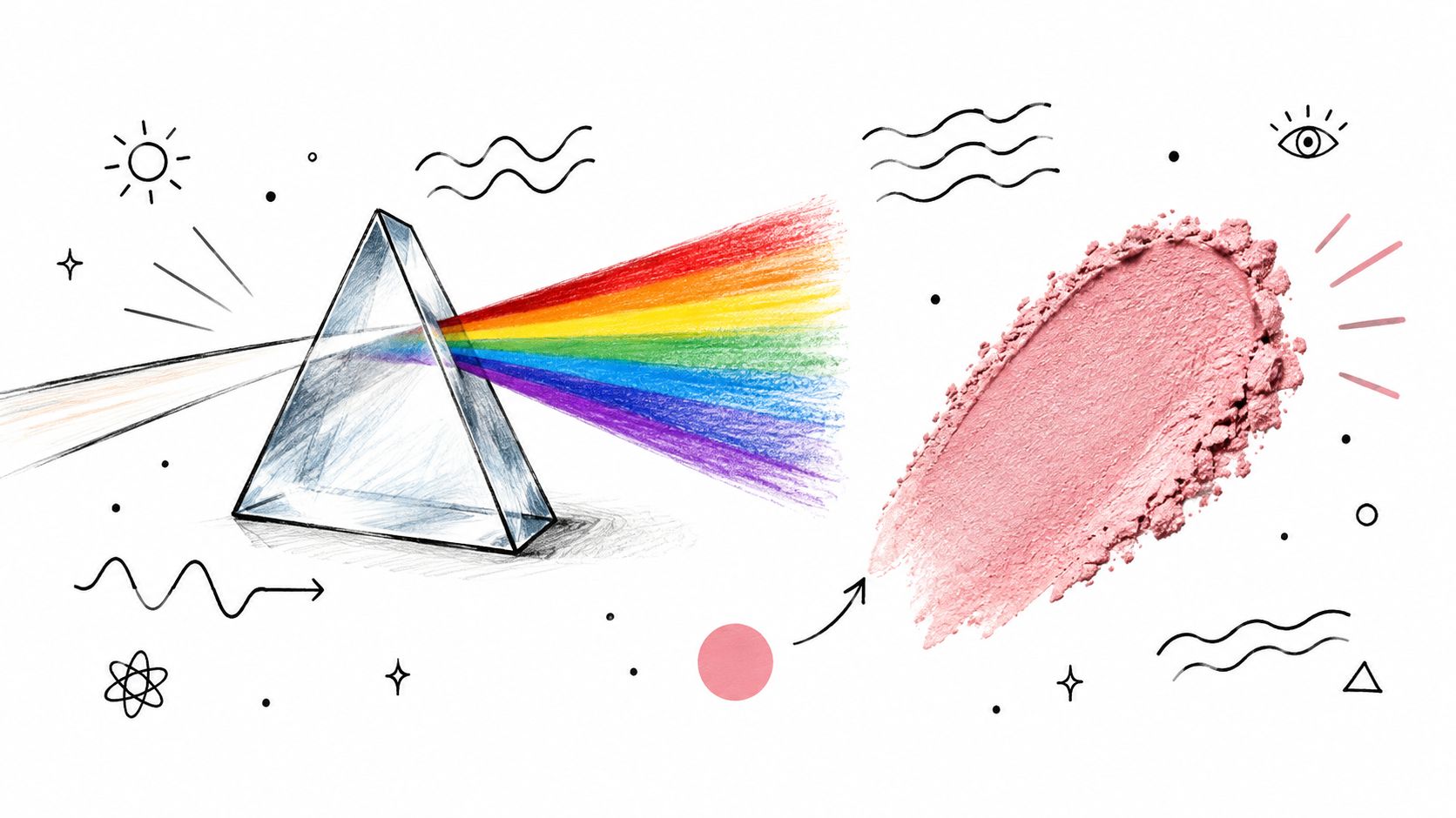
For formulation and content teams, this distinction has a direct production consequence. Two products can carry similar digital references but behave differently under studio lighting, sunlight, warm retail illumination, or a phone display. A natural pigment may also change with exposure, while a synthetic system may hold a different balance between hue strength, opacity, and finish.
Separate formulation stability from image consistency
A 2025 plant-pigment blush study reported stable pH values of 6.88–7.45 and good thermal stability across cream-blush formulations. The richer pink formulation nevertheless showed moderate fading during prolonged sunlight exposure, with the authors associating the loss with beetroot pigment sensitivity, as reported in the plant-pigment blush study.
That result doesn't mean plant pigments are unsuitable. It means the approval process must account for exposure. A formula can remain thermally stable while still changing visually under prolonged light, and a campaign image can look accurate at capture while becoming misleading if the physical product shifts later.
A useful production dossier should record:
- Before-and-after color measurements for relevant exposure tests.
- Lighting conditions used for product approval and photography.
- Acceptable color-difference thresholds agreed by product, design, and merchandising teams.
- Reference images at consistent white balance, rather than relying on uncalibrated screens.
- Material and finish notes, including whether shimmer or gloss changes perceived saturation.
The video below can help non-specialist teams understand why color appearance depends on light, surface, and perception. Use it as shared vocabulary, not as a substitute for controlled measurement.
A thumbnail should never be the final authority on the product. It should be a controlled representation tied to the approved physical reference, with retouching rules that preserve the intended pink rather than just making the image more attractive.
Inclusive Shade Mapping Across Diverse Skin Depths
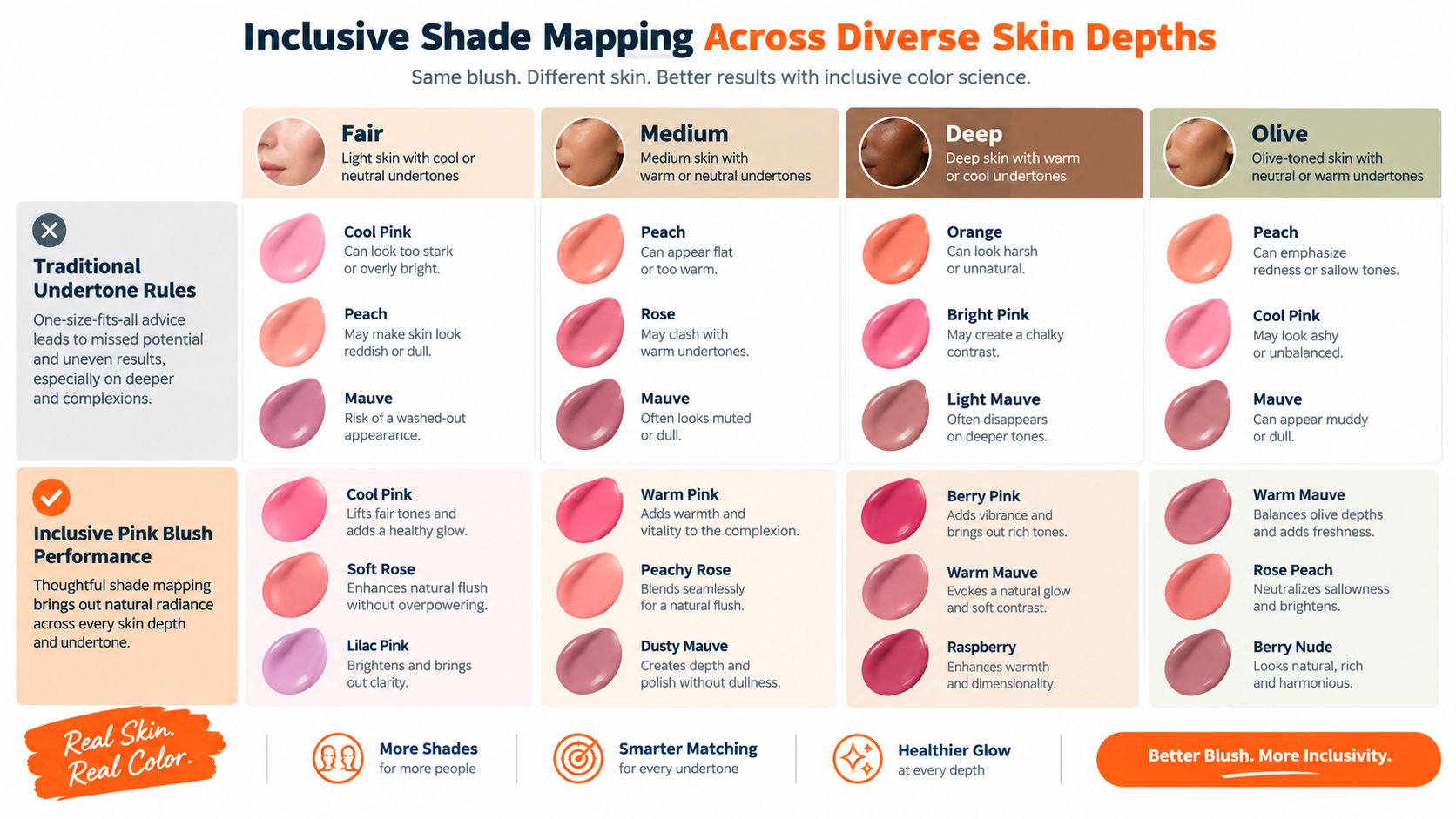
Undertone matching is a useful starting point, but it can't carry the whole decision. Traditional advice often recommends blue-based pinks for cooler skin and peachier pinks for warmer skin. That framework becomes less reliable when teams ignore lightness, chroma, pigment load, opacity, finish, surrounding makeup, and lighting.
A pale, low-chroma pink may blend naturally on a lighter complexion and appear ashy or invisible on deeper skin. Conversely, a highly saturated warm pink can look excessive when applied heavily but natural when sheered out. As L'Oréal Paris' guidance on blush for different skin tones indicates, a shade labeled “pink” may disappear on deeper skin if it's too light and low-chroma, while a saturated warm pink may look more natural once diffused.
Compare performance, not just shade names
A production mapping system should test each pink family across skin-depth groups and application states. The objective isn't to force one “universal” shade. It's to identify where a shade remains legible, flattering, and controllable.
| Variable | Lighter application | Heavier application |
|---|---|---|
| Lightness | May read soft and natural | Can become chalky if the base lacks depth |
| Chroma | May create a subtle flush | Can appear stronger than expected |
| Opacity | Allows skin to influence the result | Covers more of the base tone |
| Finish | Luminous finishes can amplify freshness | Shimmer may exaggerate texture or contrast |
Olive and golden complexions deserve their own review rather than being treated as a minor variation of warm skin. A cool pink may create too much contrast, while a pale pink can lose clarity. A muted warm rose, coral-pink, or mauve may perform better, but the answer depends on dose and finish, not the label alone.
Build the application map early
Test sheer, buildable, and full-intensity states during concept development. Photograph each state under controlled editorial and e-commerce lighting, then retain the application context in the asset metadata. This helps creative teams avoid showing a heavily applied swatch while describing the product as sheer.
Virtual representation can support this process when it's tied to calibrated inputs. Sprello's virtual try-on technology overview provides relevant context for teams considering digital visualization as part of shade evaluation and content planning.
The inclusive standard isn't a larger list of pink names. It's evidence that each approved shade has been examined across complexion depth, undertone context, opacity, finish, and lighting. That documentation makes “universally flattering” a claim teams can define precisely rather than a promise they can't reproduce.
Scaling Campaign Assets and Merchandising Workflows
A pink color system becomes valuable when it survives the handoff from assortment planning to final campaign delivery. The workflow should begin before photography, with a colorway record that connects the product code, approved coordinate range, finish, application state, skin-depth mapping, and channel requirements.
A merchandising team might start with a seasonal family containing a muted blush, a warmer pink-coral, and a deeper rose. Design then tests each color on the intended packaging or product surface. Product development confirms the physical result, while creative operations prepares controlled campaign references instead of asking photographers to interpret a descriptive name.
Give every channel the same source record
The e-commerce grid needs a clean product view. A regional lookbook may need a model application with a specified dose. Social content may require a more expressive crop, but it still shouldn't alter the product's identity. These outputs can vary in composition while preserving the same governed color family and approved variant.
A practical handoff contains:
- The master color record, including CIELAB reference values and permitted tolerances.
- The application brief, stating sheer, buildable, or opaque presentation.
- The lighting brief, including white-balance and background requirements.
- The retouching boundary, identifying which corrections are allowed and which would misrepresent the product.
- The regional asset rules, defining what can change for local campaigns and what must remain fixed.
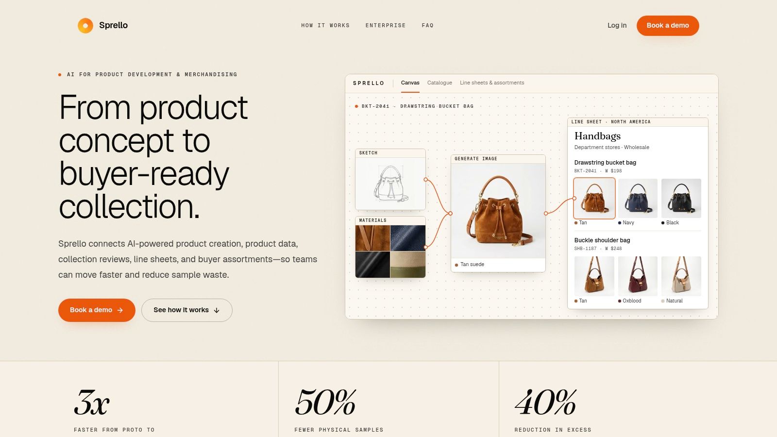
The process also benefits from a visual workflow canvas where merchandising, design, and marketing can inspect the same inputs and outputs. Sprello's e-commerce content production workflow is relevant to teams connecting product records with repeatable asset creation across large catalogs.
Use AI for controlled variation, not color improvisation
AI-assisted visualization can reduce the need to create every regional concept from scratch, but it needs guardrails. The system should receive the approved colorway, product geometry, material or formula behavior, background direction, and model or complexion requirements. It shouldn't be asked to “make the pink feel nicer,” because that instruction invites uncontrolled hue, saturation, and lighting changes.
A strong review loop compares the generated asset with the physical reference and the approved dossier. Creative teams can then approve a channel-specific crop or reject an image that makes the color too pale, too warm, too reflective, or too saturated. Speed matters, but repeatability matters more when one color appears across a broad assortment.
Building a Production-Oriented Pink Color System
Subjective shade matching does not scale across a large assortment. A production-oriented pink color system gives merchandising, design, and marketing a shared control method, mapping hue, chroma, depth, opacity, and finish to skin-depth groups and lighting environments. It addresses the underserved opportunity identified in consumer undertone guidance.
Begin with an audit rather than another naming exercise. Gather existing pink SKUs, packaging references, physical samples, digital swatches, campaign images, and regional adaptations. Compare them under defined viewing conditions. Flag cases where different names produce the same visual result, or one name has led to incompatible executions.
Replace the framework with a controlled SKU record
The closing governance step is a traceable variant record. Assign every SKU a variant ID, such as PB-C-02-Satin-Sheer, then log the approved CIELAB coordinates, tolerance of ΔE ≤2.0, finish, and illuminant D65 in a shared dossier. Merchandising and creative can then approve the same reference instead of relying on separate swatches, screenshots, or memory.
Record the application limits alongside the color data. Specify whether the product is sheer or opaque, how much it can build, and how the finish should appear across skin-depth groups. Attach the approved physical sample, digital reference, lighting conditions, and channel-specific crop guidance to the same variant ID.
A short approval test catches drift before launch. Review the product under the approved illuminant, compare it with the physical reference, and inspect the corresponding packaging, product page, thumbnail, and campaign render. Record the reason for any exception, including a regional adaptation or material-related shift, rather than allowing the adjustment to become an undocumented precedent.
The system should make the right result repeatable, not make creative judgment irrelevant.
AI-assisted visualization belongs after these records are approved. It can help teams explore colorways, show products on varied complexions, and prepare channel assets. The generated output still requires comparison with the physical sample and shared dossier. Instructions should specify the approved colorway, product geometry, material or formula behavior, background direction, and complexion requirements, rather than asking AI to make the pink feel nicer.
The operational payoff is clearer handoff control. Teams can catch shade drift before launch, reduce avoidable sampling revisions, and represent pink products more consistently across complexions and channels. Regional teams can explain an approved variation without weakening the core color identity.
Start with one pink family, measure every handoff, and expand after merchandising and creative use the same record. Sprello can support governed colorway visualization and repeatable campaign workflows across SKUs, channels, regions, and seasons.
Related
More to explore
Fresh reads

Crimson and Cream Colors: The Complete Styling Guide
Master crimson and cream colors for fashion and beauty. Learn exact hex codes, contrast ratios, merchandising use-cases, and region variations.

Virtual Try on Technology: A Practical Guide for Brands
Learn how virtual try on technology works, why it matters for fashion and beauty brands, and how to plan, measure, and scale it across your catalog.

Product Visualization Software: Guide for Fashion Brands
Compare product visualization software for fashion and lifestyle brands. Learn how to choose the right tool for quality, scale, and seamless integration.