October 7, 2026
Crimson and Cream Colors: The Complete Styling Guide
Master crimson and cream colors for fashion and beauty. Learn exact hex codes, contrast ratios, merchandising use-cases, and region variations.

A brand director reviews a seasonal lookbook and pauses at the same spread twice. A deep red dress sits against a soft cream wall, the accessories repeat the contrast, and the page feels both immediate and considered. The combination doesn't need a crowded layout or a loud graphic treatment to command attention.
That's the strength of crimson and cream colors. The pairing can carry a fashion campaign, refine a beauty package, warm a home collection, or give an e-commerce interface a recognizable visual anchor. Its success, however, depends on more than choosing a red swatch and an off-white background. At scale, the palette needs rules for materials, channels, product roles, accessibility, and regional execution.
The Timeless Allure of Crimson and Cream
Crimson and cream create tension without visual disorder. Crimson supplies energy, depth, and a clear focal point. Cream softens the composition, gives the eye somewhere to rest, and keeps the red from becoming aggressive. In a lookbook, that relationship might appear as a crimson evening dress framed by cream negative space. In beauty, it could become a saturated lip color on a warm ivory carton. In lifestyle, cream upholstery might provide the foundation while crimson cushions, ceramics, or knitwear supply the seasonal note.

The palette also behaves well across image styles. High-gloss photography can make crimson appear dramatic and lacquered, while a matte cream background introduces restraint. On a product page, the same pairing can organize hierarchy: cream as the interface field, crimson for selected variants or large editorial type, and a darker neutral for transactional copy. The result feels deliberate because each color has a job.
Why the pairing remains commercially useful
A seasonal trend usually asks a brand to move quickly. A durable colorway asks a different question: can the combination survive changing silhouettes, fabrics, photography directions, and market expectations? Crimson and cream often can, provided the team treats them as a system rather than a decorative mood.
Merchandising principle: Let crimson identify the product story, and let cream determine how much visual space that story receives.
The ratio should change by category. Apparel can support a crimson hero garment with cream styling pieces. Beauty may need cream packaging to protect shelf clarity while crimson communicates the product's intensity. Home collections often work better when cream dominates the larger surfaces and crimson appears in movable accents. The palette's familiarity creates recognition, but the execution determines whether it feels ceremonial, modern, romantic, or overly seasonal.
Defining the Palette and Hex Codes
A mood-board label such as “crimson” isn't precise enough for production. Digital teams need a defined color token, while product teams need a physical reference that accounts for substrate, finish, dye, lighting, and print process.
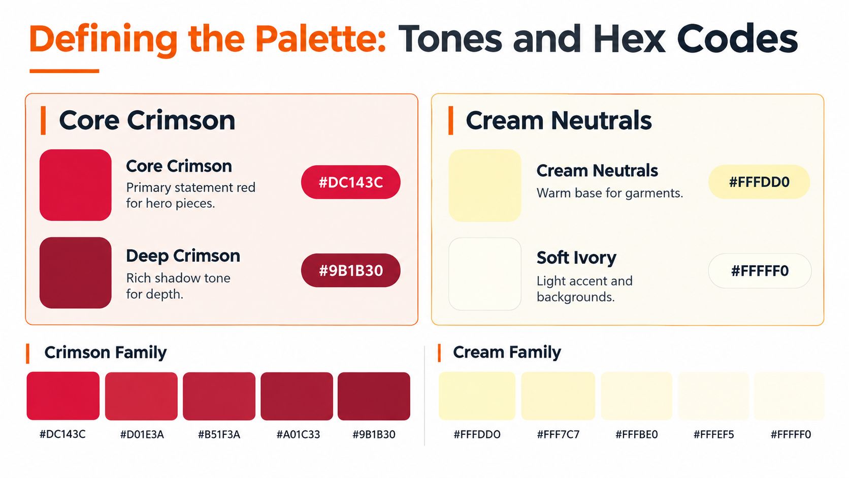
The commonly used CSS named color Crimson is #DC143C, with sRGB values of 220, 20, 60. Its HSV representation is approximately 348° hue, 91% saturation, and 86% value, placing it in a highly saturated red area with a slight magenta bias. These specifications are useful for web and e-commerce, but they don't guarantee that a woven fabric, coated carton, or uncoated paper will look identical. The digital definition is documented in the Crimson color reference.
Give every tone a production role
Cream is especially vulnerable to vague naming. “Warm cream,” “ivory,” and “soft neutral” can describe visibly different results, particularly when one version contains more yellow or beige than another. Instead of approving a long list of loosely named shades, define a small family with clear roles:
- Core crimson: The primary statement red for hero products, campaign accents, and selected calls to action.
- Deep crimson: A darker variation used for shadows, trims, packaging depth, or situations where the core tone lacks sufficient contrast.
- Warm cream: The principal neutral for garments, backgrounds, and larger product surfaces.
- Soft ivory: A lighter accent for editorial layouts, packaging interiors, and minimal digital fields.
Each token should connect to a measurable reference, such as a Lab target, an allowed tolerance, the intended substrate, and the relevant illuminant. Web files should preserve sRGB. Physical production should use the printer's CMYK conversion or an approved spot color, followed by an actual sample review.
Teams working across apparel decoration can also benefit from adjacent color-system references. For a different approach to organizing a named palette for production, try Cobra DTF's teal guide. The point isn't to copy another color family. It's to adopt the discipline of defining what a color means before it enters a SKU or campaign workflow.
For related palette thinking, the coral and green color guide offers another useful comparison. Crimson and cream should be governed with the same care, even when the visual mood is more traditional.
Ensuring Accessibility and Contrast Ratios
A crimson-and-cream composition can look excellent in a controlled photoshoot and still fail in a live interface. The problem is that visual drama doesn't equal readable contrast. A red that appears dark to a designer may retain lower perceived luminance than expected because red contributes differently to luminance than green or blue.
WCAG guidance sets a minimum contrast ratio of 4.5:1 for normal text, 3:1 for large text, and 3:1 for important interface components or graphical objects, as explained in the MDN contrast guidance. A Washington State University example cited there shows bright crimson on white at 3.9:1, which isn't sufficient for normal-sized text even though the pairing looks vivid.
Test the actual pair
Don't approve “crimson on cream” as a general rule. Test the exact crimson token against the exact cream token, at the intended text size, weight, and state.
- Calculate relative luminance. Use a contrast checker with the final sRGB values rather than relying on visual judgment.
- Check every interface state. Normal, hover, selected, disabled, and error treatments can produce different results.
- Use crimson selectively. Reserve it for large display type, borders, icons, labels, and accents when small text doesn't pass.
- Choose a dark neutral for body copy. Near-black or deep brown text on cream is usually a more dependable reading choice.
- Add a non-color signal. Pair status color with text, an icon, a pattern, or position so users don't need to distinguish crimson from another hue alone.
Accessibility rule: Approve the pair in the finished interface or exported asset, not only in a swatch library.
The same testing applies to campaign annotations, assortment boards, packaging claims, and mobile product cards. Display brightness, ambient light, compression, and color-vision differences can all change how the pairing is experienced.
Historical Roots and Material Integrity
Crimson carries unusual material weight because its most prestigious traditional versions came from insect-derived dyes. In Mediterranean Europe, kermes insects living on kermes oak shaped early crimson production. After the Spanish conquest of Mexico, American cochineal became a major alternative because it could produce a comparable or more intense color with far less raw material. Historical accounts report that achieving the same effect could require approximately 10 to 12 times more kermes than cochineal, a comparison documented in the historical overview of crimson.

Cochineal use itself predates European contact by many centuries. Indigenous peoples in Mesoamerica used it for textiles and other materials by at least the 2nd century BCE, while Peruvian textile production using cochineal is documented from approximately 600 to 1000 CE. Spanish expansion later turned the dye into an international commodity, connecting saturated crimson and scarlet with prestige across European and Asian textile systems.
Luxury needs a material explanation
The dye's intensity demanded extraordinary biological and production resources. The Getty Research Institute reports that producing one pound of cochineal dye could require as many as 70,000 dried insects. A separate account estimates that amount could dye approximately 13 wool sweaters a vivid cardinal red, or roughly 5,385 dried insects per sweater before processing losses and variations in dye depth. The Getty account of cochineal's history also describes the pigment's use in textiles, paintings, cosmetics, and military uniforms.
That history changes how a brand should talk about crimson. A natural-dye claim needs traceability, process detail, and honest labeling. A synthetic pigment may provide better repeatability or a different sustainability profile, but it shouldn't borrow the authority of historical cochineal without explaining the distinction. Material integrity starts by documenting whether a color is natural, synthetic, digitally simulated, or a combination of treatments.
Merchandising Applications Across Categories
The same colorway can tell different stories depending on where it appears. The merchandising mistake is to apply one crimson-to-cream ratio across the entire assortment. Product category, surface area, finish, and purchase context all change the balance.

Apparel
Use crimson as the hero when the silhouette benefits from immediate recognition, such as a dress, knit, coat, or occasion accessory. Cream can appear in styling, footwear, knitwear, or the surrounding set design. The risk is overloading the frame with equal quantities of both colors, which can make the outfit feel costume-like rather than edited.
Beauty
Beauty packaging often performs best when cream creates the calm surface and crimson signals the active product. A lipstick carton, nail color, fragrance detail, or campaign lip can carry the saturated note without forcing the entire range into a red block. Test the printed crimson against the package coating, since gloss and matte finishes can create very different perceptions of depth.
Home and lifestyle
In home goods, the role usually reverses. Cream works well across upholstery, bedding, ceramics, or larger surfaces, while crimson enters through cushions, table linens, mugs, candles, or small furniture details. This structure makes the colorway easier to refresh without replacing the foundation of the room.
Accessories
Accessories can tolerate stronger crimson exposure because smaller products function as punctuation. Handbags, scarves, shoes, and jewelry packaging can carry the statement tone, while cream supports coordination across the broader assortment.
A category matrix prevents the creative team from making each decision from scratch:
| Category | Primary role | Supporting role | Main risk |
|---|---|---|---|
| Apparel | Crimson hero garment | Cream styling and backdrop | Excessive visual density |
| Beauty | Cream packaging field | Crimson product cue | Print and coating drift |
| Home | Cream foundation | Crimson accents | Seasonal overstatement |
| Accessories | Crimson punctuation | Cream coordination | Fragmented color naming |
Teams that want to connect palette decisions with store presentation can use data-driven visual merchandising advice from Next Point. For broader assortment references, merchandising examples can help translate a color story into coordinated product groupings rather than isolated SKUs.
Regional and Channel Variations
A global brand shouldn't assume that crimson carries one fixed meaning everywhere. In some markets, deep red may suit celebratory gifting and seasonal presentation. Elsewhere, the same tone may feel formal, ceremonial, traditional, or more appropriate for limited-edition positioning. Cream can also shift from warm and artisanal to minimal and premium depending on local styling conventions.
The answer isn't to create unrelated regional palettes. That approach protects local relevance in the short term but weakens recognition across the brand. A better model keeps the core crimson and its naming stable while allowing controlled changes in cream temperature, image styling, product emphasis, and supporting neutrals.
Govern the adaptation
A regional campaign brief should identify what can change and what cannot:
- Keep the token stable: The core crimson needs a defined reference across markets, even if physical production requires approved conversions.
- Adjust the supporting neutral: A warmer cream may suit one material or market context, while a cleaner ivory may perform better in another channel.
- Localize the story: Gifting, occasion, everyday wear, and home styling can each use different copy and product groupings without changing the core color identity.
- Review channel behavior: Social ads need immediate readability, e-commerce needs clear variant differentiation, and stores add changing light, texture, and viewing distance.
- Document exceptions: A regional variation should have a reason, an owner, and an expiry or review point.
This governance protects the brand from two opposite errors. A rigid system can feel culturally tone-deaf, while uncontrolled adaptation produces crimson shades that no longer look related. The practical objective is recognizable difference, not identical execution.
Building a Scalable Colorway Architecture
A colorway architecture turns inspiration into an operating language. Start with a core crimson token, a defined family of cream variants, approved depth tones, and a short list of supporting accents. Then assign each token a job across product, image, interface, packaging, and print.
Create the record before production
A useful color record should include:
- Token name: Use a controlled name such as Core Crimson or Warm Cream, not an informal description from a mood board.
- Digital value: Record the approved sRGB value for web, catalog, and campaign work.
- Physical target: Add Lab references, tolerance, substrate, finish, and illuminant for production review.
- Assortment role: Mark whether the color supports a hero SKU, carryover basic, limited edition, gift set, or editorial background.
- Contrast rule: State where the token may appear as text, a large display element, a border, or a background.
- Regional status: Identify universal tokens and market-specific variants.
- Approval owner: Assign responsibility for color decisions so teams don't create competing versions.
A seasonal dossier can then show the palette across actual materials and channels. Include fabric swatches, packaging proofs, product photography, mobile screens, print samples, and lighting conditions. The dossier should make failure visible early, before a mismatch reaches a full assortment or a regional campaign.
For teams formalizing brand rules, Taja AI brand style templates can provide a useful reference for organizing guidance into a repeatable document. A complementary assortment planning template can help connect the color tokens to product roles, line architecture, and seasonal planning.
The enduring appeal of crimson and cream comes from the balance between intensity and restraint. Their strategic value comes from making that balance repeatable. When every stakeholder can identify the approved tone, understand its production limits, and see where it belongs in the assortment, the palette stops being a mood-board preference and becomes an auditable commercial asset.
Use Sprello to map crimson and cream across seasonal assortments, SKU variants, campaign assets, and regional channel executions without losing the approved color logic. Visit Sprello to build production-ready workflows that keep merchandising, design, and marketing aligned from concept through final delivery.
Related
More to explore
Fresh reads

Virtual Try on Technology: A Practical Guide for Brands
Learn how virtual try on technology works, why it matters for fashion and beauty brands, and how to plan, measure, and scale it across your catalog.

Product Visualization Software: Guide for Fashion Brands
Compare product visualization software for fashion and lifestyle brands. Learn how to choose the right tool for quality, scale, and seamless integration.

Ecommerce Content Production: The Enterprise Playbook
Master ecommerce content production for fashion and beauty brands. Learn enterprise workflows, AI acceleration, and scaling strategies for catalog growth.