October 10, 2026
Dark Brown with Red: Styling and Merchandising Guide
Master dark brown with red styling for fashion campaigns. Learn color theory, pairings, textile testing, and merchandising workflows that work.
The most important fact about dark brown with red is that it isn't one color. It's a family built from different levels of depth, warmth, reflectance, and material behavior. That distinction explains why a shade can look almost brown in a fitting room, visibly red in daylight, and inconsistent again in an e-commerce image.
For a creative director, the palette is compelling because it combines red's visual emphasis with brown's grounding effect. For a production team, that same flexibility creates risk. A poetic name such as mahogany or cherry cola can guide ideation, but it can't control a fabric lot, a beauty formula, a generated image, or a regional SKU without measurable specifications and testing.
Why Dark Brown with Red Still Commands Attention
Dark brown with red has deeper roots than the current trend cycle. Renaissance artists commonly worked with four major brown earth pigments, raw umber, raw sienna, burnt umber, and burnt sienna. Raw umber was associated with Umbria in Italy, while raw sienna came from the area around Siena in Tuscany. Heating these materials produced darker variants, including burnt sienna, a distinctly dark reddish brown. The historical record is summarized in the history and composition of brown pigments.
That material logic matters. Umber gets much of its color from iron oxide, while manganese oxide contributes to its deeper brown character. Iron-rich minerals could produce both brown and red effects, then shift through heating and processing. The pairing therefore belongs to a long visual language of painted surfaces, ceramics, textiles, and decorative objects, not just to a contemporary mood board.
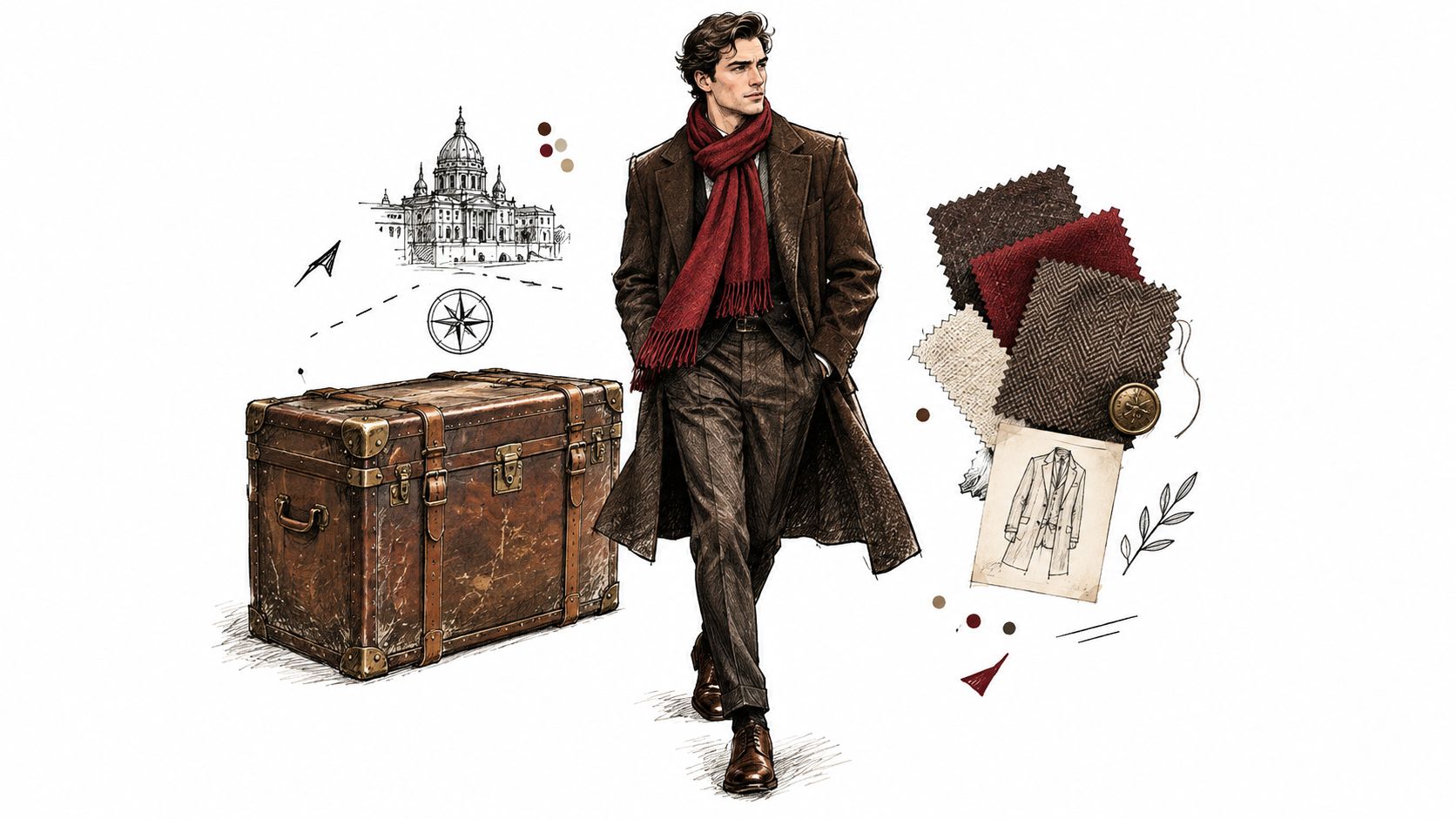
A palette with built-in hierarchy
Brown isn't a single spectral color. It can contain yellow, orange, or red components while remaining relatively low in luminance or saturation. That's why red-brown, reddish brown, and dark brown overlap without being interchangeable formulas.
In merchandising, this creates a useful hierarchy:
- Red supplies emphasis. It draws attention to a scarf, lining, knit panel, lip product, or hero accessory.
- Dark brown supplies depth. It gives the assortment a quieter base than black while retaining warmth.
- The combined system supports variation. Teams can move from restrained red reflection to richer oxblood without abandoning the seasonal story.
The palette also carries tactile associations. Leather, brushed wool, suede, clay, wood, and oxidized metal all reinforce its material credibility. That makes it particularly effective when the visual story needs warmth without looking overly decorative.
Practical rule: Treat dark brown with red as an earth-tone system, not as a single swatch.
The same principle applies when building related color stories alongside crimson and cream color combinations. The creative task is to decide where the red sits, how much contrast it creates, and which surfaces are allowed to carry the strongest expression.
How to Specify Dark Brown with Red for Production
A color name can start a conversation, but it can't finish a production handoff. “Dark brown with red” leaves open several questions: How dark? How red? Does the brown lean yellow, orange, neutral, or violet? Will the intended appearance survive a change in fabric, finish, lighting, or image generation?
Colorimetry gives teams a more reliable language. CIELAB separates lightness, red-green position, and yellow-blue position through (L^), (a^), and (b^). A production target for this palette should use a relatively low (L^), a positive (a^), and a (b^) value that defines whether the brown leans warm and yellow or cooler and more neutral. The NIST material on color measurement and appearance explains why measured appearance depends on both illumination and wavelength-specific reflectance.
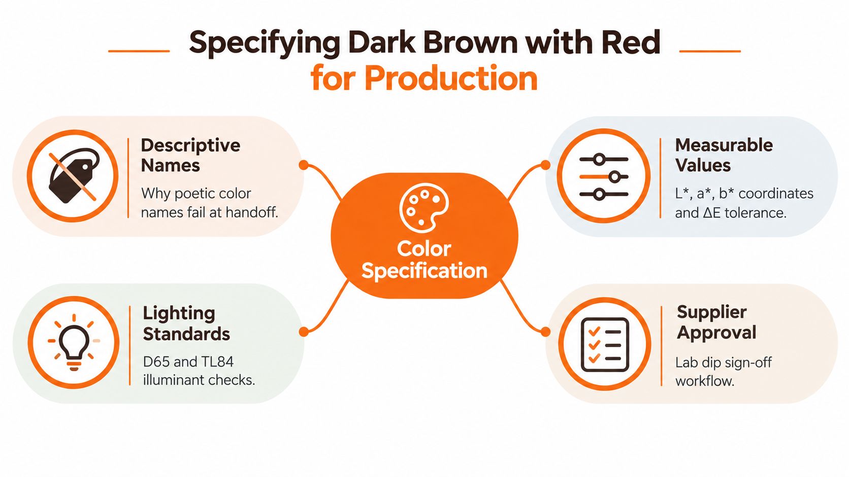
What the handoff must contain
Two materials can appear close under one light source and separate under retail lighting, daylight, or studio illumination. The illuminant's spectral power and the product's reflectance determine what the eye receives, so a screen preview isn't a sufficient approval standard.
A production record should include:
| Specification field | Why it matters |
|---|---|
| CIELAB or spectral target | Replaces ambiguous names with measurable color information |
| Illuminant and observer conditions | Defines the viewing assumptions behind the target |
| Approved physical swatch | Anchors the digital target to the actual substrate |
| Color-difference threshold | Establishes when a sample requires review or rejection |
| Channel reference images | Shows how the shade should appear in retail, daylight, studio, and e-commerce contexts |
The workflow should begin with a creative name, then move quickly to coordinates and references. Attach the measurable definition before suppliers, retouchers, or content teams begin execution. A practical sample design brief can carry the narrative direction while the technical appendix controls the color.
Where generated imagery needs a gate
AI-generated imagery is useful for exploring styling, proportion, material relationships, and campaign direction. It shouldn't become the final color authority. Validate generated visuals against the approved physical swatch, using the same lighting assumptions and a defined color-difference threshold.
That gate protects against three common failures. A warm red-brown can become flat brown in one render, a cool burgundy can become too purple in another, and a product can appear consistent in isolation while drifting across a catalog. The prompt belongs to ideation. The measured target belongs to the SKU.
Choosing the Right Undertone Family for Your Audience
The right red-brown depends less on the shade name than on the starting base and the desired visibility. Auburn, mahogany, cherry cola, bourbon brunette, and black cherry may sound distinct, but names alone don't tell a colorist or product team whether the result should show a restrained red reflection or a clearly burgundy surface.
Three families make the decision easier.
| Undertone family | Best use | Behavior to expect | Lighting response |
|---|---|---|---|
| Subtle red reflection | Low-contrast refinement and natural-looking depth | Red appears as a secondary note over a dark brown base | Often reads brown indoors, then reveals warmth in daylight |
| Balanced red-brown | A visible but wearable seasonal statement | Brown and red remain visually legible together | Holds a warm, dimensional appearance across varied lighting |
| High-contrast burgundy | Strong editorial direction and attention-led color blocking | Red or wine becomes a major part of the surface impression | More likely to look distinctly red in retail and campaign light |
Starting depth changes the result. Warm brown tones can amplify existing red, while blue- or violet-based browns can help neutralize unwanted orange or red warmth. A dark base may accept deposited red directly when the aim is reflection, but controlled lightening may be needed when the brief calls for a brighter, more visible result. The same named shade can therefore land very differently on different starting levels.
A decision matrix for teams
Use the audience brief to decide the family before selecting the name:
- Choose subtle reflection when maintenance, discretion, and low contrast matter most.
- Choose balanced red-brown when the product needs clear seasonal identity without overpowering the base.
- Choose high-contrast burgundy when the campaign depends on immediate color recognition and stronger visual separation.
Skin contrast also affects merchandising. High-contrast red can dominate a low-contrast styling story, while a restrained red reflection may disappear beside dark leather or low-light imagery. The team should test the shade against intended garments, accessories, backgrounds, and complexion ranges rather than judging it on a white swatch alone.
For broader palette planning, a resource such as choose fabric palettes for quilts can help teams think in relationships rather than isolated colors. The useful lesson is not to copy a craft palette, but to evaluate adjacency, contrast, and balance across the full assortment.
Standardize attributes, not just names
Every regional team should receive the same depth, undertone, contrast, and lighting behavior. A label can remain expressive, but the operational record should identify the measurable attributes behind it. That approach prevents one market from interpreting mahogany as warm brown while another treats it as deep violet red.
Testing Colorfastness Before Scaling Assortments
Creative approval answers one question: does the shade look right today? Production approval asks a harder question: will the shade remain acceptable after light exposure, washing, perspiration, water contact, rubbing, finishing, and handling?
Darker shades generally present a higher colorfastness burden than pale shades. Red components make the problem more visible because fading or bleeding can change the balance between the red and brown portions of the color. A small shift may turn a rich red-brown into a dull brown, a warmer rust, or a surface with unwanted transfer.
The relevant testing plan depends on the substrate and process. Centexbel's guidance on colorfastness testing under the ISO 105 series identifies methods for light exposure, washing, water, perspiration, and rubbing. ISO 105-B01 and ISO 105-B02 address light exposure, while ISO 105-X12 addresses rubbing fastness and staining transfer.
Build approval around the actual material
A digital swatch can't predict how a dark red-brown will behave on every textile. Fiber content, dye system, finishing chemistry, coating, print construction, surface texture, and substrate preparation all influence the result.
Use a controlled approval sequence:
- Approve the target on the intended substrate. Don't sign off a cotton result as a proxy for a coated synthetic or a brushed wool.
- Test the complete process. Include dyeing, printing, coating, washing, and finishing steps used in production.
- Assess color change and transfer. Grey-scale evaluation is useful, but measurement adds a more precise comparison.
- Review under defined lighting. A shade that passes under one viewing condition may reveal a red shift elsewhere.
- Record the result against the SKU. Keep the target, tolerance, material, process, lighting setup, and test status together.
Production rule: A beautiful lab dip is not a production approval until the finished material has passed the relevant tests.
Print teams face the same issue. Ink choice, curing, garment texture, and wash exposure can change the relationship between the brown ground and the red detail. Guidance on durable prints that feel right is useful when evaluating print construction, but the final decision still belongs to testing on the actual garment and process.
Put the evidence in the seasonal dossier
Attach fastness status to the same seasonal production dossier that contains the color target and approved imagery. Merchandising should be able to see whether a SKU is creatively approved, technically approved, or waiting for a test result. That single distinction prevents campaign assets from outrunning manufacturability.
Modeling Fade Behavior Across the Product Lifecycle
Campaign imagery captures launch-day intensity. Customers experience the color after washing, handling, UV exposure, heat styling, and ordinary wear. A responsible palette strategy shows both the ideal appearance and the likely lifecycle, especially when red is carrying much of the visual energy.
The lowest-maintenance result usually isn't the most vibrant red. Keeping the roots near the natural depth and placing red-brown through the mids and ends can produce a gentler grow-out. Brighter cherry or copper effects ask more from the maintenance routine because pigment replacement and glossing become more visible parts of the ownership experience.
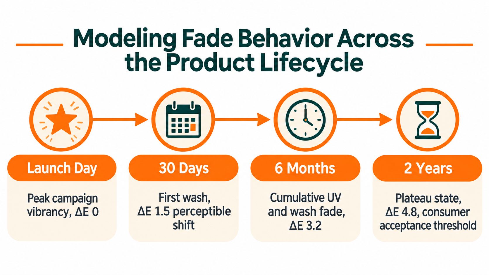
Replace the single hero image with a fade calendar
A useful calendar doesn't promise one universal result. It shows how the red-to-brown balance may evolve under the product's actual care conditions.
- Week 1: Capture the approved appearance under indoor, daylight, studio, and e-commerce lighting.
- Week 4: Show the first meaningful change in warmth, saturation, or reflection after routine use.
- Week 8: Document whether the shade remains balanced, becomes more brown, or reveals unwanted warmth.
- After repeated washing: Record the plateau state and the care instruction needed to maintain the intended direction.
The calendar should connect each image to the SKU, material or hair starting base, care instructions, and market. That gives customer service and content teams a consistent answer when the campaign image looks more vibrant than the lived result.
Consumer promise: Sell the maintenance reality, not only the appointment-day fantasy.
For color-treated hair, a gloss can refresh tone and shine without lightening, while a toner is generally used to cancel an unwanted undertone, particularly after lightening. The hair gloss guidance from Madison Reed provides useful context for distinguishing refreshment from a major color change. Brand teams should translate that distinction into care content that matches the specific shade family rather than applying one generic instruction to every red-brown result.
The same lifecycle discipline applies to apparel. Light exposure, washing, rubbing, and transfer can alter the surface, so the approved campaign image should sit beside a realistic care and wear expectation. A product visualization workflow can help teams coordinate those references across channels, including product visualization software.
Integrating the Palette into Fashion Workflows
A palette becomes commercially useful when designers, merchandisers, marketers, suppliers, and regional teams can act on the same definition. The workflow should begin with a seasonal color story, then connect that story to assortment architecture, SKU attributes, physical approvals, and channel-specific imagery.
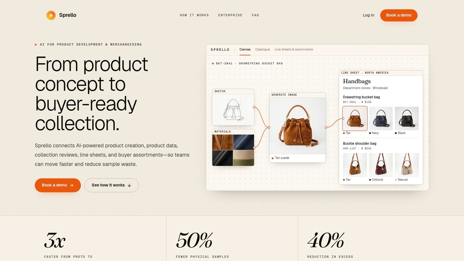
Establish the guardrails before exploration
Start with a palette record that separates creative language from production language. The creative record can include names, references, styling direction, materials, and seasonal narrative. The production record should contain the measurable target, approved swatch, substrate, tolerance, lighting conditions, fastness status, and image references.
Then build the assortment around roles:
- Anchor items use dark brown as the lower-contrast foundation.
- Attention items place red where the customer's eye should land.
- Bridge items combine both hues through texture, print, trim, or accessories.
- Regional variations adjust styling and imagery without changing the approved color definition.
The visual canvas should let teams compare those roles at line level and SKU level. That makes it easier to spot an assortment where every item competes for attention, or one where the red element has become too weak to support the campaign story.
Creative production also needs a named handoff. The brief should identify the intended surface, silhouette, lighting, crop, background, and red intensity. If the team needs external help for campaign layouts or visual systems, graphic design services can support execution, but the brand's color guardrails still need to remain the source of truth.
A workflow overview can clarify how the stages connect:
Make consistency auditable
Catalog-scale production needs more than a folder of approved images. Each asset should be traceable to the SKU, market, channel, and approved color record. That structure allows marketing to create e-commerce and editorial variants without altering the shade, while merchandising can compare colorways and accessory stories in one place.
The strongest workflow is flexible during concepting and strict at handoff. Teams can explore silhouettes, materials, and styling freely at the beginning, then lock the measurable color, testing status, naming convention, and reference imagery before production begins.
Turning Color Discipline into Measurable Outcomes
The commercial value of dark brown with red doesn't come from its historical appeal alone. It comes from the team's ability to preserve the intended relationship between depth, warmth, red emphasis, material, lighting, and lifecycle appearance.
That relationship starts with a clear creative premise. Earth pigments explain why the palette feels familiar and tactile. CIELAB specification turns that feeling into a production target. Undertone selection connects the target to the starting base and audience. Fastness testing checks whether the material can support the promise. Lifecycle modeling shows whether customers will recognize the product after use.
What disciplined teams control
A reliable operation controls four points:
- The definition. Everyone uses the same measurable target, not a loose interpretation of a shade name.
- The evidence. Physical swatches, lighting conditions, test results, and approved images travel with the SKU.
- The variation. Regional and channel adaptations change presentation without changing the product's color intent.
- The expectation. Campaigns and care guidance show the shade's likely behavior, not only its most flattering moment.
This approach reduces avoidable revision loops because teams identify ambiguity before suppliers, retouchers, and regional marketers build on it. It also gives creative directors a better basis for judging whether a shade is drifting, rather than relying on memory or a screen viewed under uncontrolled conditions.
Color discipline strengthens recognition across a collection because the red element can remain intentional even when the material changes. A wool coat, coated accessory, printed jersey, and digital product image don't need to look identical. They do need to belong to the same defined color system.
The practical next step is to choose one upcoming red-brown colorway and audit it end to end. Compare the name, coordinates, swatch, material test, campaign render, channel crops, care guidance, and regional adaptations. Where the chain breaks, add the missing approval field before the next seasonal handoff.
Sprello helps fashion, beauty, and lifestyle teams turn palettes such as dark brown with red into production-ready workflows across SKUs, channels, regions, and seasons. Use Sprello to connect assortment visualization, campaign production, brand guardrails, and seasonal dossiers in one visual workflow.
Related
More to explore
Fresh reads
8 60s Flower Power Looks to Adapt for Modern Collections
Explore 8 60s Flower Power looks: psychedelic palettes, florals, tie-dye, lettering, and vintage styling, with ways to adapt each for modern collections.
Pink Blush Color Guide for Fashion and Beauty Brands
Master the pink blush color for fashion and beauty. Explore hex codes, CIELAB values, inclusive skin tone mapping, and scalable merchandising workflows.

Crimson and Cream Colors: The Complete Styling Guide
Master crimson and cream colors for fashion and beauty. Learn exact hex codes, contrast ratios, merchandising use-cases, and region variations.