October 9, 2026
8 60s Flower Power Looks to Adapt for Modern Collections
Explore 8 60s Flower Power looks: psychedelic palettes, florals, tie-dye, lettering, and vintage styling, with ways to adapt each for modern collections.
A stylist walks onto a modern lookbook set carrying one saturated scarf. It's draped over a cream suit, pinned beneath a clean collar, and suddenly the image speaks in the visual language of 60s flower power. No vintage silhouette is required. The color, the oversized bloom, and the handmade-looking lettering do the work.
That's why this aesthetic keeps returning to fashion, accessories, home goods, and editorial campaigns. Its codes are specific enough to recognize instantly, yet modular enough to rebuild for a current collection. The original movement turned flowers, bright clothing, long hair, peace symbols, and handmade visual art into a broader challenge to authority and materialism, as documented in Britannica's history of the 1967 Summer of Love.
The strongest modern interpretation doesn't copy a vintage garment. It selects a palette, defines a pattern logic, controls the production trade-offs, and assigns each visual element a job. These eight looks show how to do that.
1. Psychedelic Color Palettes and Chromatic Saturation
The first look begins with color before it begins with clothing. A hot pink scarf sits against a lime green blouse. Electric purple appears beside sunny yellow. A flash of orange cuts through deep teal. The combination feels joyful because it ignores quiet, conventional harmony and treats contrast as the main event.
This chromatic intensity is one of the clearest signals of flower power. Psychedelic fashion used saturated color, optical distortion, high-contrast geometry, and densely layered patterning, then carried those features from textiles and posters into boutiques and mass-market apparel. By 1968, merchants were reportedly using “psychedelic” as a sales trigger, and the style had reached independent designers as well as mainstream fashion sectors, according to this overview of psychedelic fashion.
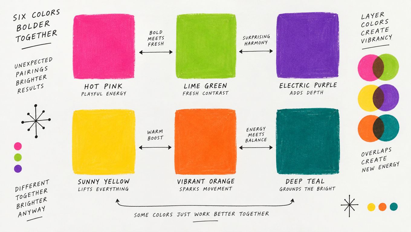
Build the palette as a system
A modern team shouldn't select intense colors one SKU at a time. Establish a master palette in Sprello's AI Product Concepting workflow, then define which pairings belong to hero products, accessories, packaging, and campaign backgrounds. A coral and green color pairing guide can help your team assess whether a lively combination supports the intended mood without letting every color compete at once.
Use catalog-scale visualization to compare colorways across dresses, scarves, bags, or home goods before production. Brand guardrails should specify acceptable saturation levels and regional variations. In photography, place the loudest products against white, cream, or black so the image has somewhere to rest.
Practical rule: Let one color combination create the visual shock. Use neutrals to frame it, not additional bright accents that dilute the focal point.
The trade-off is clear. Saturation creates immediate recognition, but uncontrolled saturation creates visual fatigue. Document the emotional rationale behind each palette in workflow templates so merchandising, design, and marketing teams understand why a pairing exists and when to use it.
2. Floral and Botanical Print Patterns
A floral dress enters the frame covered in blooms, not scattered with them. The flowers are oversized, tightly arranged, and slightly stylized, so the garment reads as one moving image rather than a neutral base with decoration. A scarf uses the same motif at a smaller scale, giving the collection a visual echo without repeating the exact product.
Flower power's botanical language can move from realistic illustration to almost abstract shapes. The useful design decision isn't whether a flower looks historically accurate. It's whether the motif has a clear scale, repeat, line quality, and color relationship to the rest of the range.
For a more tactile direction, study the visual logic of India block print fabric techniques. That reference point can inspire irregular registration, hand-drawn edges, and layered botanical forms without forcing a direct vintage reproduction.
Control scale before production
Create print templates in Sprello's Product Concepting workflow with defined repeat standards. Then use Assortment Visualization to see how the same floral behaves on a dress, a neck scarf, bedding, or a small pouch. A bloom that feels generous on a dress may become muddy on a narrow strap.
A soft pink direction can remain vivid when its surrounding colors provide enough contrast. This pink and blush color guide is useful when a team wants botanical warmth without defaulting to a fully saturated psychedelic palette.
Test three placements before approving the SKU:
- All-over repeat: Best for a confident hero garment, but it demands careful color control.
- Border placement: Useful for hems, cuffs, scarves, and home textiles where the edge can tell the story.
- Centered motif: Strong for tees, bags, or packaging, though it can feel too static if every product uses it.
The strongest floral assortment pairs one dominant print with quieter solids. Without that contrast, the collection loses hierarchy. With it, the flower becomes a recognizable asset that can travel across product and campaign formats.
3. Peace Symbols and Countercultural Iconography
A white tee carries a hand-drawn flower around a peace symbol. The lettering bends slightly, as if a person made it with a marker rather than a corporate design program. On a nearby tote, the same idea becomes smaller and cleaner, allowing the message to remain visible without turning every product into protest merchandise.
The peace symbol and related love-themed graphics gave clothing a social role. Flowers, handwritten words, antiwar imagery, and protest graphics made apparel and accessories vehicles for expression, not just decoration. The design challenge today is to preserve that expressive quality without borrowing political language your brand hasn't earned.
The movement also carried contradictions that modern campaigns shouldn't flatten. Popular accounts often celebrate its antiwar identity while overlooking the way predominantly white American counterculture repackaged Asian symbols and ignored many people affected by the Vietnam War. This critical analysis of Flower Power offers a useful reminder that floral symbolism has religious and cultural histories across Vietnam and East, South, and Southeast Asia.
Separate message from ornament
Start by documenting approved brand values and campaign language in Sprello workflow templates. Then create two product branches:
- Message-led graphics: Larger symbols, visible statements, and editorial storytelling for customers who want political or social expression.
- Minimal graphics: Small peace marks, flowers, or hand-drawn details for a broader commercial range.
AI Product Concepting can test graphic scale and placement across tees, sweatshirts, scarves, and home goods before the team commits to samples. Brand guardrails should also define typography, illustration style, and which cultural references require additional context.
A peace symbol works when the product, campaign, and brand behavior support the message. It doesn't work as a hollow retro sticker placed on a collection with no related point of view. Treat iconography as a narrative commitment, not a shortcut to nostalgia.
4. Tie-Dye and Hand-Dyed Textile Techniques
A tie-dyed tee is laid flat on a neutral studio surface. The spiral isn't perfectly centered. One section is darker than another, and that irregularity becomes the product's proof of process. The piece feels personal because the pattern resists total control.
Tie-dye expresses the DIY and anti-mass-production spirit associated with flower power. Folding, binding, and resist dyeing produce variation, while printed imitations offer greater consistency and easier scaling. Neither route is automatically better. They tell different product stories.
A small-batch maker may use variation as the central value proposition. A larger brand may need repeatable color placement, reliable delivery, and consistent photography. The wrong choice is to promise handmade uniqueness while producing a tightly controlled industrial print, or to use natural variation without preparing customers for what they'll receive.
Make variation legible
Use Sprello's Assortment Visualization to plan quantities with natural variation in mind. Product descriptions and image sets should explain that no two pieces will appear identical when that's true. Photograph several representative outcomes rather than showing one idealized sample.
Create separate workflows for hand-dyed colorways and printed alternatives. Their lead times, approvals, cost structures, and quality checks aren't interchangeable. Product dossiers should record dyeing methods and material decisions so a premium sustainability narrative rests on documented process rather than vague language.
The Seattle boutique velvet accessory demonstrates how a tie-dye treatment can become a focused accessory statement rather than an entire head-to-toe uniform.
Keep tie-dye concentrated in selected drops, statement pieces, or limited editions. Used everywhere, it loses its handmade charge and makes the assortment harder to coordinate. Consistent neutral photography will keep the organic pattern visible without turning every image into a second visual event.
5. Bold Typography and Hand-Lettered Fonts
The garment says “Love” in rounded, inflated letters. A small flower replaces the center of one character. Beneath it, a plain sans-serif line gives the product information room to breathe. The contrast makes the piece feel expressive without making it difficult to read.
Flower power typography rejected corporate cleanliness in favor of irregular curves, heavy blocks, organic forms, and decorative letterforms. The lettering itself could signal rebellion, individuality, and creative freedom before the viewer processed the words.
The production problem appears when every word uses the loudest possible font. At a distance, the design may look energetic. On a product page, a crowded graphic becomes difficult to scan, and small lettering can disappear in photography or embroidery.
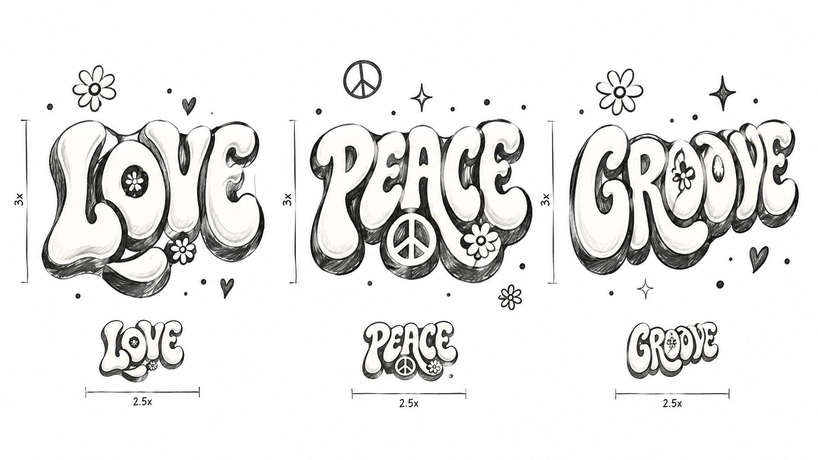
Give each typeface a job
Build a curated font library in Sprello brand guardrails. Assign expressive hand lettering to headers, product names, campaign titles, or hero graphics. Use a clean sans-serif for body copy, care information, technical details, and smaller packaging text. A brand consistency software workflow can help teams keep those assignments stable across regions and channels.
Test every typographic treatment in three environments:
- Product surface: Check embroidery, screen print, woven labels, and small-scale placement.
- Photography: Confirm that the letterforms remain legible under folds, shadows, and styling layers.
- Digital commerce: Review mobile thumbnails, product titles, campaign tiles, and accessibility requirements.
A hand-lettered headline can create emotional warmth. It shouldn't carry the entire information architecture. The most effective modern versions use expressive type as a focal point, then let disciplined typography make the collection usable.
6. Mod and Op-Art Geometric Patterns
A structured handbag uses concentric circles in black, cream, and one electric accent. Beside it, a floral scarf introduces softer shapes. The two products belong together because both rely on repetition and contrast, yet they don't compete for the same visual role.
Flower power is often remembered through blooms alone, but Mod and Op-Art geometry supplied an important counterweight. Checkerboards, intersecting lines, circles, and high-contrast shapes created movement through precision rather than organic irregularity. Together, geometric and floral forms create a fuller 1960s design vocabulary.
Build precision into the workflow
Keep geometric patterns in a separate library from floral motifs in Sprello's Product Concepting environment. That separation lets teams choose patterns according to category, channel, or campaign role instead of mixing every idea into one undifferentiated archive.
Assortment Visualization is especially useful for testing pattern relationships. Place a geometric bag beside a floral dress, then try the same bag with a solid outfit and a tie-dyed accessory. The pattern can function as a hero, a bridge, or a supporting accent depending on its neighbors.
Manufacturing specifications need more precision here than with deliberately irregular tie-dye. Document registration, repeat dimensions, line thickness, and placement so production teams can identify defects early. Pattern clarity also depends on photography. Solid backgrounds can sharpen an Op-Art surface, while natural settings may soften it and help a structured accessory feel less severe.
Precision gives the collection energy. It also exposes mistakes, so approve geometry at the scale customers will actually see.
Use checkerboards and optical patterns where control is most visible, including bags, scarves, footwear, and structured knitwear. Avoid placing high-contrast geometry on every garment. One precise accessory can make a quiet outfit feel intentional, while a full assortment of competing optical patterns quickly becomes exhausting.
7. Vintage and Retro Reproduction Styling
An archive-inspired dress arrives with a period-shaped collar, a shorter hem, and a floral placement that feels researched rather than randomly retro. The styling uses a simple shoe and a deliberately restrained backdrop. Nothing says “costume.” The references sit underneath the product.
Vintage reproduction can take two distinct routes. An archive-accurate piece follows an original pattern, silhouette, or construction detail. A contemporary interpretation borrows the mood while changing the fit, fabric, proportions, or styling. Customers can appreciate both, but they shouldn't have to guess which one they're buying.
That distinction also affects the sustainability story. Vintage sourcing and reproduction may reduce the need for entirely new visual invention, but a retro reference alone doesn't prove responsible production. Teams need clear documentation for materials, pattern sources, construction, and the actual claims used in marketing.
Separate archive from interpretation
Create dedicated Sprello workflow templates for archive research and vintage sourcing. Store reference imagery, pattern notes, fit specifications, and approved adaptations in seasonal production dossiers. Assortment Visualization can then show an archive-accurate silhouette alongside a modern alternative before the line is finalized.
Maintain separate SKU lineups for reproduction and inspired pieces. That division supports clearer customer expectations, better merchandising, and more precise photography direction. Archive-accurate products can use period-aware styling, while inspired products may benefit from contemporary shoes, layering, or accessories that show how the garment fits current wardrobes.
Free People and Anthropologie often provide useful commercial reference points for retro-inspired styling, while archive-focused development requires more disciplined sourcing than a general bohemian mood board. The trade-off is authenticity versus flexibility. Reproduction creates a stronger historical signal but can narrow fit and styling options. Interpretation travels more easily across markets, but it needs enough specific detail to avoid becoming a vague “vintage” label.
8. Mixed Media, Textile Collage, and Accessory-Centric Design
The outfit starts with an accessory, not a dress. A fringed bag hangs beside a floral scarf, a textured headband, and a piece of embroidered jewelry. The base garment stays comparatively quiet so the combination can feel collected, personal, and slightly improvised.
Flower power styling welcomed layered fabrics, mixed prints, fringe, macramé, lace, appliqué, and unconventional combinations. Accessories carried much of the storytelling because they could change the character of a simple outfit without requiring a complete wardrobe overhaul.
The production risk is complexity. Every additional trim, material, seam, or embellishment creates another sourcing and quality-control decision. A mixed-media direction can justify a premium tier or limited edition, but applying it to every SKU creates costly inconsistency and makes replenishment harder.
Assign complexity strategically
Use Sprello Product Concepting to explore material combinations before committing to specifications. Workflow templates should record fabric pairings, trim placement, attachment methods, and care requirements. Assortment Visualization can then show whether a scarf, bag, shoe, and garment create a coherent story or merely accumulate detail.
Develop separate creative streams for apparel and accessories. Accessories can iterate quickly around a stable core garment, helping the merchandising team test different price points and styling narratives without reopening the entire collection.
Use macro photography for texture, close-ups for construction, and styled accessory-plus-apparel images for context. Concentrate mixed media in key pieces, limited editions, and premium tiers. Quiet products need to remain in the range so customers can build their own combinations.
An accessory-led strategy also supports modern interpretation. A simple contemporary trouser can carry a flower-power mood through one embroidered bag or saturated scarf, which makes the reference wearable rather than theatrical.
60s Flower Power: 8-Point Style Comparison
| Design Element | Implementation complexity | Resource requirements | Expected outcomes | Ideal use cases | Key advantages | Key limitations |
|---|---|---|---|---|---|---|
| Psychedelic Color Palettes and Chromatic Saturation | Low–Medium, palette creation and QA processes | Design time, color proofing, production color-matching | High visual impact and social visibility; rapid SKU differentiation | Social-led campaigns, seasonal drops, youth-focused assortments | Distinctive brand presence; flexible colorway variations | Color inconsistency in production; niche or dated risk; can overwhelm photography |
| Floral and Botanical Print Patterns | Medium–High, pattern design, repeats and scaling | High-quality print production, detailed pattern files, photography guidelines | Strong aesthetic recognition; licensing and editorial lift | Dresses, home goods, licensed prints, feminine-focused collections | Immediate recognition; multiple scale/placement SKUs | Print registration issues; difficult product photography; limited neutral versatility |
| Peace Symbols and Countercultural Iconography | Low, graphic creation; legal/brand checks required | Design assets, legal clearance, messaging guidelines | Values-driven engagement; high UGC/shareability and loyalty | Values-led campaigns, statement tees, social advocacy collections | Strong narrative alignment; authentic social messaging | Trademark/copyright risk; can feel dated or costume-like; limited mainstream appeal |
| Tie-Dye and Hand-Dyed Textile Techniques | High, artisanal methods or industrial adaptation with batch variation | Specialized manufacturers, longer lead times, QC for color variance | Authentic artisanal positioning; perceived premium; unique pieces | Small-batch drops, artisanal lines, sustainability-focused offers | Craft narrative; scarcity and premium pricing | Higher costs and lead times; color consistency challenges; supply complexity |
| Bold Typography and Hand-Lettered Fonts | Medium, custom type design and legibility testing | Font design/licensing, cross-channel reproduction testing | Distinct brand voice; adaptable across print and digital | Brand identity, packaging, headers, social graphics | Immediate recognition; versatile across media | Readability at small sizes; licensing expense; risk of amateur look if poorly executed |
| Mod and Op-Art Geometric Patterns | Medium–High, precise pattern registration and alignment | Accurate print production, pattern libraries, testing across SKUs | Visual dynamism; strong graphic presence, pairs well with florals | Structured accessories, footwear, graphic campaigns | High adaptability; strong thumbnail/social impact | Requires production precision; alignment defects visible; may read as dated without updates |
| Vintage and Retro Reproduction Styling | High, archival research, pattern reproduction, fit adaptation | Archive access, technical pattern-making, skilled manufacturers | Authentic heritage storytelling; premium positioning | Heritage collections, premium capsules, editorial-driven launches | Credibility and provenance; proven silhouettes reduce guesswork | Resource-intensive; fit vs. modern sizing issues; limited trend agility |
| Mixed Media, Textile Collage, and Accessory-Centric Design | Very High, complex construction and multi-supplier coordination | Multiple material suppliers, skilled labor, detailed specs and QC | High perceived craftsmanship; strong editorial and social content | Statement pieces, limited editions, artisan-led collections | Rich texture/storytelling; premium margins on accessories | High cost and production complexity; supply fragmentation; limited scalability |
Turning Flower Power Into a Repeatable Collection System
The eight looks work best as a connected design system, not as eight unrelated retro ideas. Start with a master palette that defines the collection's strongest saturated colors, its neutrals, and the combinations that should appear together. Then assign those colors to product roles. A hero dress can carry the loudest floral repeat, while a bag or scarf introduces the sharper geometric contrast.
Choose one dominant print and one supporting graphic. The dominant print might be an oversized botanical repeat. The supporting graphic could be a small peace symbol, a hand-lettered phrase, or a clean Op-Art motif. If every product carries flowers, lettering, geometry, fringe, and tie-dye at once, the collection loses hierarchy and customers can't tell which idea matters.
Next, decide where the handmade or historical story belongs. Tie-dye can lead a focused drop. Vintage reproduction can anchor a limited archive line. Mixed media can distinguish premium accessories. The remaining products should provide simpler silhouettes and solids that make those statements easier to wear.
A practical assortment framework looks like this:
- Color owns the collection: Use saturated pairings consistently across apparel, accessories, packaging, and campaign backgrounds.
- Print owns the hero product: Give one botanical or geometric treatment enough space to become recognizable.
- Graphics carry the point of view: Use peace symbols and hand lettering where the brand has a clear message to support them.
- Texture signals craftsmanship: Reserve tie-dye, fringe, lace, macramé, and appliqué for products that can absorb their production complexity.
- Styling translates the reference: Combine current silhouettes with one unmistakable 60s flower power cue instead of recreating a full costume.
Catalog imagery needs the same discipline as the products. On-model catalog image tools can help teams create consistent views across colorways and styling combinations, but the inputs still need clear brand guardrails. Set rules for backgrounds, crop, pose, accessory visibility, and pattern scale so a saturated print looks consistent across channels.
The cultural context deserves equal care. Flower Power became globally recognizable through peace, communal living, youth resistance, and anti-materialist imagery, yet its concentrated San Francisco experiment also revealed problems with overcrowding, homelessness, drug-related issues, and crime. The movement's aesthetic influence was substantial, but its political and cultural limitations matter. A responsible brand shouldn't present the era as an uncomplicated model of inclusion, sustainability, or liberation.
Current revival stories also need differentiation. A recent trend report cited by Historical Index's overview of Flower Power says searches for “flower outfit men” rose 105% and animal-inspired outfits rose 90% in Pinterest's 2026 trend reporting. Those figures describe a projected or reported 2026 trend context, not proof that the original movement's politics have returned. Use them, if relevant to your planning, as signals of interest in softer and more gender-expansive nostalgia, then decide which specific element your collection is reviving.
Audit your current lineup before the next seasonal drop. Find one product that can carry the palette, one accessory that can carry the print or symbol, and one editorial treatment that explains the story without overclaiming. Build those three pieces in a controlled test, review the imagery at catalog scale, and measure the response through your own merchandising signals before expanding the system.
Sprello helps fashion, beauty, and lifestyle teams turn these flower power ideas into production-ready workflows, from AI-assisted palette and product concepting to assortment visualization, campaign production, catalog-scale imagery, and brand guardrails. Build a repeatable seasonal system for color, print, accessories, and regional assets with Sprello, then use the next collection drop to test one focused interpretation rather than copying the entire era.
Related
More to explore
Fresh reads
Pink Blush Color Guide for Fashion and Beauty Brands
Master the pink blush color for fashion and beauty. Explore hex codes, CIELAB values, inclusive skin tone mapping, and scalable merchandising workflows.
Crimson and Cream Colors: The Complete Styling Guide
Master crimson and cream colors for fashion and beauty. Learn exact hex codes, contrast ratios, merchandising use-cases, and region variations.
Virtual Try on Technology: A Practical Guide for Brands
Learn how virtual try on technology works, why it matters for fashion and beauty brands, and how to plan, measure, and scale it across your catalog.