September 23, 2026
How to Create Storyboards for Campaigns That Scale
Learn how to create storyboards that move from concept to campaign-ready, with tips on framing, sequencing, templates, and clean handoffs to production teams.
Three days before a holiday campaign shoot, the creative director opens the approved storyboard and spots the problem immediately. Merchandising has added a new SKU, media needs a regional cutdown, and social now wants a carousel in a different ratio. None of those requirements appears in the frames. The board looks polished, but it can't answer what the team needs to shoot, where each product belongs, or which assets can be reused across channels.
That situation isn't unusual. A storyboard often fails long before the photographer arrives because teams treat it as a visual presentation instead of a shared decision-making interface. The strongest boards make disagreements visible while there's still time to resolve them. They connect the campaign idea to products, formats, markets, production notes, and approvals.
Why Most Campaign Storyboards Fail Before the Shoot
The creative director now has three bad options. The team can redraw the board under pressure, ask the crew to improvise, or accept that the new SKU and regional deliverables won't receive the same level of thought as the original concept. Each option transfers a planning problem into production, where changes cost more and involve more people.
Modern storyboarding became a standard preproduction practice quickly. Walt Disney Productions developed the form widely used today in the early 1930s, and Disney's 1933 short Three Little Pigs is cited as the first complete use of a storyboard in animation. By 1937 or 1938, all American animation studios were using storyboards, a shift that moved creative planning from ad hoc sketches to structured, scene-by-scene preparation (storyboard history and development).
The lesson for campaign teams isn't that every board needs to look like an animation production document. It's that the board must help people make decisions before production begins.
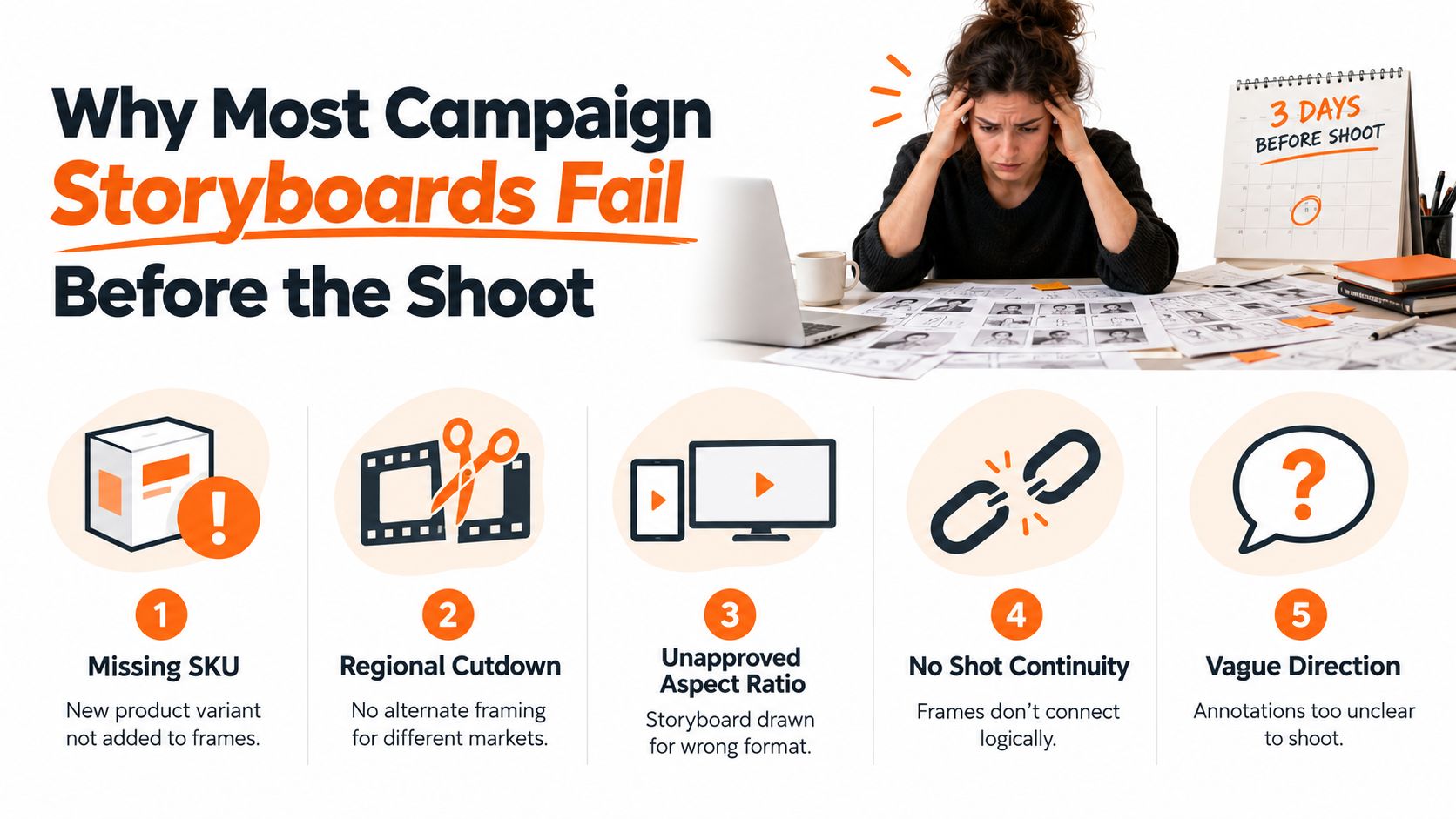
The recurring failure modes
Frames drawn too late leave no room to test the idea against the assortment, channel requirements, or production constraints. If the board appears after the brief, shot list, and media plan have already been approved, it becomes a decorative record of decisions made elsewhere.
Pretty panels that hide no decision create another problem. A beautifully rendered image might show a model in a room, but it may not specify which product is featured, where the headline sits, whether the image needs a vertical crop, or how the next shot connects. The panel earns approval because it looks finished, while the production team still has to interpret it.
Boards disconnected from the channel matrix break as soon as the campaign expands. A single hero film may need stills for product detail pages, vertical social edits, email crops, paid placements, and regional versions. If those outputs aren't mapped against the frames, the team discovers gaps during editing or retouching.
Practical rule: Every frame should settle at least one production or delivery decision. If it only makes the deck look attractive, it isn't doing enough work.
A useful board can stay rough. It can use reference photography, blocks of color, arrows, and short annotations. What matters is that merchandising, design, marketing, photography, editing, and regional stakeholders can read the same intent and identify what remains unresolved.
Building the Brief, Shot List, and Channel Matrix First
Don't open a storyboard template first. Start with a short campaign brief that can survive a handoff without a presenter in the room. Reduce it to one paragraph covering the objective, audience, season, and single idea the work must land.
For example, a seasonal fashion campaign brief might say that the work should introduce a transitional collection to existing customers, position a specific styling idea as the visual hook, and provide enough product clarity for e-commerce use. That sentence gives the team a filter. If a proposed frame doesn't support the audience, idea, or commercial purpose, it needs a clear reason to stay.
A concise brief also gives merchandising and creative a shared reference point. Guidance on aligning teams around a brief, including the practical agency brief tips for NYC, is useful when several stakeholders need to agree on the idea before visual development begins. For a working template, the sample design brief can help organize the information before it becomes a shot plan.
Build the shot list before the frames
The shot list turns the brief into an inventory. Record:
- SKU coverage: List every product variant that must appear, including colorways, hero items, accessories, and any late additions.
- Shot purpose: Label each image as hero, product detail, styling support, transition, or filler.
- Talent beats: Note entrances, gestures, garment interactions, product handling, and any dialogue or on-screen action.
- Delivery needs: Add requirements for paid social, email, product detail pages, organic social, lookbooks, and regional adaptations.
- Crop opportunities: Mark which shots need room for text, alternate framing, or multiple aspect ratios.
This prevents a common mistake, where the team creates a compelling sequence and only later asks whether it contains enough usable product imagery. The shot list should also flag dependencies. A tabletop composition may require a particular surface and lighting setup, while a moving talent beat may need a contiguous block on the shoot schedule.
Use the matrix as the control layer
The channel matrix crosses the asset type with its primary channel, aspect ratio, and required cutdowns. It doesn't need special software. A simple grid exposes duplication, missing outputs, and incompatible compositions before the team draws anything.
| Asset Type | Primary Channel | Aspect Ratio | Cutdowns Needed |
|---|---|---|---|
| Hero video | Campaign landing page | 16:9 | Vertical social edit, regional versions |
| Product detail still | PDP | 3:4 | Cropped social support |
| Styling carousel | Organic social | 4:5 | Story frames, regional copy |
| Collection email | 1:1 | Mobile crop, localized version |
Treat the matrix as a living planning document. When media changes a format or merchandising adds a product, update the matrix first, then trace the change into the shot list and storyboard. That order keeps the board scalable instead of forcing the team to guess which panels need to be redrawn.
Drafting Frames That Photographers and Editors Can Actually Shoot
A frame earns its place when a photographer, director, stylist, and editor can act on it without scheduling another clarification call. The drawing can be a rough thumbnail. The annotation must carry the production logic.
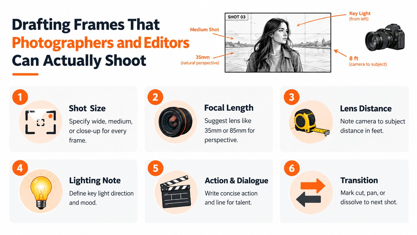
Give each panel a complete instruction set
Start with the shot size. Wide, medium, and close-up labels establish how much of the environment, model, and product should be visible. A mid-shot of a model wearing a jacket often communicates fit and texture more clearly on a PDP than a full-body image, particularly when the page needs the garment to remain legible at a smaller display size.
Add a focal length suggestion and lens distance. A 50mm can hold a natural perspective for a straightforward model portrait or product interaction. A 35mm can earn its place in a flat-lay or environmental composition when the frame needs more context and a little perspective energy. These are starting points, not handcuffs. The note should explain the intended perspective so the photographer can make an informed adjustment.
Lighting notes should identify the key light direction, contrast, and mood. “Soft light from camera left, gentle shadow under the collar” gives the crew something usable. “Make it premium” doesn't.
Mark the commercial information
Product placement deserves the same attention as talent direction. Name the SKU or product family, state which surface or feature must remain visible, and indicate whether the product is hero, supporting, or background.
Copy placement should include a safe area, not just a text box floating over the image. Mark the headline zone, price or offer area, logo lockup, and any region where a crop must not remove the product or model's face. Add alt-text guidance to the panel when accessibility or catalog operations require it. A short note such as “model in cream jacket beside folded trousers, looking toward window” gives downstream teams a usable description instead of making them reverse-engineer the visual.
The panel should also indicate the transition to the next frame. Use a simple note for a cut, pan, match action, or dissolve. Editors need to know whether the sequence depends on movement, a color match, or a repeated product gesture.
A shootable frame answers what we see, what happens, how it gets captured, where the product sits, and how the asset will be used.
Before a frame leaves the board, check:
- Subject: Is the SKU, talent, and action named?
- Camera: Are shot size, perspective, and distance clear?
- Light: Is the direction and mood defined?
- Layout: Are copy, logo, and crop-safe areas marked?
- Delivery: Does the frame map to a channel and format?
- Continuity: Does the transition make sense beside the next panel?
Sequencing Panels for Narrative, Color, and Product Flow
Panel order carries more meaning than many teams realize. People read a storyboard left to right and top to bottom, so sequence becomes the default interpretation of the campaign, even when nobody explicitly explains it.
Build the sequence across three rails. The first is the narrative rail: establish the world, introduce the tension or styling idea, reveal the hero product, then deliver the payoff. The second is the color rail: use the palette to create rhythm, placing cooler or quieter frames around warm focal pieces when you want the eye to settle on a particular product. The third is the product rail: rotate hero and supporting SKUs so adjacent panels don't repeat the same category, fabric, or color story without a deliberate reason.
For e-commerce work, place a PDP-ready three-quarter product shot early enough that the team can validate color and construction before building the lifestyle sequence around it. If that reference is wrong, every later frame inherits the mistake.
Three sequencing rails
| Rail | Purpose | What to Mark on the Frame |
|---|---|---|
| Narrative | Controls setup, reveal, and payoff | Beat, action, product introduction |
| Color | Directs visual rhythm and emphasis | Palette, contrast, tonal transition |
| Product | Balances assortment visibility | Hero, supporting, filler, SKU |
| Production | Protects continuity and efficiency | Shoot order, lighting block, consecutive frames |
Number frames in shoot order, not just presentation order. If frames need the same lighting rig, wardrobe state, or set dressing, flag them as a consecutive block even if the final edit separates them. That note helps the producer schedule efficiently while preserving the intended story.
Mark each panel as hero, supporting, or filler. The labels tell retouchers where to spend attention and help channel leads understand which images can carry a campaign message versus which ones provide pacing or coverage. They also make trade-offs visible. If the board contains too many filler frames and not enough product evidence, the issue appears before the shoot.
A clean sequence gives the photographer, stylist, client, and editor one order to debate. They can challenge the decision while it is still represented by a panel, rather than arguing about an abstract description during a lighting change.
When AI and Pre-Visualization Change the Storyboard Itself
Traditional boards rely on sketches, reference images, swipes, and concise intent notes. That approach is often enough for a simple product sequence, especially when the creative team already shares a visual language. It also leaves room for the photographer's interpretation, which can be valuable when the final image depends on texture, movement, or an unexpected interaction on set.
AI-assisted storyboards change the panel from a rough suggestion into a quick visual comp. A team can describe the frame, generate a reference, and compare variations before briefing the photographer. Pre-visualization goes further by representing sets, lighting, camera positions, and movement in a space the team can inspect and adjust.
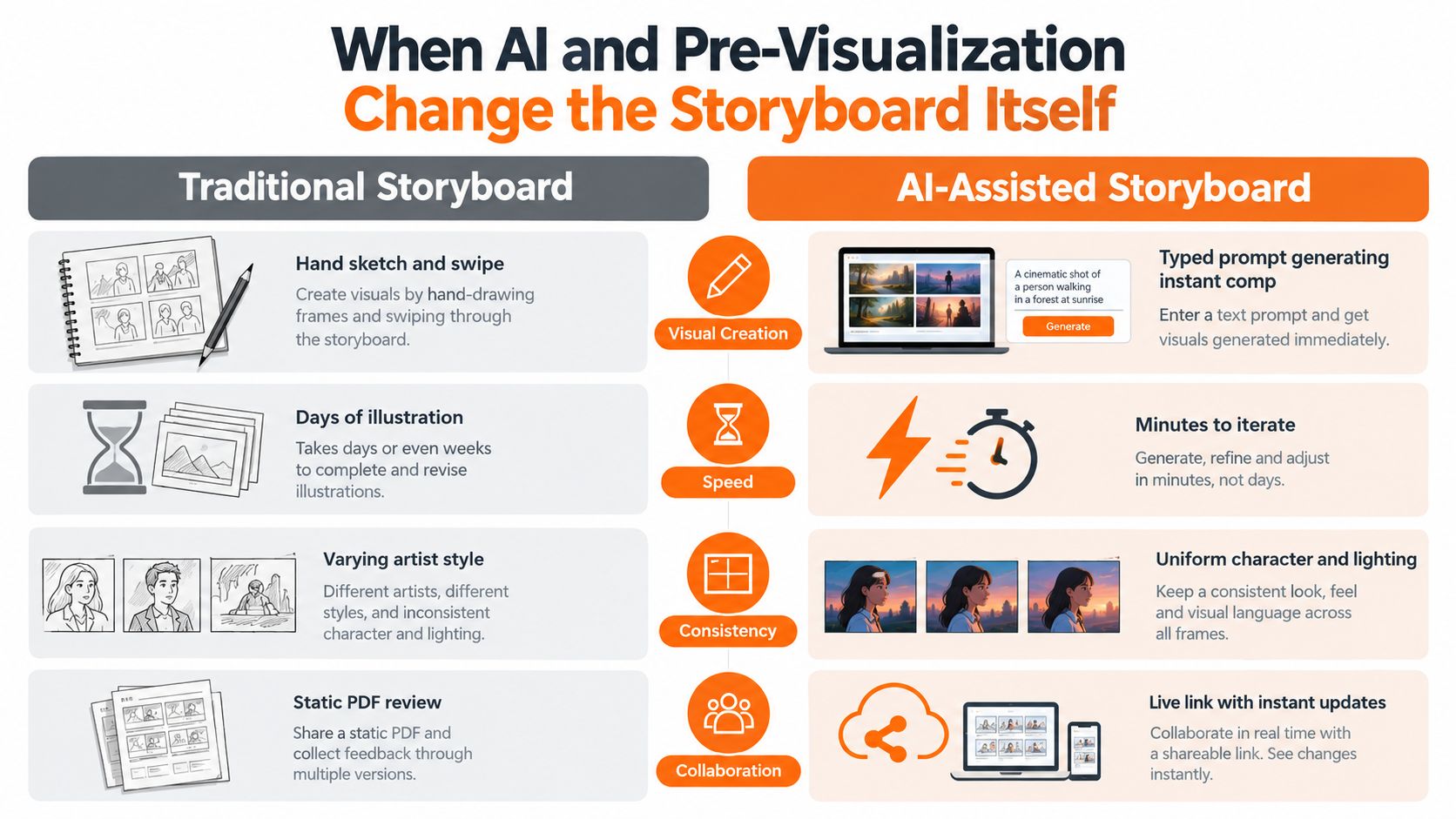
Match the method to the decision
AI comps are useful when the decision is primarily visual and fast. A merchandising buyer may need to see how a concept works across several SKU variations before approving the direction. A creative team might use generated comps to test wardrobe, background, composition, or a set of regional adaptations without commissioning finished photography.
Pre-vis is more appropriate when physical execution carries the risk. A moving camera, complex lighting transition, tabletop arrangement, or difficult grip setup benefits from a manipulable representation of the scene. The value isn't the polish of the image. It's the ability to inspect what the crew must build.
Industry coverage identifies AI-assisted storyboarding, 3D visualization, interactive storyboards, and real-time collaboration as standard features in 2026, while another report states that revisionist work is already more than 70% automated (industry coverage of storyboard software). Those developments make governance more important, not less. Automated edits can change product identity, wardrobe details, naming, or regional copy without making the revision obvious to every stakeholder.
The generated visual is not the approval record. The prompt, source assets, version, constraints, and sign-off are part of the storyboard too.
For teams exploring AI-driven music and video workflows, an AIMVG music video guide offers useful context on building sequences with generated media. Fashion and e-commerce teams should add their own controls: approved product references, locked character and lighting descriptions, SKU labels, aspect-ratio variants, and a clear distinction between exploratory and production-ready frames. A guide to AI fashion photography can also help teams think through consistency requirements before generated visuals enter an approval cycle.
Handing Off to Production Without Losing the Vision
The handoff package should survive the meeting where everyone agrees the work is ready. A single deck or PDF is easier to use than a collection of links scattered across a brief, chat thread, and spreadsheet, provided the document stays connected to the live source.
For a seasonal campaign, the production package might begin with a one-page brief that restates the campaign promise in plain language. The next pages show numbered frames in shoot order. Each frame carries the callouts a crew member needs: lens, focal length, framing, model pose, wardrobe, set notes, product placement, lighting, transition, and copy-safe zones.
Assemble the production package
Include an asset specification sheet with the required delivery ratios, such as 1:1, 4:5, and 9:16, along with the color profile and naming convention. These requirements belong beside the storyboard because they affect composition. A vertical crop can remove the very product feature the frame was meant to sell.
Add the approval trail. Record the version, date, approver, and scope of the approval. If merchandising has approved the SKU list but regional marketing hasn't approved the copy, the board should make that distinction visible. Otherwise, an editor may treat an exploratory line as final.
A short preproduction walkthrough with the lead photographer and director of photography helps surface contradictions before load-in. The call should focus on decisions that affect the day: which frames share a lighting setup, which products require special handling, where the camera must hold for copy, and which shots can be adapted into alternate crops.
Make the board usable on set
A printed contact sheet pinned near the monitor cart gives the art director a fast reference. Pointing to frame 14 is clearer than describing the same composition repeatedly while the crew waits. The digital board remains the source for updates, but the printed sequence provides immediate orientation when people are moving between camera, styling, and production areas.
In one production workflow, the photographer may capture a strong lifestyle image that wasn't part of the original sequence. The team can keep it, but the producer should record its frame relationship, SKU, intended channel, and approval status rather than letting it disappear into an untracked folder. The same discipline applies to skipped frames. Mark them as skipped, explain why, and identify whether another frame covers the requirement.
A structured creative production workflow can help teams connect planning, production, and delivery without treating the storyboard as a disposable presentation. The cheapest insurance on a campaign day is a handoff that tells every contributor what has been decided and where they still have discretion.
Habits That Keep Your Storyboard Useful From Brief to Delivery
A storyboard stays valuable when the team treats it as a living operational record. The board should change when the brief changes, preserve the reasoning behind those changes, and remain readable after production ends.
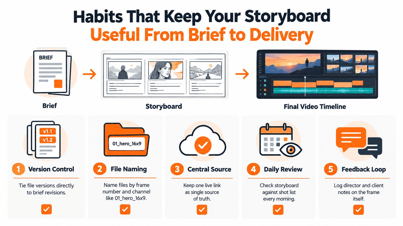
Versioning is the first habit. Tie the board version to the brief revision, not to an arbitrary filename. When the hero SKU changes or a market adds a cutdown, the new version should make that relationship clear. Lock approved frames visually, label exploratory frames, and route regional changes through one accountable approver per market.
A practical maintenance checklist
- One frame per concept: Don't combine several possible compositions in one ambiguous panel.
- SKU and copy visible: Put the product identifier and copy treatment directly on the frame.
- Camera intent recorded: Keep the focal length, shot size, and perspective close to the visual.
- Color reference attached: Add the palette, material reference, or approved product image that controls appearance.
- Approvals traceable: Leave sign-off lines for merchandising, design, channel, and regional leads.
File names should carry useful information. A format such as 01_hero_16x9 tells the team the frame order, role, and delivery shape without opening a file. Keep one live link as the source of truth, then export a PDF for production when a stable snapshot is required.
The most common maintenance failures are predictable. Over-detailed sketches can restrict a photographer without improving the decision. Vague copy callouts get retyped on set, often with a different line break or offer. Asset specifications buried in chat become invisible to the editor who needs them later.
Review the board against the shot list at the start of each production day. After delivery, update the frames with what worked, what was skipped, and which crop or lighting note should become a reusable template. That post-production record turns the next seasonal campaign into an informed iteration instead of another blank page.
Sprello gives fashion, beauty, and lifestyle teams a visual canvas for mapping scenes, arranging asset previews, and connecting briefs to production-ready workflows across SKUs, channels, regions, and seasons. Use Sprello to turn your next storyboard into a shared planning and handoff workspace, then visit the platform to see how it fits your campaign process.
Related
More to explore
Fresh reads
Audit Process Steps That Keep Creative Work on Brand
Learn audit process steps for fashion and beauty teams to audit creative workflows, catch errors early, and keep campaigns on brand at scale.

Product and Concept Guide for Fashion Development
Learn how product and concept workflows turn sketches and materials into production-ready apparel briefs with scalable, brand-consistent processes.

Dark Charcoal Grey Styling and Palette Guide for Brands
Discover dark charcoal grey codes, pairings, and styling tips for fashion and lifestyle. Learn when to use it over black with brand-ready palette guidance.