September 29, 2026
8 Colors That Go Well with Forest Green
Explore 8 colors that go well with forest green, with hex swatches, styling ideas, and campaign tips for fashion, beauty, and lifestyle brands.
A team has forest green products ready for a lookbook, beauty launch, or lifestyle collection, but the supporting palette still feels unresolved. Cream makes the range look refined, gold pushes it toward occasionwear, and blush changes the conversation completely. The right choice depends on the mood you want, the contrast your products need, the materials in the frame, the sales channel, and how consistently the palette must scale across many SKUs.
This guide focuses on colors that go well with forest green as working campaign systems, not isolated swatches. Each pairing includes approximate hex references, a practical dominant-to-accent balance, direction for styling and product photography, and a clear warning about where the combination can fail. If your project involves a home collection, forest green can also translate beautifully into a tactile setting, such as a range of green porcelain tiles.
1. Forest Green and Cream or Off-White
Forest green with cream is the safest route to quiet premium. The deep green provides authority and focus, while a warm off-white creates visual rest without the starkness of pure white. Adobe Express traces the first recorded use of the name “forest green” to 1810 and notes its association with environmentalism from the 1960s, a history that helps explain why the color feels both institutional and nature-led today. Adobe Express's forest green color guide connects that heritage to restrained pairings such as cream, white, and brown.
Useful starting swatches are forest green #228B22, cream #FFFDD0, and a darker evergreen such as #174A35. Let cream occupy roughly the visual role of the background or surrounding field, while forest green carries the product, typography, borders, or primary buttons. The exact ratio should follow the product. A green garment can sit against cream; a cream handbag can use green for packaging, labeling, and editorial framing.
Where the palette earns its place
In product photography, use a cream sweep or plaster-toned setting so knit texture, leather grain, or ceramic edges remain visible. For an e-commerce assortment, cream works especially well behind SKU cards because it separates adjacent green colorways without making the grid look cold. In a lookbook, use forest green for chapter headings and small graphic elements, then place cream overlays behind type when photography contains dark foliage or shadow.
The pairing suits the visual language associated with Hermès, Everlane, Ralph Lauren, and Restoration Hardware, although each brand uses its own proportions and materials. Linen, brushed cotton, matte paper, uncoated card, and warm stone reinforce the refined side of the palette.
Practical rule: Let cream provide the room around forest green. If both colors compete for equal attention, the composition loses the calm quality that makes this pairing useful.
The main failure is over-clean execution. Bright optic white, glossy surfaces, and hard blue lighting can strip away the warmth and make forest green look synthetic. Keep the white balance consistent across product shots, especially when green appears on fabric, packaging, and digital color chips.
2. Forest Green and Gold or Brass Metallics
Forest green and warm metallics create an impression of craftsmanship, exclusivity, and controlled opulence. Brass and gold bring warmth to a dark green base, but their success depends on restraint. Published guidance on forest green recommends warm metals, including brass, gold, and copper, alongside a light neutral because these accents preserve contrast without making the palette feel muddy. Your Color Theory's forest green pairing guide supports using the green as the anchor, a light neutral for readability, and one accent for premium emphasis.
Start with forest green #228B22, antique gold #C9A227, and brass #B08D57. For most campaigns, forest green should dominate, gold or brass should remain a small accent, and white, ivory, or soft gray should handle breathing space. Metallics work best on a logo, a rim, a closure, a foil line, or a single styling object. They rarely need to cover an entire background.
Match the finish to the category
A matte brass detail can make a home object feel architectural and considered. Shiny gold is more suitable for prestige beauty, evening accessories, or a hero image designed to feel glamorous. On packaging, test the physical finish rather than judging only a screen mockup. A reflective gold foil can photograph as yellow, while brushed brass may read as muted beige under soft light.
The visual territory recalls the luxury cues of Charlotte Tilbury, Estée Lauder, Gucci, and Ted Baker, but a smaller brand can achieve the same impression through production discipline rather than excess. Use a dark green box, a single metallic bottle, and a pale background instead of filling every surface with reflective detail.
For home and fashion storytelling, combine green velvet, walnut, satin, brushed metal, or opulent gold fabric textures. Keep the supporting materials quiet so the metallic element has somewhere to land.
Avoid pairing green, gold, and multiple additional jewel tones in baseline catalog photography. That combination can look expensive in a campaign hero, yet chaotic in a product grid. Metallic color also changes with light direction, camera exposure, and print process, so document whether the approved finish is matte gold, antique brass, or polished brass. Without that specification, the same collection can look coordinated online and inconsistent in physical production.
3. Forest Green and Warm Terracotta or Rust
A green wool coat, rust scarf, and pale stone backdrop can make a fashion campaign feel grounded without looking rural. Forest green with terracotta or rust communicates grounded authenticity, drawing on clay, dried grasses, wood, leather, and outdoor settings. It suits home goods, slow fashion, wellness, and lifestyle brands. Neutral palette guidance from The IJDesign color-harmony study places closely related colors within a more coherent harmony than forceful red-green contrasts, making softened terracotta a practical partner for green.
Try forest green #228B22, terracotta #C96F4A, rust #A34F32, and taupe #B8A99A. Keep forest green dominant across the main garment, packaging field, website header, or hero product. Use rust for a scarf, ceramic prop, chair, headline panel, or small color block. Cream or taupe should interrupt the warmer hues, especially in assortment grids and promotional layouts where several products appear together.
Build the story through materials
Materials give this pairing credibility. A forest green knitted sweater beside a terracotta scarf has more depth than two flat swatches. Woven baskets, raw linen, dried grasses, oak, stone, and handmade ceramics reinforce the palette's organic character. In a home assortment, let green anchor the collection while terracotta identifies a secondary product family, variant, or room category.
The direction can support the earthy styling associated with Anthropologie, Patagonia, COS, and Pottery Barn, while clean silhouettes and open space keep it contemporary. A polished terracotta lacquer can feel current. A distressed backdrop, rough props, and heavy texture can push the same colors toward a craft-market mood.
Use the palette differently by channel. In product photography, keep the background pale and assign rust to one prop or product detail. In assortment visualization, repeat terracotta selectively so it organizes the range without competing with green. For campaign production, record approved material finishes and lighting conditions, because clay, leather, fabric, and paint can shift in photographs.
The pairing fails when both colors cover large surfaces at high saturation. Lower one color's intensity, add a pale neutral, and use soft directional light rather than orange-tinted illumination. That preserves separation and keeps the result from becoming muddy, overly autumnal, or themed.
4. Forest Green and Deep Navy or Charcoal
Forest green with deep navy or charcoal creates gravitas, precision, and professional polish. Unlike a warm earthy palette, this combination relies on neighboring dark values and cool undertones. It suits refined fashion, eyewear, premium technology-adjacent lifestyle products, and digital interfaces that need a strong visual hierarchy.
Useful references include forest green #228B22, navy #172A46, charcoal #333333, and warm white #F5F1E8. Choose one dark color as the main field and use the other for products, type, borders, or secondary panels. If forest green is the product color, charcoal can frame it. If navy is the campaign background, green can become the recognizable merchandising cue across product tiles.
Prevent the dark palette from closing in
Navy and charcoal backgrounds can make products look expensive, but they also absorb detail. Increase separation with warm white type, pale gray cards, or a small brass or copper accent. A green wool coat on charcoal needs edge lighting and enough tonal contrast to separate the silhouette. A green skincare bottle on navy may need a pale plinth or light label to remain legible.
The direction fits the heritage and restraint associated with J.Crew, Burberry, Oliver Peoples, and Theory. It also translates well to web design. Charcoal navigation, forest green category markers, and warm white content areas can create a clear system without relying on bright color.
For teams refining the dark side of a palette, this guide to dark charcoal grey is useful for distinguishing charcoal from near-black and understanding how that difference affects perceived weight. The distinction matters in production because a near-black background can make green appear brighter and more saturated than the same product photographed against softer charcoal.
“Dark-on-dark palettes need a light pause.”
Use that pause in every channel. Place a cream product card between dark campaign panels, add white space around a green logo, or introduce a pale garment into a fashion lineup. The pairing fails when every surface is deep and matte, especially in mobile layouts where small details disappear. Alternate dominance across assets, but keep the approved values and contrast rules fixed.
5. Forest Green and Soft Blush or Mauve Pink
Forest green and blush or mauve create modern warmth without relying on traditional femininity. The green supplies depth and stability; pink adds approachability, softness, and a human touch. Mauve makes the combination more editorial and subdued, while pale blush makes it lighter and more accessible.
Try forest green #228B22, blush #E8B7B1, mauve #A97882, and neutral gray #D8D4CE. Keep forest green dominant when the brand needs authority. Use blush for typography, beauty props, knit layers, nail color, flowers, packaging details, or social templates. A blush background with green product photography can work, but it needs enough gray or cream to avoid becoming candy-like.
Use the pairing where emotion matters
Beauty and wellness campaigns can use a green bottle, mauve shadow, and soft blush textile to suggest care without looking clinical. In fashion, a forest green jacket with a dusty rose accessory feels considered and gender-inclusive. In social content, blush can appear in short-lived editorial assets while the core e-commerce system stays more neutral.
The direction can sit near the contemporary visual language associated with Glossier, Aesop, Free People, and Ganni, though the brand's typography, photography, and materials determine whether the result feels minimal, romantic, or fashion-forward. Matte paper, soft knit, glazed ceramic, and diffuse daylight support the palette better than highly glossy surfaces.
Red-leaning complements require control. Strong red beside green can introduce festive associations, while muted blush or mauve keeps the contrast more year-round. Warm white and soft gray are useful buffers, particularly when a campaign includes skin tones or several product colors.
Don't let blush become an equal block beside forest green in every asset. Equal areas can create a visual tug of war, especially when both colors appear on packaging and clothing at once. Assign green to the anchor role, pink to the emotional accent, and gray or cream to the editing layer. Test the result across different models and lighting conditions because blush can shift quickly from dusty to peach or lavender on camera.
6. Forest Green and Warm Sage or Olive Green
Layering forest green with sage or olive creates botanical calm and collection coherence. The analogous palette keeps the assortment related, while differences in tone, value, and saturation establish hierarchy. It suits brands with multiple SKUs that need a connected range without making every product look identical.
Use forest green #228B22 for the logo, primary garment, or hero product. Sage #A8B5A2 works well on backgrounds, cartons, and light styling pieces. Olive #808000 can bridge the values through accessories, labels, foliage, or supporting products. Cream #F3EBDD gives the system breathing room. Let one shade dominate, then assign the others specific supporting roles.
Make a monochromatic range readable
A botanical skincare line might place forest green on hero bottles, sage on cartons, and olive on secondary labels. A fashion assortment can reverse those roles across SKUs while keeping one recurring green as the brand anchor. In product photography, use linen, paper, leaves, stone, and pale wood. Study green marble veining patterns to keep the green-on-green system from becoming a flat color study.
The palette supports the nature-led restraint associated with Aesop, Herbivore Botanicals, Outdoor Voices, and Rapha. Cream, brass, or dark walnut can shift it toward a more premium impression. For a controlled contrast in a campaign asset or social graphic, this coral and green color guide can help frame the accent decision.
Production note: Record exact green values, material finishes, and lighting references before sampling the full assortment.
Color consistency requires coordinated approval. Sage fabric, sage ink, and sage digital color can look unrelated when teams review them separately. Keep a physical or calibrated reference, name each approved colorway clearly, and define where each shade may appear in backgrounds, products, type, and accessories. Test the palette across e-commerce photography, print, packaging, and social placements. The pairing loses structure when every green is equally saturated or dark. Give each shade a job, then protect that hierarchy across channels.
7. Forest Green and Vibrant Jewel Tones
Forest green with emerald, sapphire, or amethyst creates drama, spectacle, and prestige. It isn't the best default for a permanent product grid, but it can make a seasonal story, limited edition, or hero image memorable. The palette works because the deep green gives saturated colors a controlled setting rather than leaving them to compete against white.
Consider forest green #228B22, emerald #50C878, sapphire #0F52BA, amethyst #9966CC, and cream #FFFDD0. Use forest green as the anchor, then choose one jewel tone as the principal accent. A second jewel tone can appear in a smaller accessory, graphic detail, or environmental element. Adding every rich color at equal strength will overwhelm the product.
Reserve intensity for the right moment
A prestige beauty image might place a green compact against sapphire fabric with one amethyst object in the background. A fashion campaign can use forest green tailoring, an emerald shoe, and a cream studio wall. A jewelry assortment may support deeper color because gemstones and reflective metals already belong to the visual language, while a basic e-commerce grid needs more restraint.
The maximalist territory associated with Versace, Fendi, MAC Cosmetics, and Dolce & Gabbana shows how jewel tones can support theatrical storytelling. Smaller brands can borrow the principle without copying the density. Keep baseline product photography clean, then use the richer combination for launch films, editorial spreads, collection banners, and social campaign covers.
The most common failure is saturation without hierarchy. Black, cream, or warm white can restore space, while matte and gloss finishes should be coordinated rather than mixed at random. Review the palette in motion as well as in stills. A rapid sequence of saturated assets can feel visually louder than any single frame, especially across social feeds.
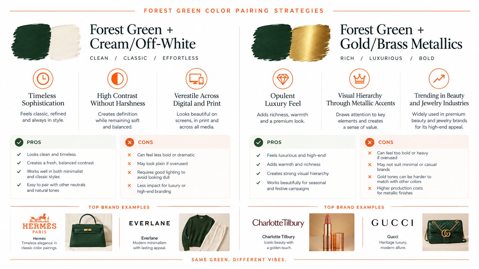
A comparison graphic can help teams align stakeholders before production. Use the forest green color pairing infographic once as a discussion aid, then translate the decision into named swatches, material references, and channel rules.
8. Forest Green and Warm White or Ivory with Natural Textures
Forest green with ivory becomes more distinctive when texture carries as much weight as color. The result communicates craft, tactility, and considered sustainability, making it suitable for home goods, slow fashion, accessories, and lifestyle brands that want a lived-in premium mood rather than a polished showroom.
Use forest green #228B22, ivory #FFFFF0, natural linen #D9CBB5, and warm wood #9A7048 as starting references. Warm white should provide the main visual field, while green frames the composition through garments, cushions, labels, tile, foliage, or graphic panels. Linen, wool, wood, ceramic, stone, and brushed metal should create the secondary layer.
Let the camera capture material evidence
A forest green wool throw on ivory linen tells a stronger story than a flat green square beside a white square. Photograph weave, grain, seams, glaze, and edge detail. Natural light can reveal those differences, but keep exposure and white balance consistent so ivory doesn't drift toward gray in one image and yellow in another.
This pairing fits the restrained lifestyle positioning associated with Snowe Home, Cuyana, Organic Basics, and Schoolhouse Electric. It also works for assortment visualization because each SKU can retain its own material identity while sharing the same green-and-ivory environment. Use lifestyle images to show the products in use, then add close-ups for finish and construction.
A production workflow can include a product image AI generator when teams need to explore consistent settings across a large assortment. The tool should support approved references and brand rules, not replace the decisions about which textures, surfaces, and lighting belong to the collection.
For home collections, place green porcelain, ivory textiles, pale wood, and stone in the same visual family, then vary only one material at a time. For fashion, use green as the framing garment or dominant layer and let ivory accessories soften the silhouette. The pairing fails when every surface is beige and tactile, because the image loses contrast. Keep one crisp edge, dark green detail, or polished object in each frame to maintain definition.
A tactile reference video can also help teams discuss the intended material mood before a shoot.
Forest Green: 8 Color Pairings Comparison
| Title | Implementation complexity | Resource requirements | Expected outcomes | Ideal use cases | Key advantages |
|---|---|---|---|---|---|
| Forest Green + Cream/Off-White | Low–Moderate, simple pairing, requires balance | Minimal, standard photography, neutral props/backgrounds | Clean, elevated, readable aesthetic | Luxury fashion, e‑commerce catalogs, lookbooks | Timeless, accessible; improves readability and reduces visual fatigue |
| Forest Green + Gold/Brass Metallics | Moderate–High, needs restraint and precision | High, metallic finishes, controlled lighting, production QA | Opulent, high perceived value with clear hierarchy | High‑end beauty, packaging, hero campaigns | Signals exclusivity; striking accenting and photogenic detail |
| Forest Green + Warm Terracotta/Rust | Moderate, balance warm tones to avoid muddiness | Moderate, textured props, natural materials, styling | Earthy, warm, authentic brand narratives | Sustainable fashion, home goods, lifestyle editorial | Organic warmth; appeals to eco‑conscious consumers |
| Forest Green + Deep Navy/Charcoal | Low–Moderate, tonal contrast management | Minimal–Moderate, dark backdrops, contrast control in photography | Professional, structured, screen‑optimized presentation | Corporate menswear, digital interfaces, catalog merchandising | Timeless, trustworthy; excellent readability and cohesion |
| Forest Green + Soft Blush/Mauve Pink | Moderate, careful balance to avoid coded messaging | Moderate, trend‑focused styling, social content creatives | Modern, inclusive, social‑friendly aesthetic | Beauty, wellness, DTC lifestyle brands targeting younger demos | Approachable luxury; strong social and demographic appeal |
| Forest Green + Warm Sage/Olive Green | Moderate, precise tone control to prevent muddiness | Moderate, strict color specs, material sampling, coordinated SKUs | Harmonious, botanical, cohesive collection storytelling | Botanical skincare, wellness, nature‑focused lifestyle brands | Cohesive tonal depth; signals sustainability and calm |
| Forest Green + Vibrant Jewel Tones | High, complex color balancing; design expertise required | High, premium styling, color management, advanced production | High‑impact, dramatic, memorable hero imagery | Seasonal campaigns, limited editions, prestige collections | Distinctive, attention‑grabbing; conveys bold luxury |
| Forest Green + Warm White/Ivory with Natural Textures | Moderate–High, texture‑forward execution and styling | High, high‑quality photography, material sourcing, lifestyle shoots | Artisanal, tactile, authenticity‑focused brand stories | Slow fashion, contemporary home goods, craft‑oriented brands | Communicates craftsmanship, materiality, and warm authenticity |
Turn One Pairing Into a Repeatable System
The best forest green palette isn't the longest list of compatible colors. It's a repeatable system that tells every team member what leads, what supports, and what stays controlled. Start by choosing the intended impression. Cream and ivory create quiet premium appeal. Gold and brass add crafted luxury. Terracotta and rust ground the story in natural warmth. Navy and charcoal make it more formal. Blush and mauve soften the message. Sage and olive create botanical continuity. Jewel tones add drama.
Then assign three roles:
- Dominant color: Decide which shade should occupy the largest visual area or carry the main product identity.
- Supporting shade: Use this color for backgrounds, secondary products, typography, packaging panels, or styling layers.
- Controlled accent: Reserve the strongest contrast for a logo detail, accessory, prop, border, button, or campaign moment.
The same pairing can behave differently by channel. A cream background may be ideal for product cards, while a charcoal hero image gives a launch campaign more authority. A blush accent can feel current in social content but too expressive for permanent packaging. Jewel tones may belong in editorial imagery and limited editions, not every baseline SKU. Treat dominance as a channel decision rather than a permanent rule.
Production consistency matters just as much as color selection. Test the palette across product cards, campaign hero imagery, email headers, social crops, packaging mockups, and printed collateral. Check green garments under different lighting, compare metallic finishes physically, and review ivory against the actual photography background. If the brand operates across regions or seasons, test variations without changing the core anchor color or the approved naming system.
Teams managing many products can use Sprello to visualize assortments, explore colorway concepts, coordinate editorial workflows, and apply brand guardrails from concept through campaign. Its workflow canvas is designed for fashion, beauty, and lifestyle teams that need to coordinate SKUs, channels, regions, and seasons rather than approve isolated images. A palette application feature can translate a logo, palette, and references into a cohesive asset kit, while assortment visualization can make forest green variants easier to compare before production.
Choose one pairing today, build a small reference board with the hex values and material samples, and test it against your most important product images. Then document the dominant, supporting, and accent roles before the palette reaches design, merchandising, or paid media.
Sprello helps fashion, beauty, and lifestyle teams explore colorways, visualize assortments, and coordinate production-ready creative workflows across SKUs and channels. Use it to turn a forest green palette into consistent product, editorial, and campaign assets, then visit Sprello to develop the system with your team.
Related
More to explore
Fresh reads
Coral Green Color: Hex, Meaning, and Brand Uses
Learn what coral green color really is, its hex and RGB values, mood and brand associations, palette pairings, and how to use it across fashion campaigns.
Assortment Planning in Fashion: A Strategic Guide
Master assortment planning in fashion with strategies for line architecture, size curves, visual workflows, and KPIs to optimize seasonal SKU allocation.
What Is Merchandise Planning in Retail? a Practical Guide
What Is Merchandise Planning in Retail. Learn what merchandise planning in retail really means, how it drives sales and margin, and the steps teams use