September 28, 2026
Coral Green Color: Hex, Meaning, and Brand Uses
Learn what coral green color really is, its hex and RGB values, mood and brand associations, palette pairings, and how to use it across fashion campaigns.
#53AA81 defines coral green, a blue-leaning green rather than a coral-relative, orange-pink shade. Its digital specification is RGB (83, 170, 129), with green clearly dominant and a moderate, softened saturation.
Why does a color called coral green sound as though it should sit beside coral pink, yet look closer to sea green when you place the swatches side by side? That naming gap creates a practical problem for fashion, beauty, and lifestyle teams. A designer may picture one shade, a supplier may match another, and a regional content team may choose a third from a search result.
The useful answer isn't to debate which image feels most “correct.” It's to establish a working definition, document it, and use that definition consistently across product development, photography, line sheets, and campaign assets. Coral green is best treated as a managed color identity, not as a universally stable trend label.
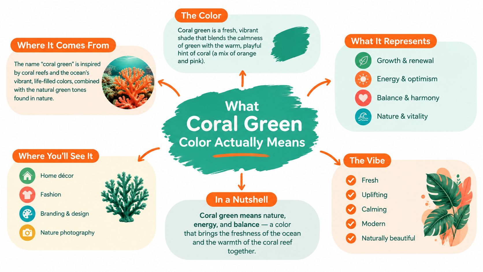
What Coral Green Color Means
How can a color name create different products across the same range? The value a production team can act on is #53AA81. Its importance lies in giving design, retouching, e-commerce, and supplier teams one shared reference, rather than another impression-based label.
Visually, coral green belongs in the blue-green family. Place it beside familiar coral pink and the difference is clear: this shade reads closer to softened sea green or mint than to orange-pink. The name can still suggest warmth and organic character, while the color itself remains green-led. Its moderate saturation keeps it away from jewel-toned emerald, and its blue undertone stops it from becoming yellow olive.
A practical visual test
Present three swatches together when aligning a fashion or merchandising team:
- Mint, usually lighter and airier.
- Coral green, with greater visual weight and a fuller green body.
- Sea green, often shifted further toward blue or teal.
The neighboring shades will change with the palette system, but the three-way comparison gives everyone a common visual reference. A buyer expecting salmon can identify the mismatch before a color name reaches a product page or purchase order.
For merchandisers, this is a governance task. Record the approved digital reference in the color library, connect it to the relevant SKU names, and give regional teams the same naming rule. Local descriptions such as jade, aqua green, or muted teal may still appear in search or customer language, but they should not replace the approved product identity.
Digital agreement does not make every physical sample identical. Fabric texture, dye lot, lighting, coating, and screen calibration alter perception. The reference instead defines an acceptable starting point, helping teams distinguish controlled material variation from accidental fragmentation across SKUs, regions, and seasons.
Where the Name Comes From
The name makes more sense when its two parts are separated. Coral brings an organic, marine reference. Living coral can display green-brown coloration through its relationship with symbiotic algae, while host-produced GFP-like proteins contribute vivid fluorescent effects under suitable light. Research on coral fluorescence explains how these proteins can produce colors ranging from cyan through green and into other visible hues, with green variants commonly emitting above 500 nanometers under the relevant conditions. The Frontiers overview of fluorescent proteins in corals describes that optical behavior in scientific terms.
The reef image is not a single paint chip. A coral colony can appear muted in ordinary daylight and glow more strongly under blue-rich illumination. The Woods Hole Oceanographic Institution explanation of coral coloration notes that algae pigments contribute brown-green tones, while host fluorescent proteins absorb blue light and re-emit it as green. That composite quality helps explain why designers associate coral with softness, depth, and living color rather than with one immutable hue.
The word itself also has a long cultural history. The English color name “coral” was first recorded in 1513, while coral jewelry dates back at least to 3000 BC in Mesopotamia. Coral ornaments appeared in Ancient Egypt and Ancient Rome, where people often treated them as protective talismans, and the material remained popular through the Renaissance and Victorian eras. Adobe's history of coral as a color and cultural reference connects those older associations with modern color naming.
Why the hybrid sounds plausible
Green contributes the stability of a familiar color family. Coral contributes the reef, organic, and slightly warm atmosphere. The fusion therefore feels intuitive, even though it doesn't point to a single universally accepted commercial swatch.
Naming rule: Treat “coral” as an atmosphere and “green” as the measurable color family. The hex value decides the production match.
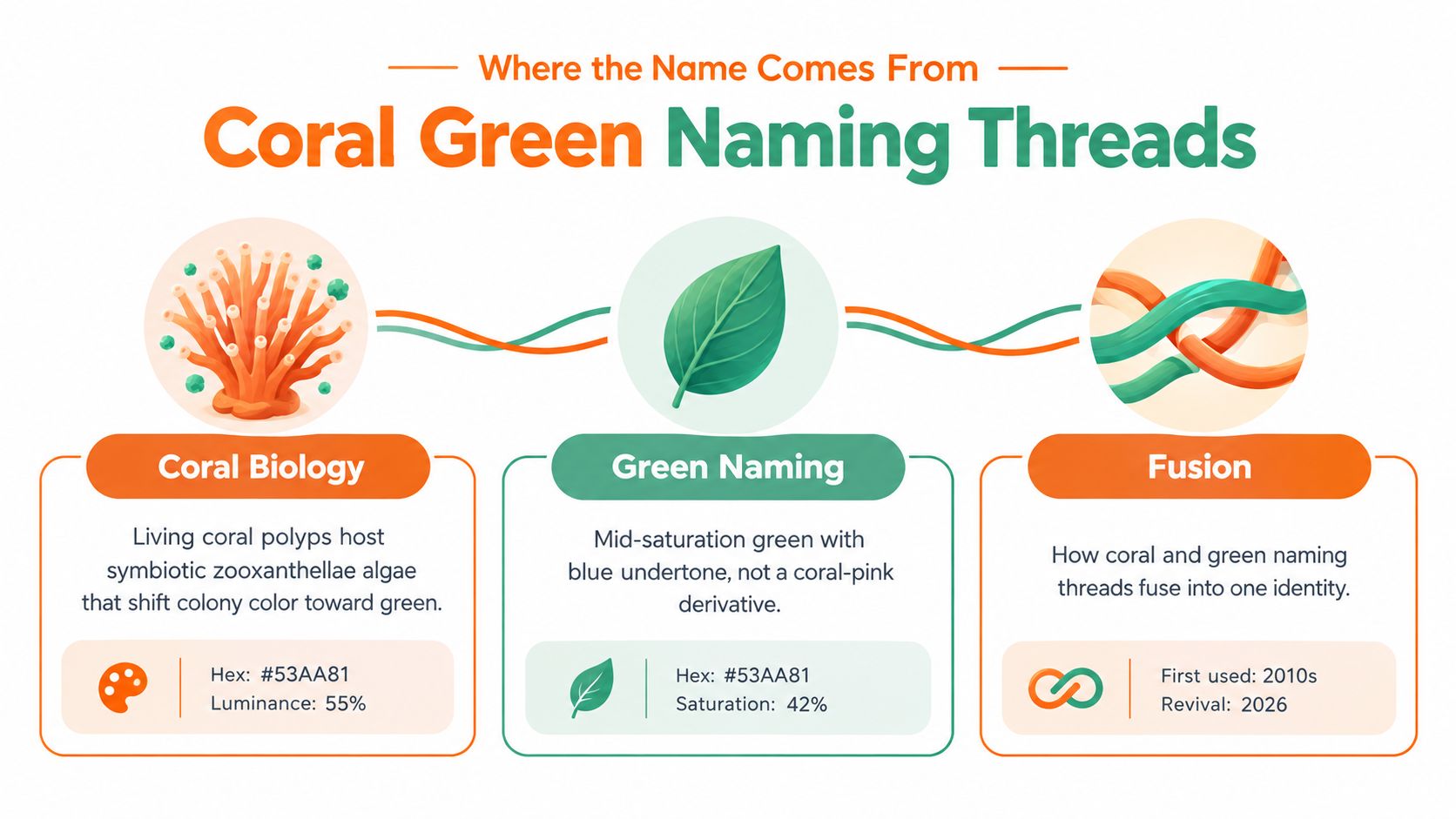
This distinction helps in a line sheet. If a buyer asks whether the name is a mistake, the team can explain that the label combines reef-inspired softness with a defined blue-green value. It isn't a claim that coral green has one ancient, standardized origin. It's a useful commercial name that needs a controlled reference.
Reading the Hex, RGB, and HSV Values
How can a merchandising team keep “coral green” consistent when the name may point to more than one color? Start with the measurable specification. A hex code is compact, while production teams may need RGB for digital assets, HSV for color analysis, and material notes for physical goods.
For this reference shade, #53AA81 converts to red 83, green 170, and blue 129. Its HSV description is 152° hue, 51% saturation, and 67% brightness. The hue places it in the green-blue range. Green is the strongest RGB channel, while moderate saturation keeps the shade fresh without making it fluorescent. The result remains calmer than a vivid neon and clearer than a gray-green.
Production reference table
| Format | Values |
|---|---|
| Hex | #53AA81 |
| RGB | 83, 170, 129 |
| HSV | 152°, 51%, 67% |
| Channel balance | 22% red, 45% green, 34% blue |
A related registry entry uses RGB (171, 226, 207), or #ABE2CF. Because that value differs visibly from #53AA81, the name alone cannot control production. Store the color name beside its approved numeric value, swatch, and material application. This record should travel with every SKU, regional assortment, and seasonal update. A search spike may bring the label to a team's attention, but a controlled specification determines what customers receive.
Digital and physical color also require separate checks. Displays emit light; paper and fabric reflect it. For print, review a coated-stock proof on the actual substrate under the intended lighting. Large gradients can reveal banding or other rendering defects, so teams preparing digital assets can consult Nereo's guide to color banding.
What the values mean for handoffs
Put the hex and RGB values in the digital style guide, then attach a physical swatch approved by the product team. Record the fabric, finish, and lighting used for approval. For beauty packaging, identify whether the specification applies to the substrate, ink, cap, label, or on-screen product image. A correct code still needs a defined material and finish.
Check accessibility for each text and background pairing. Coral green may suit a field, illustration, border, or large display element, yet a pleasing swatch does not guarantee readable body copy. Test the final digital treatment with a contrast checker, and choose darker text when the color carries important information.
Palette Pairings That Work With Coral Green
Coral green works because it can lean in two directions. Against a cool dark, it looks crisp and mineral. Against a warm neutral, it feels more organic and resort-oriented. The pairing should follow the job of the image, not the color's popularity in a mood board.
| Companion Color | Hex | Best Use Case | Avoid When |
|---|---|---|---|
| Deep navy | #1B2A4E | Product detail pages, outerwear, structured accessories | The product already has a dark, high-contrast print |
| Warm sand | #E8D9B5 | Resort stories, spring lookbooks, natural-material settings | The scene needs a strictly cool, technical mood |
| Coral pink | #F88379 | Showing the coral and green relationship in a controlled palette | Both colors compete equally in one crowded frame |
| Cream | #F5F1E6 | E-commerce tiles, packaging grounds, clean editorial layouts | The image needs dramatic depth or nighttime energy |
| Charcoal | #2E2E2E | Typography, navigation, CTA buttons, functional labels | A soft, low-contrast wellness mood is the primary goal |
Five useful palette moves
Deep navy creates authority. Use #1B2A4E behind a coral green garment when the product needs a grounded, dependable frame. This is particularly effective for outerwear, bags, performance layers, and product pages where the background must provide structure without stealing attention.
Warm sand adds lifestyle context. #E8D9B5 supports linen, raffia, wood, and sunlit settings. It makes coral green feel less technical and more tactile, so it belongs in resort capsules and spring storytelling.
Coral pink explains the name. #F88379 can appear as a small styling detail, secondary product, or graphic note. It clarifies the relationship between the two words, but it shouldn't dominate the same frame as the green. Otherwise, viewers may read the combination as a confused category rather than a deliberate palette.
Cream protects clarity. #F5F1E6 is the safest base for commerce. It leaves enough breathing room for the shade and keeps small product thumbnails from becoming visually busy.
Charcoal handles function. #2E2E2E gives the palette a reliable text and interface partner. For teams comparing neutral options, this guide to dark charcoal grey offers useful language for distinguishing charcoal from black.
Use navy or charcoal for hero commerce imagery when conversion clarity matters. Choose sand and cream for lifestyle narratives. Keep coral pink out of a single frame when the brief needs the audience to recognize coral green as one controlled color, not as an unresolved mixture.
Mood, Brand, and Seasonal Associations
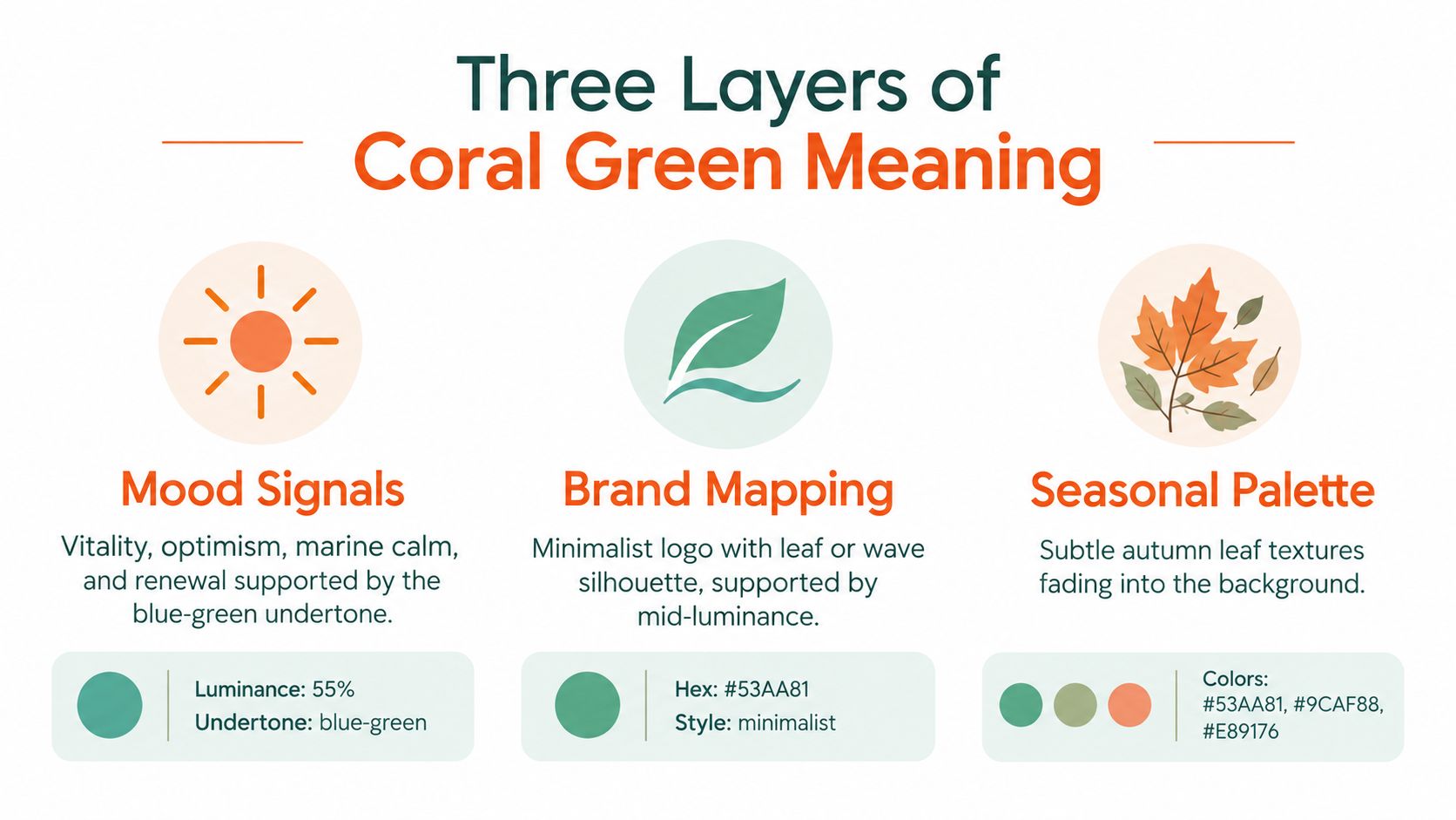
Color meaning works on several levels at once. The blue-green structure of coral green suggests marine calm and renewal, while its green dominance carries vitality and growth. Its medium visual intensity keeps those signals approachable. The result can feel optimistic without becoming childish, and natural without becoming rustic.
That combination makes the shade flexible across brand archetypes. A wellness label might use it to signal freshness and balance. A coastal hospitality brand can connect it to water, reef life, and filtered sunlight. A beauty brand can use it for skincare packaging, tools, or a youthful editorial accent. An outdoor performance line may pair it with navy, graphite, or technical neutrals to soften an otherwise hard visual system.
Three layers of meaning
Mood comes first. Ask whether the brief needs renewal, vitality, or calm. Coral green can carry all three, but the companion colors decide which signal dominates.
Brand context gives the color a job. A minimalist wordmark, a leaf silhouette, or a wave motif will reinforce different readings of the same swatch. Keep the graphic language restrained if the shade already supplies the visual personality.
Season changes the supporting cast. Coral green is naturally comfortable in spring transitional drops and summer resort capsules. It can work in autumn when placed beside olive, bark, stone, or deep brown, but it needs stronger neutrals in winter. Holiday campaigns typically require deeper framing colors if coral green is to avoid looking too light or summery.
Merchandising teams can use the shade as a lead color in a renewal-focused drop, then reduce it to trim, lining, packaging, or digital accents when the collection moves toward formality. The assortment planning guidance from Sprello is relevant to this decision because colorways need to be considered alongside the full line architecture, not in isolation.
Decision shortcut: If the brief says renewal or vitality, lead with coral green. If it says luxury or formality, use coral green as an accent.
This approach avoids assigning one permanent personality to the shade. A coral green dress on warm sand reads differently from a coral green technical shell against navy. The color supplies a starting signal, while styling, material, scale, and contrast complete the message.
Is Coral Green a Real 2026 Trend
Coral green may be less of a single trend than a taxonomy problem wearing trend language. Search interest can gather around coral, sage, mint, jade, and sea green while shoppers and editors use overlapping terms for nearby shades. That creates genuine curiosity, but curiosity doesn't prove that one hybrid color has achieved stable commercial meaning.
The available 2026 coverage supports a fragmented picture. One reference describes palettes moving toward soft corals, sage, pistachio, jade, and muted greens, with Sage Green highlighted for Spring/Summer 2026. Other coverage treats soft coral and muted intelligent green as separate directions. September 2026 fashion reporting also places coral, pea green, and other saturated accents on runways, while one trend article says coral-related search interest peaked in February 2026 across clothing, accessories, and home decor. These claims appear in the 2026 color trend discussion from Color Psychology.
Signal versus naming spillover
There is a real commercial signal when buyers respond to blue-green, soft green, and coral-adjacent palettes across fashion, beauty, and resort categories. There is also a naming artifact when a product tagged “coral green” receives a mint image, a jade sample, or a coral-pink interpretation depending on the source.
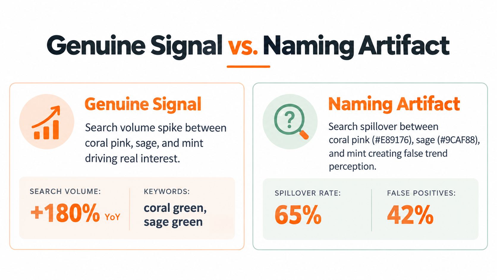
Procurement teams face the practical consequence. If one supplier interprets coral green as #53AA81 and another uses a lighter aqua-green registry value, the assortment may arrive with mismatched swatches even though both purchase orders use the same words. The customer experiences inconsistency, while the internal team may incorrectly blame dye, photography, or regional taste.
So the responsible 2026 position is disciplined rather than predictive. Track search, runway, beauty, and sell-through signals, but standardize the color before calling it a trend. A stable taxonomy lets the team measure demand for the actual shade instead of measuring demand for a shifting label.
Using Coral Green in Merchandising Workflows
How can a team keep “coral green” consistent from the first sketch to the final product page? Treat the name as a governance term, not a flexible impression. The designer needs a digital reference, the developer needs physical approval, the supplier needs a production target, and the content team needs a shared asset label. Each handoff should leave a record that another team can verify without asking what the shade means.
Six controls for a stable color identity
Lock the canonical value. Put #53AA81 and RGB (83, 170, 129) in the brand color guide. Create a named swatch such as “Coral Green CG-01,” and block unqualified substitutions in design libraries.
Add production fallbacks. Record the approved physical swatch, selected print conversion, and material context in the production specification. A screen value alone cannot describe how the color should appear on textile, packaging, or another surface.
Standardize photography. Photograph approval swatches under one documented lighting setup and store those conditions with each image. Regional studios should check the same reference card before shooting garments, cosmetics, or accessories.
Write the attribute rule. Define when a product earns the “coral green” attribute. Base the decision on the approved swatch and the team's color-difference tolerance, rather than a copywriter's judgment or a supplier's naming habit.
Separate hero and accent roles. Mark each SKU as a hero color, supporting color, trim, or campaign accent in the line plan. A shade used for a small accessory detail should not be forecast as a full collection pillar.
Review the taxonomy periodically. Keep the approved shade stable while reviewing adjacent names, search behavior, runway evidence, and customer language. Add aliases only when buyers consistently use them for the same visual target.
Deliverables that keep teams aligned
The working package should include a swatch card, DAM taxonomy tag, line-sheet notation, approved product-image reference, and short copy rule. The rule might use “coral green” as the primary customer-facing name and “blue-green” as a descriptive support term. It should not alternate randomly among mint, jade, teal, and sage.
Catalog-scale teams also need visual checks across channels. A product page, marketplace tile, email banner, and social crop can place the same garment against different backgrounds, so reviewers should compare the color in context rather than approve one isolated image. Sprello's merchandising examples offers a useful way to frame repeatable assortment and campaign deliverables. A workflow canvas such as Sprello can turn the approved definition into a repeatable brief and handoff process.
Use the same rule at SKU, regional, and seasonal levels. Regions may translate the customer-facing name differently, and seasons may introduce nearby colors, but the canonical swatch, attribute rule, and alias record should remain traceable.
If inconsistent “coral green” references keep reaching your team, document #53AA81 as the canonical value, approve the physical swatch, and add the name to your SKU and DAM rules this week. Then visit Sprello to map that palette across assortment planning, campaign production, and channel-ready creative assets.
Related
More to explore
Fresh reads

Assortment Planning in Fashion: A Strategic Guide
Master assortment planning in fashion with strategies for line architecture, size curves, visual workflows, and KPIs to optimize seasonal SKU allocation.
What Is Merchandise Planning in Retail? a Practical Guide
What Is Merchandise Planning in Retail. Learn what merchandise planning in retail really means, how it drives sales and margin, and the steps teams use
8 Product Concept Examples for Brand Teams
Explore 8 product concept example ideas across fashion, beauty, and lifestyle, with strategic analysis and workflows for scaling concepts into production.