September 20, 2026
Dark Charcoal Grey Styling and Palette Guide for Brands
Discover dark charcoal grey codes, pairings, and styling tips for fashion and lifestyle. Learn when to use it over black with brand-ready palette guidance.
You're probably looking at a rail of samples, a digital color chip, or an approval deck where black feels too severe but standard grey feels too exposed. The coat loses depth. The packaging looks flat. The room rendering turns a little office-like. Someone says, “Let's make it charcoal,” and everyone nods as if that solves it.
Usually, it doesn't.
The problem is that dark charcoal grey isn't one color. It's a family of dark neutrals that can lean cool, warm, mineral, smoky, or almost brown depending on the formula, the material, and the light. If your team treats it like a single swatch name, you'll get drift. The e-commerce image won't match the fabric. The trim color will sharpen when it should soften. A luxe neutral can suddenly read corporate or tired.
That's why dark charcoal grey deserves to be handled less like a trend word and more like a controlled brand decision. Recent fashion coverage has framed charcoal grey as a refined neutral in tailoring, coats, and monochrome dressing, while adjacent categories are also moving toward warmer, espresso-leaning dark neutrals rather than icy cool greys in many contexts (Elle on gray outfit styling). That tension is exactly why teams get stuck. The same label can be current in one category and wrong in another.
What follows is the practical version. Not a mood-board definition. A working guide for creative, merchandising, and production teams who need to choose the right dark charcoal grey, pair it with confidence, and keep it stable across SKUs and channels.
Introduction to Dark Charcoal Grey as the Modern Neutral
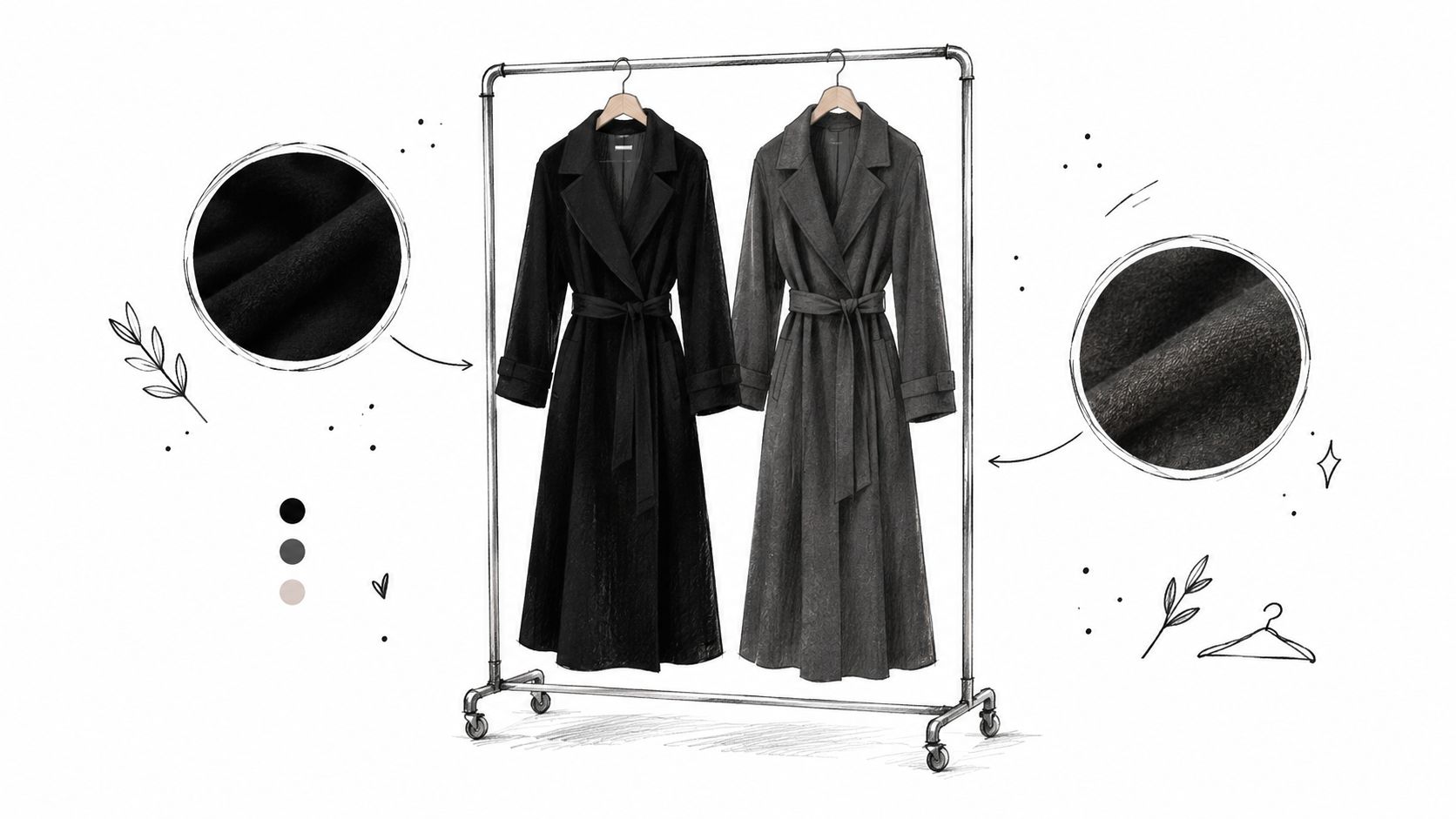
A merchant picks black for a trench because black is dependable. Then the first sample arrives and the coat feels harder than intended. The silhouette is elegant, but the color eats the seam detail. In the campaign mockup, the garment overpowers the model's skin tone and swallows the texture of the wool.
That's the moment dark charcoal grey earns its place.
Why teams reach for it
Dark charcoal grey often solves a very specific problem. You want the authority of a dark neutral, but not the bluntness of black. You want depth, but you still need the eye to register surface, tailoring, grain, or weave. In interiors and product styling, the same logic applies. Black can create drama. Charcoal can create depth with more air around it.
That's why so many teams now use charcoal as a working neutral, not just a fashion neutral. It can anchor a palette, soften contrast, and still feel polished.
Practical rule: If black is stealing detail from the thing you're trying to show, test dark charcoal grey before you lighten the whole palette.
Why the name creates confusion
The trap is simple. People say “charcoal” as if it's precise. It isn't.
In one workflow, charcoal means a blue-cool dark grey. In another, it means a softened black with green cast. In another, it means a warm, brown-tinted dark neutral that looks richer beside cream, camel, or brass. All three can be called charcoal in a meeting, and all three produce very different results once they hit fabric, print, paint, or screen.
A shared vocabulary helps, but numeric standards help more. That's where this gets easier. Once your team understands dark charcoal grey as a spectrum, the decisions become cleaner. You stop debating the name and start choosing the behavior you want.
The real value of learning it well
For creative teams, this shade is useful because it travels. It can support outerwear, suiting, beauty packaging, furniture, hard goods, and digital product visualization. But it only travels well when you define which charcoal you mean, how warm or cool it should read, and what role it plays beside other colors.
Handled well, dark charcoal grey becomes less of a fallback neutral and more of a signature.
What Makes Dark Charcoal Grey Distinct
Dark charcoal grey gets misunderstood because people often describe it by what it isn't. It isn't black. It isn't mid-grey. It isn't silver. Those comparisons help a little, but they don't explain why one charcoal feels expensive and another feels lifeless.
The better way to understand it is by behavior.
It has depth without going fully opaque
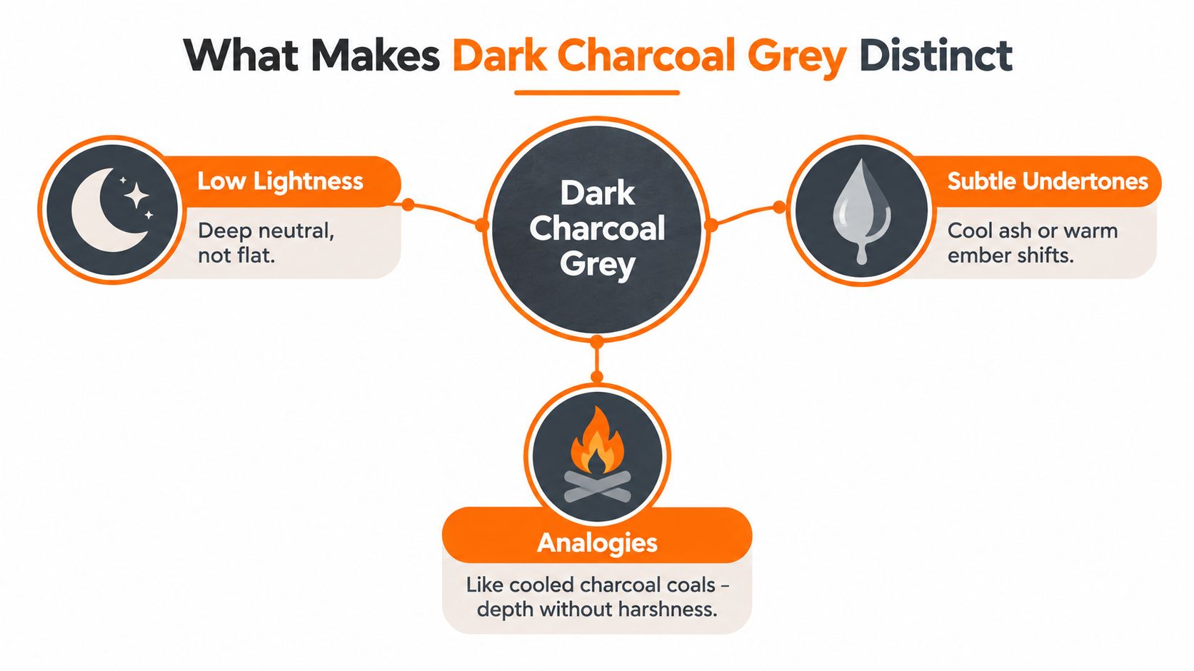
Think of black ink on white paper. It reads immediate, sharp, and final. Now think of cooled charcoal from a fire pit. It's dark, but it still has complexity inside it. You notice ash, mineral, soft brown, maybe even a blue cast depending on the light.
That second image is closer to dark charcoal grey.
Its visual identity comes from low lightness, but not total visual shutdown. It lets edges, texture, and shadow separate from each other. That's why wool suiting in charcoal can show tailoring more gracefully than the same shape in pure black.
Undertone decides the personality
Readers usually get tripped up. They assume grey is neutral in a simple sense. In practice, grey is rarely that simple.
A dark charcoal grey can lean:
- Cool ash, which feels urban, and clean
- Blue mineral, which can become steely under bright light
- Green smoke, which sometimes looks and sometimes sickly
- Warm ember, which feels softer and often works well with creams, browns, and aged metals
That undertone shift is small on paper and large in use. A cool charcoal next to bright white feels crisp. The same charcoal next to camel may look colder than intended. A warm charcoal beside ivory can look refined. The same warm charcoal beside icy silver can look muddy.
Dark charcoal grey is a neutral the way tea is water. True, but incomplete. The small additions define the experience.
It has a long material history
The word charcoal also makes visual sense because of the material itself. Charcoal and carbon black have been used in drawing and pigments for a very long time. Cave paintings made with charcoal are dated to roughly 40,000 years ago, and some historical references place charcoal-based artistic use even earlier around 14,000 BCE. In pigment history, carbon black was already widely used, and a documented industrial process for a black suitable for watercolor was developed in America in 1864 and was widely employed by 1884 (history of charcoal and carbon black use).
That history matters because dark charcoal grey doesn't feel synthetic by default. Even in digital design, it carries a material memory. It suggests carbon, ash, soot, slate, and weathered surfaces rather than a purely abstract dark tone.
Texture changes the read
The same dark charcoal grey can shift character dramatically across finishes.
- Matte wool makes it look softer and deeper
- Gloss packaging can push it toward sharper, near-black formality
- Brushed metal can wake up cool undertones
- Velvet or suede can make warm notes feel richer
That's why swatches alone often mislead teams. Color and surface are having a conversation. If you only approve one of them, you haven't approved the result.
Decoding the Numbers Behind Dark Charcoal Grey
Once a team agrees that dark charcoal grey is a spectrum, the next step is simple. Stop approving the name by itself. Approve the numbers.
In modern color systems, a commonly referenced charcoal grey is #36454F with RGB 54, 69, 79, and there's also a British Standard match listed as BS4800 10 A 11 Charcoal Grey. Other published charcoal-related references sit near but not on that target, including #6A6A6A in one color comparison tool and a darker listing at #3C4142, which shows how the label spans multiple dark neutral positions in practical use (charcoal grey reference values).
Why the name fails without the code
If one designer means #36454F and a supplier means #6A6A6A, both can say they used charcoal grey. Visually, though, they did not choose the same color. One sits cooler and deeper. The other is flatter and lighter. Put those into the same seasonal story and the assortment starts to wobble.
This is why naming alone isn't enough for:
- SKU photography
- fabric lab dips
- e-commerce renders
- print collateral
- regional campaign assets
A color name is a category. A numeric code is a decision.
How Dark Charcoal Grey Varies Across Standard References
| Reference | Hex | RGB | Lightness and Undertone Notes |
|---|---|---|---|
| Common charcoal grey reference | #36454F | 54, 69, 79 | Dark, cool-leaning, blue-slate behavior |
| Alternate charcoal comparison value | #6A6A6A | 106, 106, 106 | Lighter, more even neutral grey, less dramatic |
| Darker charcoal-grey listing | #3C4142 | 60, 65, 66 | Deep, smoky, slightly mineral feel |
| Pantone 18-0601 TCX mapping | #6C6868 | 108, 104, 104 | Softer, warmer, slightly browned charcoal |
The technical spread is real
Published specifications don't collapse into one universal charcoal. One technical profile lists Pantone 18-0601 TCX mapped to #6C6868, RGB 108,104,104, and Lab 44.36,1.56,0.55. Another darker implementation lists #3C4142, RGB 60,65,66, and Lab around 29.9,5.3,-4.2. That spread is wide enough to change how the color behaves in merchandising, photography, and print production (published charcoal grey specifications).
For creative ops, the lesson is straightforward.
What to pin in your library
Use a compact standard for every approved charcoal entry:
Name plus number
“Dark Charcoal Grey” should always sit beside its hex, RGB, and whichever production standard your team uses.Undertone note
Add a plain-language note such as “cool blue cast” or “warm brown cast.”Use case
Define whether that charcoal is for suiting, outerwear, packaging, background fields, hardware, or digital surfaces.Do-not-substitute warning
If a charcoal is signature, flag adjacent values that look similar but reproduce differently.
A good color library doesn't remove taste. It protects it.
When to Choose Dark Charcoal Grey Over Black and Other Neutrals
Dark charcoal grey is often treated as the safe answer. Sometimes it is. Sometimes it isn't.
The overlooked issue is that charcoal can be more sensitive than black to undertone, surface, and lighting. Black declares itself quickly. Charcoal negotiates. That makes it more nuanced, and sometimes more fragile.
Choose by job, not by label
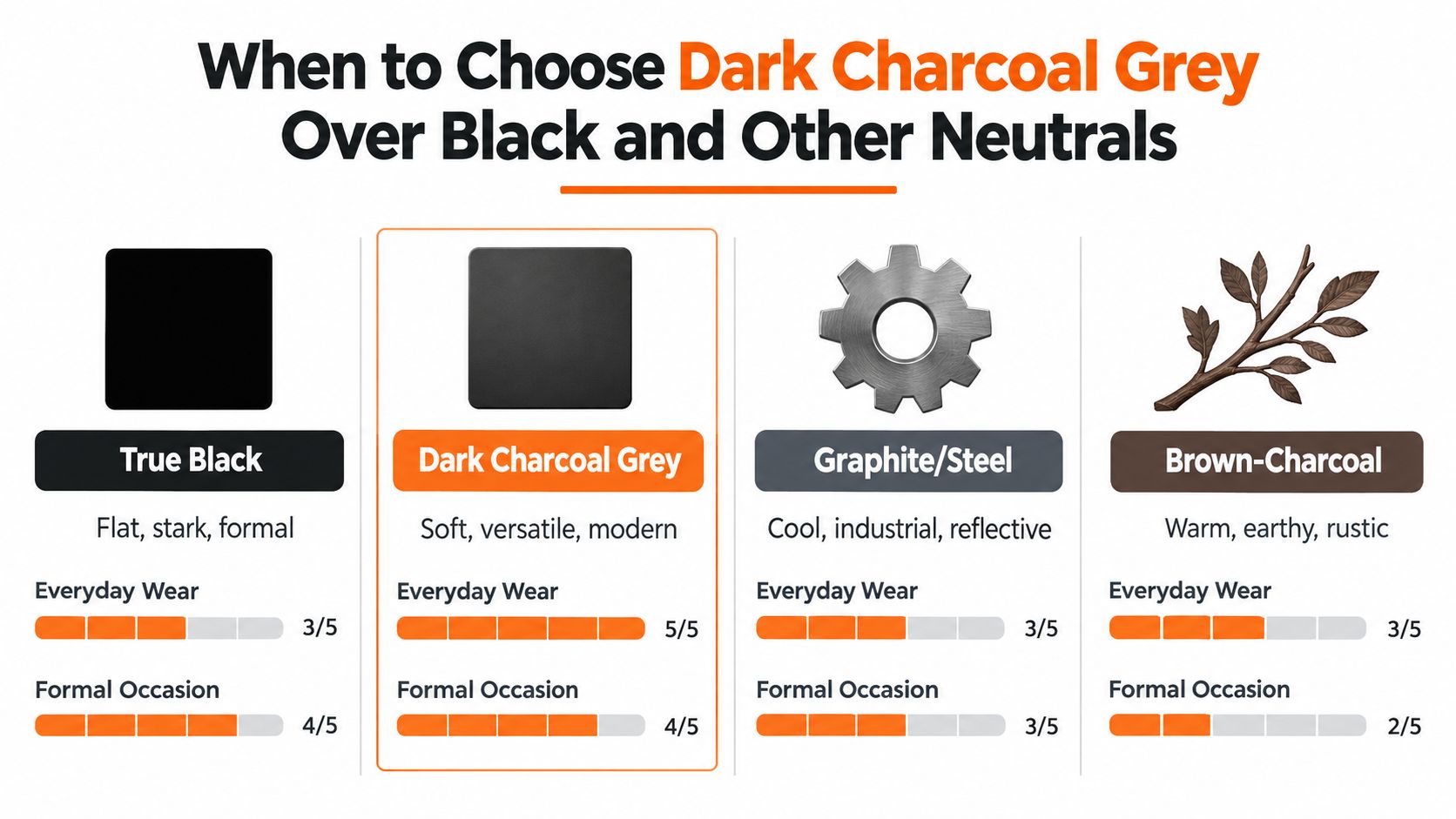
Use true black when you want maximum contrast, strict formality, or graphic clarity. It's useful when silhouette matters more than texture, or when branding needs a decisive edge.
Use dark charcoal grey when you want darkness with more flexibility. It often works better in outerwear, suiting, and lifestyle storytelling because it can reveal material and sit more gently beside skin, cream, stone, wood, and layered neutrals.
Use graphite or steel grey when the mood should feel cooler, more technical, or more industrial. These variants can look sleek in hardware, footwear, electronics-adjacent packaging, and hard-surface environments.
Use brown-leaning charcoal when you want warmth without fully leaving grey territory. This is often the better bridge when a palette includes camel, mushroom, ivory, brass, tobacco, or espresso.
If black is a tuxedo shoe, dark charcoal grey is a beautifully worn leather loafer. Still polished. Less rigid. More conversational.
A quick decision matrix
| Option | Best when you want | Watch out for |
|---|---|---|
| True black | High contrast, ceremony, graphic impact | Can erase detail and feel severe |
| Dark charcoal grey | Soft depth, modern tailoring, flexible neutral base | Undertones may shift under lighting |
| Graphite or steel grey | Technical, cool, metallic, urban mood | Can feel hard or corporate |
| Brown-leaning charcoal | Warm luxury, soft structure, seasonal richness | Can lose clarity beside cool accents |
The category matters too.
- Outerwear often benefits from charcoal when you want a premium everyday neutral.
- Tailoring can use cooler charcoal for authority, warmer charcoal for approachability.
- Interiors need more caution because surrounding light and materials can make a cool charcoal feel dated faster than expected.
- Packaging depends heavily on finish. Matte charcoal tends to feel softer than gloss charcoal.
- Digital visualization demands tighter control because on-screen interpretation varies fast.
A useful visual reference sits below if your team needs a quicker comparison during reviews.
Why charcoal is not always the safer dark
Recent exterior guidance treats dark grey as a middle ground with moderate heat risk, low fade risk, and a more versatile footprint than true black, while also warning that very dark finishes still raise practical questions around heat and substrate choice (exterior color guidance for 2026). That same logic carries into merchandising in a different form. A charcoal that looks forgiving in a swatch can become touchy under daylight, studio light, and screen translation.
So the choice isn't “black or a softer version of black.” The choice is which dark neutral performs best in the context you have.
Building Palettes and Outfits Around Dark Charcoal Grey
A strong charcoal palette doesn't start with “what matches grey?” It starts with what role the charcoal is playing. Is it the anchor, the softener, the luxury note, or the backdrop that lets another color move forward?
When teams skip that question, palettes become generic. Everything coordinates, but nothing speaks.
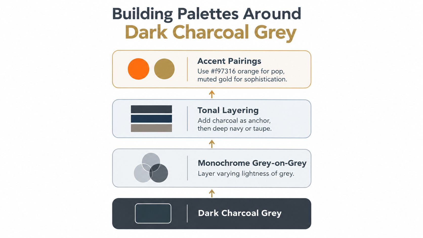
Monochrome done properly
Grey-on-grey works when the layers don't collapse into one flat band. You need separation in lightness, surface, or temperature.
A dark charcoal coat over a mid-grey knit and a pale stone trouser gives the eye steps to follow. In interiors, a charcoal upholstery fabric can sit comfortably with lighter plaster, weathered oak, and pewter accents if each surface reflects light differently.
Pairing principle: When charcoal is the base, change either the texture or the temperature in the next grey. If both stay the same, the look goes dull.
Warm and cool directions
A cool charcoal usually pairs best with crisp white, icy blue, slate, silver, and deep navy. This route feels sharp and urban. It can be excellent for tailoring, beauty packaging, and minimalist product stories.
A warmer charcoal opens another set of options. Cream, taupe, camel, espresso, muted gold, and soft olive tend to make it feel richer and more lived-in. This route usually gives better results when you want softness and depth at the same time.
If your image team is refining campaign balance, a practical primer on color theory for image enhancement can help frame why a charcoal base shifts so much depending on adjacent tones and contrast handling.
Fabric changes the palette logic
Many assortment reviews go wrong. Teams approve colors as if all materials speak at the same volume.
They don't.
- Charcoal wool often likes chalk, ivory, and softened navy
- Charcoal leather can handle stronger contrast and richer browns
- Charcoal satin or gloss may need quieter companions or it starts reading formal too quickly
- Charcoal knits usually benefit from tonal layering rather than hard contrast
In merchandising, the easiest way to pressure-test this is to build a story in grouped families instead of isolated SKUs. A planning framework like this assortment planning template helps teams see whether charcoal is acting as a true anchor across a lineup or just appearing repeatedly without purpose.
Three reliable palette stories
Here are three directions that usually translate well:
Urban tonal
Dark charcoal grey, graphite, pale grey, optic white. Best when the mood should feel clean and modern.Soft luxury
Warm charcoal, cream, camel, espresso, muted gold. Useful for outerwear, knitwear, interiors, and premium packaging.Night color accent
Dark charcoal grey, deep navy, aubergine, or forest as secondary darks. Good for replacing flat black stories with more nuance.
The goal isn't to make charcoal the star every time. It's to let it act like a disciplined lead actor. Strong enough to carry the scene. Generous enough to support everyone else.
Keeping Dark Charcoal Grey Consistent Across Channels and Materials
Most charcoal problems aren't styling problems. They're governance problems.
A team chooses the right shade in concept. Then the photography warms it. The retouching cools it back down. The print vendor deepens it. The product page background shifts it again. By launch, the customer sees four versions of the same “charcoal” item.
Where drift usually starts
Drift tends to enter at predictable points:
- Sample-to-screen translation when fabric depth gets flattened by capture settings
- Material substitution when a matte charcoal moves to a glossier surface
- Regional asset production when local teams use the name but not the numeric value
- Loose naming when “charcoal,” “graphite,” and “dark grey” are used interchangeably
That last one causes more confusion than people expect. If your file names, swatch cards, and briefing language are inconsistent, the visual inconsistency usually follows.
A working control system
You don't need a heavy process. You need a clear one.
Lock the master value
Approve one numeric reference for each official charcoal variant.Add visual intent notes
State whether it should read cool, smoky, softened-black, or warm mineral.Review under multiple conditions
Check the color in daylight-style imagery, soft indoor light, and on common screens.Audit neighboring colors
Charcoal can look right on its own and wrong once cream, navy, brass, or wood enters the frame.Track naming at workflow level
The same term should appear in design files, merchandising tools, shoot briefs, and final exports.
For teams formalizing that discipline, a structured brand audit services guide is useful because it shows how consistency issues often start upstream in naming and standards, not just in final assets.
Why the workflow matters
Dark grey finishes are often treated as easier than bright colors. In practice, they can be surprisingly sensitive. Slight warmth can become brown. Slight coolness can become blue. Slight exposure changes can make the product look cheaper, flatter, or harsher.
Workflow tools become practical rather than abstract. For example, brand consistency software is relevant when teams need to keep color decisions visible across merchandising, creative, and production handoffs. Sprello is one option in that category. It provides an AI workflow canvas for fashion, beauty, and lifestyle teams to design and audit production workflows across SKUs, channels, regions, and seasons.
The safest charcoal is not the darkest one. It's the one your team can reproduce on purpose.
That's the standard worth holding.
Making Dark Charcoal Grey Work for Your Brand Story
Dark charcoal grey becomes powerful when you stop treating it like a generic neutral and start treating it like a signature range. One brand's charcoal may be cool and architectural. Another's may be softened with brown and feel almost espresso at dusk. Both can work. What matters is that the choice is deliberate.
Brand story lives in these small distinctions. A cold, inky charcoal can support precision, restraint, and technical polish. A warmer charcoal can support tactility, ease, and quiet luxury. The color itself isn't saying one fixed thing. Your version of it is.
Turn preference into policy
Creative teams usually know the charcoal they like when they see it. The challenge is making that preference reusable.
Write it down. Document the approved value, the undertone, the preferred pairings, and the materials where it performs best. If your brand system is already maturing in other areas, a resource like this audit-ready guide by Font Checker Pro is a helpful reminder that scalable brand discipline often comes from documenting the subtle decisions, not just the obvious ones.
Then connect that color decision to production rhythm. If your team is standardizing handoffs across concept, campaign, and channel execution, a mapped creative production workflow helps keep your chosen charcoal from turning into a different color every season.
A good dark charcoal grey doesn't chase relevance. It earns repeat use because it keeps showing up well. On product. On people. On screen. In print. In the spaces between black and softness where many brands live.
Sprello gives fashion, beauty, and lifestyle teams a way to design production-ready creative workflows across assortments, campaigns, and large SKU catalogs. If you're trying to define a precise charcoal grey, test how it behaves across assets, and keep that decision consistent from concept through launch, visit Sprello.
Related
More to explore
Fresh reads

AI Fashion Photography Explained from Concept to Catalog
Learn what AI fashion photography is, how it works, and how brands scale catalog and campaign assets with quality, consistency, and governance.

Assortment Planning in Retail Explained for Growth
Learn assortment planning in retail from core process to SKU strategy, KPIs, and seasonal best practices for fashion and beauty teams.

AI Tools for Retail That Actually Scale Operations
Explore AI tools for retail from visual search to automation. Learn categories, use cases and how to evaluate enterprise-ready workflows.