October 19, 2026
Product Concept Presentation That Wins Buy-In
Build a product concept presentation that earns sign-off from merchandising and leadership. Step-by-step structure, visuals, and workflows inside.
You've got the silhouette right, the colorway story is tight, and the deck looks beautiful on screen. Then merchandising asks about margin, a regional lead questions the fit for their market, and finance wants to know what you're asking them to approve. The room doesn't reject the idea. It drifts, because nobody can tell what decision the visuals are supposed to support.
That's the gap a strong product concept presentation closes. It isn't a moodboard with better typography. It's a governed investment decision, sequenced so design, merchandising, marketing, and finance can judge the same product, for the same customer, against the same criteria, and leave with a defensible yes, no, or refine.
Why Most Concept Presentations Lose the Room
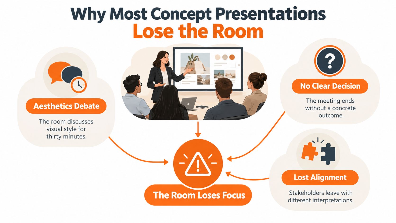
A designer walks into a seasonal review with thirty polished slides. The first ten minutes go well. Then someone prefers a different heel shape, someone else debates the backdrop, and a third person asks whether this is a core SKU or a campaign hero. Thirty minutes later the team has opinions on aesthetics and no agreement on assortment role, price position, or next step.
I've sat through that meeting in different rooms with different categories. The failure is rarely talent. It's structure. The deck was built to inspire, but the room was assembled to allocate samples, buy depth, and production time. When those two jobs collide, inspiration loses and the concept gets parked for another round.
A Discipline Older Than the Deck
Formal screening isn't a new corporate habit. By at least 1992, concept testing was a recognized part of new-product development, and a Fortune 500 survey reporting 87% use of new-product concept screening and 72% use of customer tests also found respondents rated screening as the most critical activity in development. Those were major corporations, not experimental startups. They treated presentation as the gate before engineering, sourcing, and launch spend.
Fashion, beauty, and lifestyle teams face the same gate, whether the concept is a silhouette, a material, a packaging direction, or a campaign narrative. Reviewers need to judge the intended product, target user, positioning, and use case, and they need concepts presented consistently enough to compare one against another.
The Three Ways Rooms Derail
- No decision metric: The team never agrees whether it's judging appeal, feasibility, margin, or brand fit, so every comment sounds equally important.
- Aesthetics first: Polished imagery triggers taste debates before anyone names the customer problem the product solves.
- No explicit ask: The meeting ends with encouragement instead of an approval, a kill, or a defined refinement brief.
Practical rule: If you can't write the decision you need in one sentence at the top of the deck, you're not ready to present.
Fix those three, and the same creative work suddenly travels. The room still debates, but it debates trade-offs that lead somewhere.
Building the Slide Architecture That Drives Decisions
Don't start with templates or fonts. Start with sequence. A decision-driven product concept presentation needs six blocks in a deliberate order, because each block prevents a specific kind of confusion in the next one.
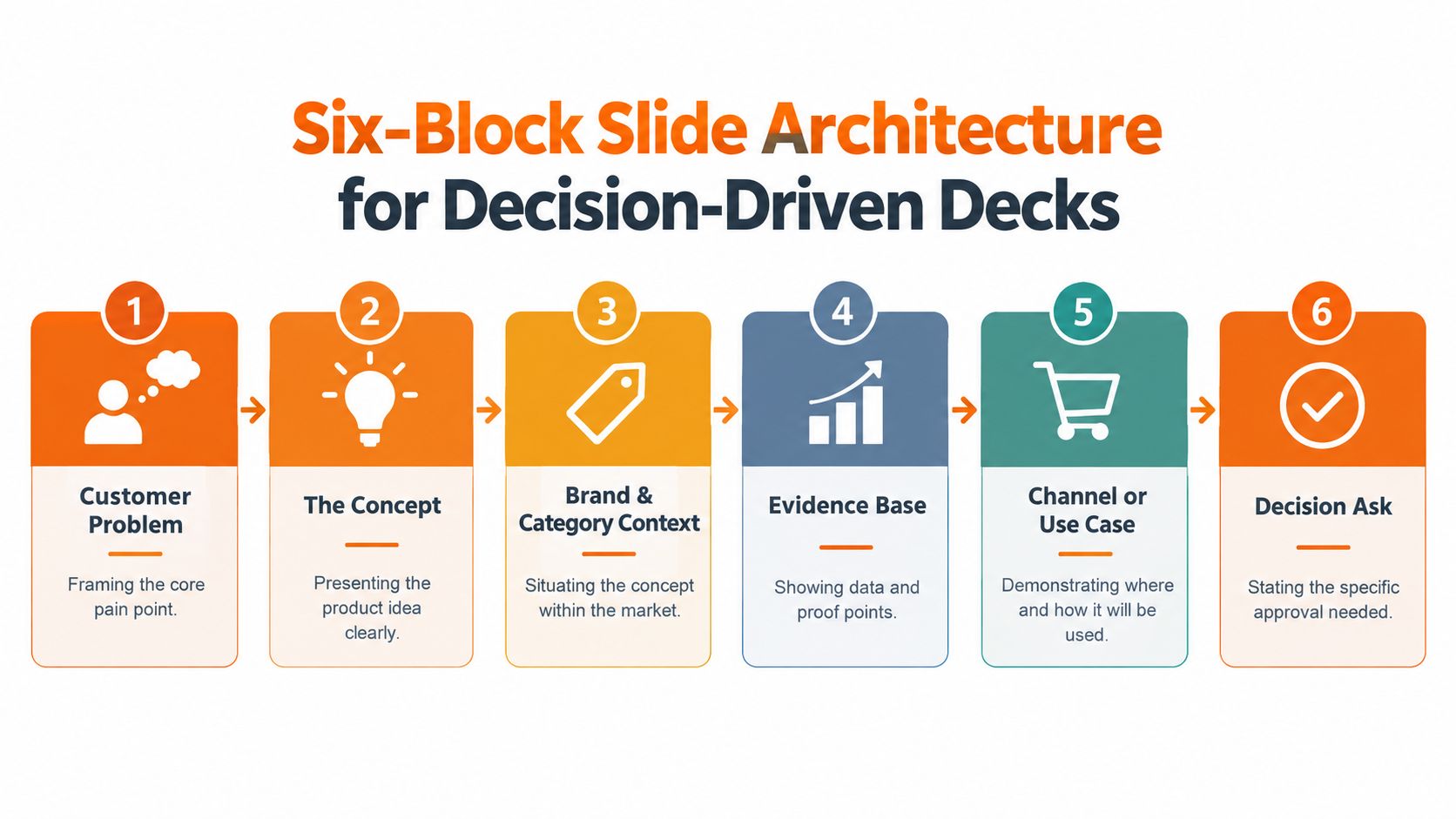
The Six Blocks in Order
1. Customer problem. Open with the unmet need, occasion, or assortment gap. This stops the room anchoring on color or styling before it knows why the product should exist. One slide, one problem, stated in the customer's terms.
2. The concept. Show the product or silhouette clearly, without a feature dump. Reviewers should be able to describe what it is after a few seconds. If they can't, later evidence won't rescue comprehension.
3. Brand and category context. Place the concept inside your line architecture and against known competitors. Is it replacing, extending, or opening a price tier? This is the first point at which regional and channel relevance gets tested.
4. Evidence base. Bring test results, sell-through analogues, search or fit data, and material constraints. Keep claims tied to what you've measured, and label assumptions as assumptions.
5. Channel or use context. Show where the product lives, on body, on shelf, in a PDP carousel, or in a lookbook sequence. Teams planning that sequence can borrow the discipline in a practical guide to creating storyboards for visual narratives, because order changes how reviewers imagine use.
6. Decision ask. Close with the specific approval requested, the options considered, and what happens next under each outcome. Vague encouragement is not an outcome.
Writing Slides That Get Read
Make each slide title a takeaway, not a label. "Colorways" tells the room nothing. "Three colorways cover core, trend, and regional demand without splitting buy depth" gives it something to challenge. Pair one idea with one visual per slide, and keep wording identical across concepts you're asking the room to compare.
The most common sequencing mistakes are predictable. Teams bury the concept under inspiration imagery, front-load pricing before comprehension, or save constraints for the Q&A where they feel like ambushes. Price, availability, and regional variation matter, but they land better after the room understands the product promise.
This skeleton works for a single SKU, an accessory story, or a full assortment. The content changes. The logic doesn't, and that consistency is what lets leadership compare concepts across seasons without relearning your deck every time.
Choosing the Right Visual Assets for Each Block
More imagery doesn't mean more clarity. In a 2023 randomized controlled study of the Japanese personal-computer market, presenting the product together with its corporate brand produced the most accurate sales estimates, while adding design, price, or product-color information didn't create statistically significant effects. Completion times also rose for richer variants, with the price group averaging 85.330 seconds and the color group 86.790 seconds, compared with 74.632 seconds for concept only.
That category isn't fashion, but the lesson transfers. Extra attributes can raise cognitive load without clarifying identity or value. Your asset choices should reduce load block by block, not compete with each other.
Matching Asset Type to the Question
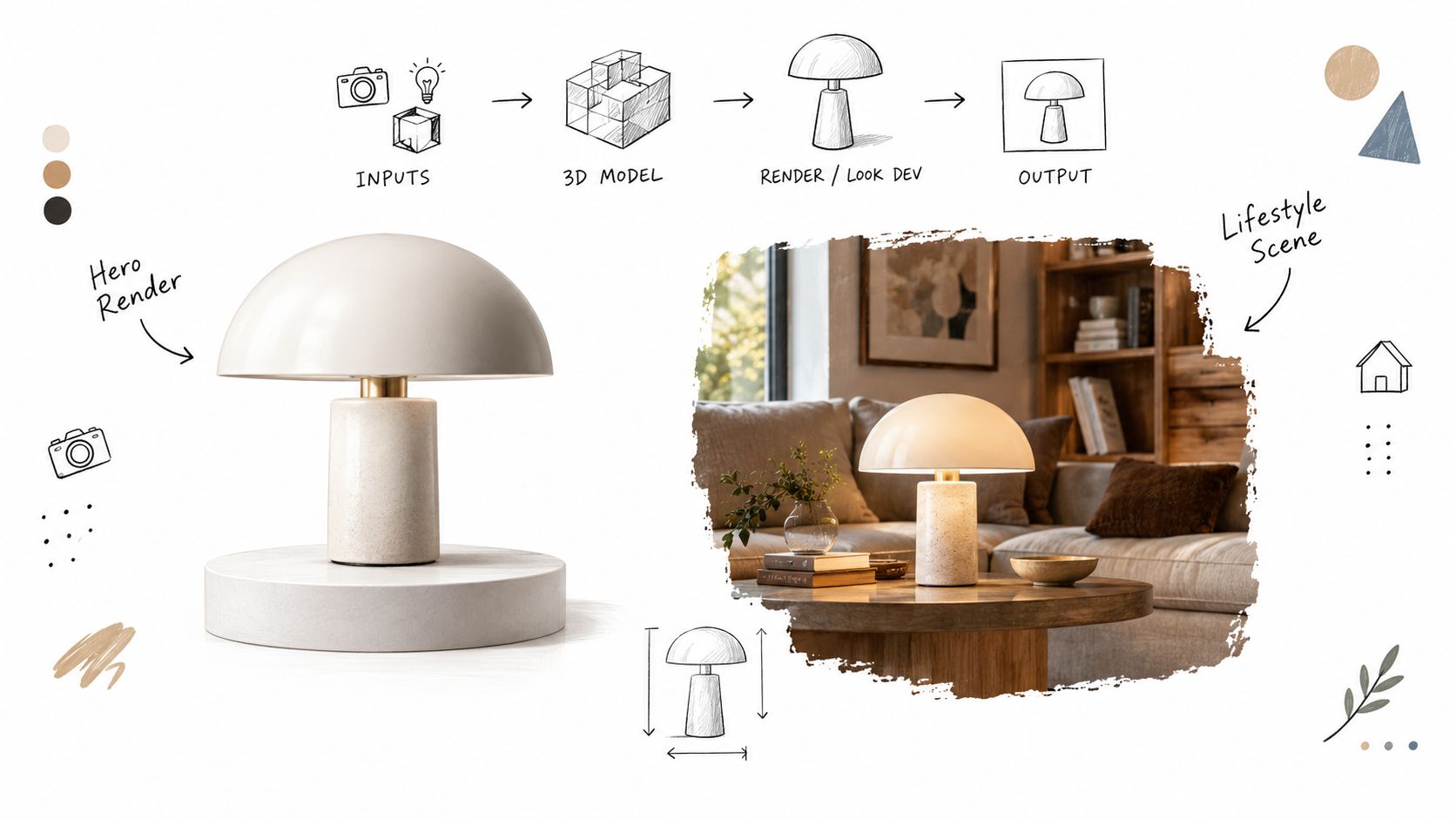
Use a plain-background hero view when the room must judge silhouette, proportion, construction, or packaging form. Nothing should fight the product. Use a contextual lifestyle scene only when the question is occasion, styling, or channel fit, and test the two versions separately rather than assuming the richer scene wins. Dynamic, busy presentation can consume attention that reviewers need for mental imagery of the product itself.
Material swatches earn their place when hand feel, finish, or sustainability claims drive the benefit. A colorway matrix earns its place when buy depth and regional allocation are on the table. Size-run visualizations matter when fit inclusivity or inventory risk is part of the decision. If an asset doesn't answer the block's question, cut it, however good it looks.
Teams evaluating tooling for these assets should compare options in an overview of product visualization software for concept work against a simple test. Can the tool hold silhouette, material, and color consistent across views, or does each render drift?
Where AI-Assisted Imagery Helps and Hurts
AI assistance is useful for exploring materials, color palettes, and contexts before physical samples exist. It's risky when reviewers can't tell what's specified and what's invented by the model, a seam, a logo placement, a proportion. Treat AI imagery as one input among many, checked against brand guardrails before the meeting, not explained away during it.
A render that's clear enough to evaluate beats a render that's polished enough to oversell. If the room falls in love with lighting you can't reproduce at catalog scale, you've created rework, not momentum.
Static decks are sufficient for most screening decisions. Reserve short motion or interactive prototypes for concepts where drape, movement, opening mechanics, or application ritual is the actual claim. Motion should prove something stills can't, not decorate a weak brief.
Designing the Concept on a Visual Workflow Canvas
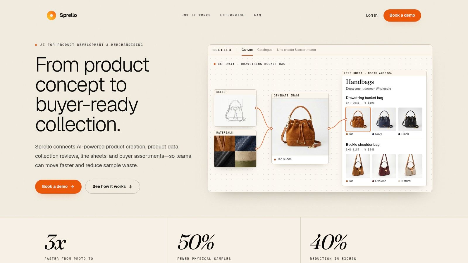
Decks hide how a concept was made. A visual workflow canvas shows it. Instead of copying images from folders into slides, you build the concept as a traceable pipeline, inputs on the left, transformations in the middle, guardrail checks and outputs on the right. The canvas then becomes the presentation, because any reviewer can inspect how a colorway or material choice was reached.
What Belongs on the Canvas
Start with source inputs, tech packs, reference photography, material libraries, and prior-season winners. If your early exploration still lives in moodboards, the AdCrafty mood board guide is a useful reference for organizing that inspiration before you convert it into specified inputs with owners and rules.
Next come transformation steps, silhouette generation, material swaps, colorway expansion, and channel crops. Each step should carry its settings or prompt lineage at a level your team can audit without exposing noise. Then add brand-rule checkpoints for logo use, color tolerance, body proportion, cultural references, and claims. Finally, define outputs, the exact views and formats each channel and region receives.
Sprello is one option built for this pattern, an AI workflow canvas where fashion, beauty, and lifestyle teams design workflows across SKUs, channels, regions, and seasons with brand guardrails applied inside the pipeline. Whatever tool you choose, judge it on traceability and repeatability, not on a single impressive image.
Common Workflow Canvas Steps for a Production-Ready Concept
| Workflow Step | Purpose | Who Owns It |
|---|---|---|
| Input intake | Lock references, tech packs, and material sources | Design |
| AI-assisted ideation | Explore silhouette, material, and color variants | Design |
| Brand guardrail check | Verify logo, color, proportion, and claims rules | Brand management |
| Assortment build | Expand approved concept across SKUs and size runs | Merchandising |
| Regional adaptation | Apply market variations without breaking global rules | Regional teams |
| Final render and export | Produce channel-ready assets with lineage intact | Creative operations |
This structure answers questions decks can't. Which parts were generated or transformed by AI? What was checked, and by whom? Can the concept reproduce consistently next season? That's the trust layer, and it's what turns an exploratory visual into a production specification the business can sign.
Turning Feedback Into a Defensible Decision
Applause is not validation. The goal of a product concept presentation is a decision another team could defend later, when sell-through, margin, or returns data arrives and someone asks why you proceeded. That requires feedback structured before open discussion starts, because unstructured discussion rewards the loudest stakeholder and the prettiest slide.
Separate Appeal From Everything Else
Use a decision matrix that scores concepts on distinct criteria rather than one blended gut feeling.
- Customer appeal: Desirability, relevance, and comprehension for the target user.
- Feasibility: Material, construction, lead time, and supplier risk.
- Margin impact: Cost position against the intended price tier.
- Regional adaptability: Whether the concept flexes by market without breaking brand rules.
- Channel fit: How it performs in e-commerce, retail, and social contexts.
- Brand risk and evidence quality: What could damage equity, and how strong the supporting data actually is.
A concept can win on appeal and still lose the portfolio argument. That's not failure, that's the matrix doing its job. Clarify who scores, who advises, and who decides for each row, and if those roles are fuzzy in your organization, work through how to map approval roles before your next review cycle.
Measure Comprehension, Not Just Enthusiasm
For formal screening, a staged concept-testing protocol using roughly 200 respondents per experimental cell recommends comparative research to narrow 10 or more concepts, then monadic evaluation of finalists to reduce contrast and order bias. Measure appeal, relevance, uniqueness, comprehension, and purchase intent on five- or seven-point scales, and add an open-ended paraphrase so respondents prove they understood the promise. Treat thresholds directionally. Below roughly 30% probably or definitely would buy signals substantial refinement, while above approximately 50% is often strong, subject to category norms.
Keep instruments short. Guidance summarized in SurveyMonkey's concept testing best practices on short survey completion notes one-to-ten-question surveys at 98.8% completion versus 81.5% once surveys exceed 21 questions. Randomize order at respondent level when showing variants, and benchmark against known competitive brands rather than generic norms where you can.
Your internal process should mirror that rigor at smaller scale, and a deeper walkthrough of product concept testing methods can help align research and merchandising on method. Finally, state what evidence would overturn the recommendation. A green light with a defined review trigger, a fit-test failure, a cost increase, a regional compliance issue, is stronger than unconditional enthusiasm, because the room knows exactly when to reopen the call.
Running the Sign-Off Workflow Without Bottlenecks
Most delays don't happen in the review meeting. They happen after it, in scattered comments, version confusion, and approvals nobody recorded. A clean sign-off workflow treats the presentation as a staged artifact with explicit owners at each gate.
From Working Draft to Leadership Version
Stage the draft on the canvas first, where design and merchandising can inspect inputs and guardrail status together. Export a shareable review format for stakeholders who won't open the canvas, but keep the canvas as the source of truth so exported decks don't fork into competing versions.
Run a working review to resolve product questions, silhouette, materials, colorway logic. Capture redlines as structured comments tied to specific assets and criteria, not as chat threads. Then produce the leadership version, which adds the decision matrix scores, untested assumptions, risks, and the exact ask. Leadership shouldn't have to reconstruct the trade-offs from working-session debris.
If your team needs a starting structure for routing and documenting those approvals, adapt a social media approval template to concept reviews by swapping post-level fields for SKU, region, and guardrail status. The mechanics of who approved what, and when, transfer directly.
Handling Conflicting Regional Feedback
Conflicts usually aren't creative disagreements. A colorway that performs in one market may break a brand rule or a cultural norm in another. Separate creative input, which is negotiable, from rule-based gating, which isn't. Regional teams get real authority over local relevance, assortment emphasis, and channel crops. They don't get to waive global logo, claims, or quality rules locally, and global teams don't get to override documented local compliance issues for the sake of consistency.
Routing rule: Every piece of feedback gets tagged as preference, evidence, or rule. Preferences get weighed, evidence gets tested, rules get enforced.
At handoff, export the approved concept with its lineage attached, source inputs, checks passed, regional variations approved, and open assumptions. Development, lookbook production, and campaign briefing then start from the same record, instead of re-interpreting a deck three weeks later. That's how approval cycles compress without lowering the bar. The bar is visible, so fewer loops are needed to prove you've cleared it.
Pre-Flight Checklist and Long-Term Discipline
Good teams don't rely on presenters having a great day. They run the same pre-flight before every product concept presentation, so weak structure gets caught while it's still cheap to fix.
The Pre-Flight Checklist
- Decision metric named: The primary criterion and threshold are written down, not implied.
- Audience confirmed: Scorers, advisors, and the final decider are identified in advance.
- Evidence base checked: Claims are sourced, assumptions are labeled, and competitive benchmarks are included where available.
- Assets ready and consistent: Every concept uses identical information architecture, visual quality, and wording.
- Brand-rule status clear: Guardrail checks are passed or exceptions are flagged with owners.
- AI provenance disclosed: Generated or transformed elements are identified, with human approvals recorded.
- Specific ask stated: The closing slide requests a decision, with options and next steps for each outcome.
Pitfalls That Keep Coming Back
Watch for inconsistent concept standards, where one concept gets a lifestyle scene and another gets a flat sketch, making comparison meaningless. Watch for leading language that tells reviewers the concept is groundbreaking before they've judged it. Watch for too many alternatives at once, which splits attention and buy depth. And watch most carefully for treating internal enthusiasm as market validation. Your room is not your customer, however experienced it is.
The long-term payoff comes from compounding. Save approved architectures as templates. Build seasonal production dossiers that carry guardrails, proven workflows, and past decision records into the next cycle. Each season, your team starts from documented evidence about what cleared review and what sold, rather than from memory and a blank deck. That discipline turns concept presentation from a recurring scramble into an auditable asset, one that makes creative work easier to defend and faster to approve.
Build your next product concept presentation on a canvas that carries provenance, brand-rule checks, and decision records from first sketch to final sign-off. Sprello helps fashion, beauty, and lifestyle teams design production-ready workflows that scale across SKUs, channels, regions, and seasons, so approved concepts move straight into development and campaign production. Visit Sprello to see how your team can present concepts the business can approve.
Related
More to explore
Fresh reads
Product Concept Development That Actually Scales
A practical guide to product concept development across SKUs, regions, and seasons, covering ideation, validation, prototyping, and rollout governance.
Product Concept Testing: A Practical 2026 Playbook
Master product concept testing in 2026 with a practical playbook covering qualitative research, rapid prototypes, A/B tests, KPIs, and AI-assisted workflows
Why Brand Consistency Is Important for Modern Brands
Discover why brand consistency is important for recognition, revenue, and operational efficiency. Learn practical guardrails to scale consistency across regions