October 16, 2026
Why Brand Consistency Is Important for Modern Brands
Discover why brand consistency is important for recognition, revenue, and operational efficiency. Learn practical guardrails to scale consistency across regions
A lot of teams are living the same problem right now. The campaign deck is approved, the seasonal palette is signed off, the product shots are moving through post, and every market says it understands the brand. Then the winter look book goes live and something feels off.
The North America version feels sharp and editorial. The EU version softens the color grade and changes the copy rhythm. APAC swaps in different styling logic and tighter product crops. None of those choices look disastrous on their own. Put them side by side, though, and the brand starts reading like three different companies sharing the same logo.
That's why brand consistency is important. Not because design teams like order, and not because guidelines look good in a PDF. It matters because every inconsistency forces customers to reprocess who you are, and every internal exception adds production risk. In enterprise fashion, beauty, and lifestyle work, consistency is less an aesthetic preference than a production-control system.
The Cost of a Brand That Changes Every Time It Speaks
The expensive part of inconsistency usually doesn't show up as one obvious failure. It arrives as small drifts that pass review because each one seems reasonable in isolation. A regional team tweaks the campaign headline to sound more local. A marketplace crop drops the breathing room around the product. A studio changes lighting for speed. A social cut swaps polished brand language for trend language that performs for a week and dates the asset for a season.
Soon, approvals slow down because nobody knows what “on-brand” means with enough precision to judge it quickly.
Where the drift starts
In catalog-scale production, drift tends to begin in one of three places:
- Asset creation: Different photographers, editors, designers, or external partners interpret the same direction differently.
- Localization: Market teams adapt copy, styling, or layouts without a clear boundary between acceptable variation and brand damage.
- Channel translation: E-commerce, paid social, email, marketplaces, packaging, and retail all impose different formats, and teams start optimizing for the channel instead of the brand.
The commercial issue is cumulative. Customers don't meet your brand in one pristine environment. They meet it through product pages, social posts, emails, store displays, packaging, and search results. If those touchpoints feel unrelated, recognition weakens and trust has to be rebuilt each time.
Practical rule: If a customer has to ask “Is this the same brand?” your production system has already failed.
Why this is an operations problem
Treating consistency as a final polish step is what breaks most programs. By the time a brand lead is reviewing finished assets, the cost of correcting drift is already baked in. Teams redo layouts, reopen retouching, rewrite copy, and restart approvals. The waste isn't abstract. It shows up in review queues, missed launch dates, version confusion, and preventable rework.
What works is earlier control. Define the essentials before the brief leaves planning. Lock brand decisions into templates, naming conventions, reference libraries, and approval logic. Review against a known standard, not personal taste.
That shift matters because the question isn't whether consistency looks nicer. The question is whether your brand can produce high volumes of work without losing recognizability every time a team, market, or channel touches the asset.
What Brand Consistency Actually Means
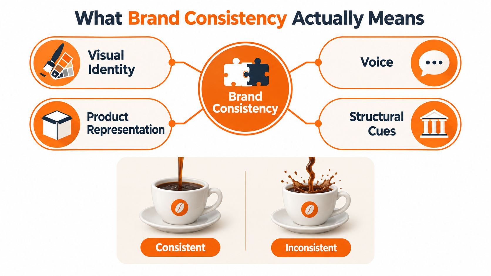
Brand consistency is disciplined repetition of signals people can recognize quickly. Those signals include visual identity, voice, product representation, naming patterns, layout logic, and the way offers are framed. The goal is predictable recognition, not rigid sameness.
In production terms, consistency is a control problem. If a brand changes its color logic, tone, crop style, or offer structure every time a team touches it, the customer has to re-interpret the brand before they can judge the product. That slows recognition and creates avoidable review work inside the business.
A useful external resource on this broader discipline is FLYP LTD on brand consistency, especially if you're comparing how different teams interpret consistency beyond logo use.
The recognition layer
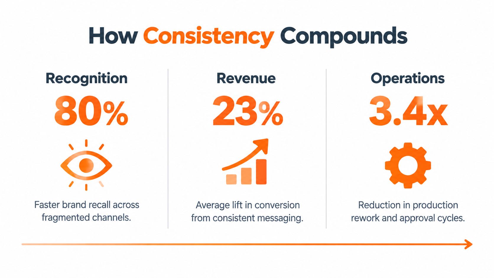
Consistency matters because memory depends on repeated cues. A signature color can increase brand recognition by up to 80% according to industry research summarized by SHNO, and consumers were reported to be 81% more likely to remember a brand's color than its name in the same research summary. Separate industry research also says 90% of consumers expect a similar brand experience across the channels they use. Those numbers should not be read as a guarantee for every brand, but they point to the same operational truth. Repetition makes identification easier.
The mechanism is straightforward. When customers repeatedly see the same system of cues, they process the brand faster and with less friction. Coherent identity presentation supports cognitive fluency, recognition, trust, and long-term brand equity. In practice, that is why inconsistent brands often feel harder to shop, even when the product is fine.
What belongs inside the consistency system
Many teams define consistency too narrowly. They stop at visual guidelines and miss the layers customers experience.
Here is the working definition I use in production reviews:
| Consistency layer | What should stay coherent |
|---|---|
| Visual identity | Logos, color systems, typography, composition logic |
| Voice | Tone principles, message structure, naming style |
| Product representation | Cropping, lighting, material truth, fit accuracy, packaging truth |
| Structural cues | Merchandising logic, hierarchy, CTA treatment, channel rules |
| Experience signals | Service standards, delivery expectations, promise-to-product alignment |
Seasonal stories, campaign concepts, and creative themes can still change. They should change. A brand that never evolves becomes stale. A brand that keeps changing its identity becomes unrecognizable, and production teams end up fixing drift instead of shipping work.
Consistency is not repeating the same asset. It is repeating the same intent in forms customers can recognize.
That distinction keeps a global brand coherent without forcing every market, campaign, and SKU into one dead template.
How Consistency Compounds Across Recognition, Revenue, and Operations
A brand that changes its cues every time it speaks creates avoidable work for customers and for the team shipping the assets. In production terms, consistency is a control problem. The question is whether the same brand signals survive across channels, markets, and formats without drift.
The payoff shows up in three places leadership already watches: recognition, revenue, and operations.
Recognition starts with fragments, not campaigns. A shopper sees a product tile in a marketplace, a paid social frame, an email subject line, a packaging moment, a store sign. If those cues hold together, the brain can file each exposure under the same known entity instead of starting fresh.
Recognition gets cheaper when cues repeat
In production terms, that memory effect means standardizing palette contrast, type hierarchy, and product rendering rules that survive thumbnails and localization. The point is not that one cue does all the work. The point is that repeatable cues lower the cost of recognition.
That is why mature teams set guardrails around the pieces customers process fastest:
- Palette and contrast rules for thumbnails, mobile, and retail environments
- Typography hierarchy that survives localization and resizing
- Product rendering rules so materials, silhouette, and finish read consistently
- Voice principles that hold up across email, PDPs, paid, and editorial
Revenue follows when the brand stays legible
Revenue improves when the brand is easier to read and harder to misinterpret. According to the SHNO summary of the report, the 2019 State of Brand Consistency Report found that respondents associated consistent presentation with stronger revenue outcomes, while also reporting widespread off-brand content and confusion in the market. The finding is survey-based, so it should be treated as directional, not as a guaranteed lift.
The practical lesson is straightforward. If coherent presentation keeps showing up beside better commercial outcomes, consistency belongs in workflow design, not in a style guide nobody checks during production.
A useful companion read is TVL Media's take on brand loops, which explains why connected systems usually outperform isolated campaigns.
Operations is the lever teams control directly
This is the part many brand articles skip. You cannot control every market condition, but you can control how often teams create off-brand work. The Lucidpress report found that respondents estimated an average 23% revenue increase from consistent presentation, that 71% saw market confusion as the largest negative effect of inconsistent usage, and that consistently presented brands were three to four times more likely to report excellent brand visibility, according to the Lucidpress report.
That last point matters operationally. Better visibility does not come from taste alone. It usually comes from systems that catch drift before publication. When teams cut duplicated review, corrective production, and channel rework, consistency stops behaving like an aesthetic preference and starts acting like production discipline.
Common Failure Modes That Quietly Erode Brand Equity
Most brand erosion doesn't arrive with a dramatic redesign. It shows up in ordinary production decisions that nobody escalates because everyone is busy. By the time the inconsistency is visible to customers, the pattern has usually been active for months.

Regional drift
A global campaign launches with one strong core idea. Then each market improves it. The German team tightens the copy. The US team sharpens the promotional framing. The Japan team changes visual pacing and swaps in different styling references. Each adaptation makes sense locally. Together, they weaken brand unity.
The symptom is rarely immediate customer backlash. It's slower approvals and recurring debates over whether an adaptation is still “on-brand.” Teams start reviewing by opinion because they don't have a documented threshold for acceptable variation.
If every market can interpret the campaign from scratch, headquarters hasn't created a system. It has distributed a suggestion.
SKU production drift
This one is common in fashion and beauty catalogs. The first asset batch looks excellent because senior creatives are still close to the work. Then volume ramps. More product categories enter the queue, more retouchers touch the files, more templates fork, and the catalog slowly loses alignment. Whites shift. Shadows harden. Crop ratios drift. Copy starts naming similar products in different ways.
The damage is subtle but cumulative. Product grids lose coherence. Look books stop feeling authored. Buyers sense inconsistency even when they can't name it.
A disciplined audit process catches this earlier. Teams building one can use a practical checklist like Sprello's overview of the audit process steps to identify where drift is entering the system before it spreads across channels.
Promise versus experience gap
This is the most dangerous failure mode because the visuals can still look polished. The campaign communicates premium quality, clean product truth, and thoughtful service. Then packaging arrives damaged, size communication feels unreliable, or customer service handles issues in a tone that doesn't match the brand promise.
Inconsistency here is deeper than design. It tells customers the identity is performative.
The Lucidpress research cited earlier is useful because it names the downstream effect clearly. 71% of respondents in that study saw market confusion as the largest negative effect of inconsistent usage. Confusion isn't limited to color and logo misuse. It also appears when the experience contradicts the presentation.
The fix depends on the failure mode. Regional drift needs governance. SKU drift needs workflow control. Promise gaps need cross-functional ownership beyond marketing.
Fixed Foundations and Adaptable Layers
The weakest version of consistency says every market should look the same. That sounds efficient on paper and fails quickly in real life. Global brands operate across different languages, retail norms, cultural references, and channel behaviors. A system that refuses all variation usually produces assets that are technically compliant and commercially tone-deaf.
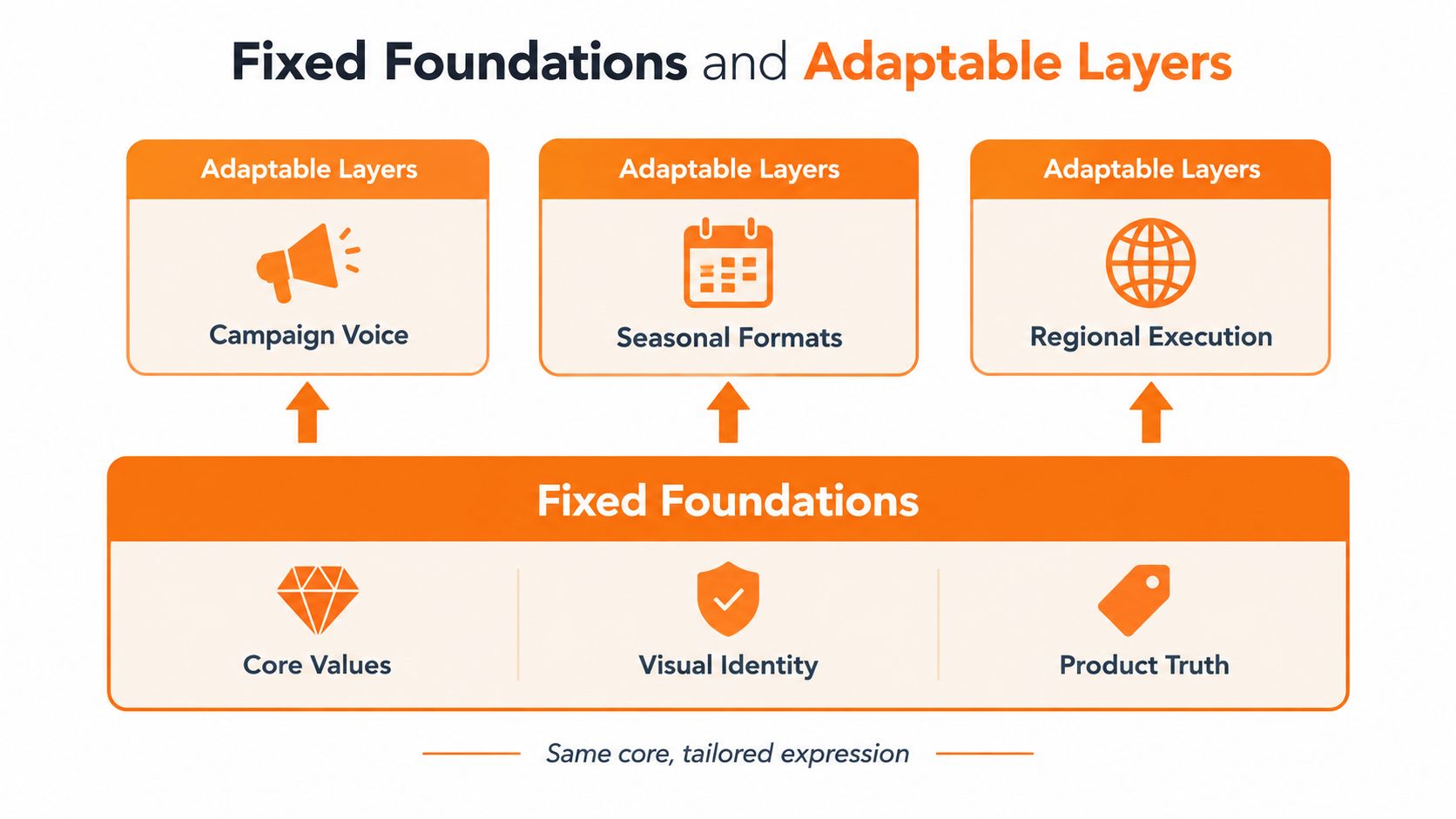
Research on global branding points to a more credible model. There is a real trade-off between standardization, which improves efficiency and coherent image, and localization, which can increase cultural relevance at the cost of operational complexity and weaker consistency. The strongest emerging view favors globally consistent foundations combined with locally responsive execution, as discussed in research on standardization and localization trade-offs.
What should never bend
Some elements need to remain fixed because they carry brand meaning too directly to localize casually.
- Core values: What the brand stands for and what it will not imply.
- Visual identity: Logo treatment, approved palette logic, typography system, and recognizable composition principles.
- Product truth: Material accuracy, fit honesty, color fidelity, and claims the product can support.
- Tone principles: Not exact copy, but the boundaries of voice.
- Quality thresholds: The minimum acceptable standard for imagery, editing, and customer-facing presentation.
These are foundations, not preferences. Once teams treat them as negotiable, every campaign becomes a fresh interpretation.
What should adapt
Other layers should flex because local relevance matters.
| Fixed foundations | Adaptable layers |
|---|---|
| Identity system | Casting and styling choices |
| Tone principles | Local phrasing and language patterns |
| Product truth | Channel-specific formatting |
| Quality thresholds | Seasonal references and market context |
| Naming logic | Regional merchandising emphasis |
A strong workflow has to encode both sides. For teams mapping this into production, a useful reference point is how digital pipelines can structure approvals and variants across regions, which is the operational question behind digital asset workflow design.
How governance should work
Most failures happen because nobody defines who can approve a deviation.
A practical model looks like this:
- Global brand team sets the standards. These rules need examples, not just text.
- Regional leads propose adaptations. They should document what is changing and why.
- Category or brand ops reviewers check preserved meaning. The test is not "Does it look similar?" The test is "Does it still communicate the same brand intent?"
- Approved variations become reusable precedents. If a local adaptation works, document it so the next market doesn't reinvent it.
Decision test: A local change is acceptable only if the customer still recognizes the same brand promise, not just the same colors.
That's the middle path many teams need. It preserves recognizability without forcing identical assets everywhere.
Guardrails That Make Consistency Operationally Real
Consistency becomes real when it moves out of slide decks and into workflow rules. Academic literature links coherent identity presentation with cognitive fluency, brand recognition, trust, and long-term brand equity, which supports encoding approved color systems, typography, composition logic, naming conventions, and channel-specific constraints across SKUs, markets, and seasons in the workflow itself, as discussed in academic work on coherent identity presentation.
That means the creative brief is not enough. Teams need production controls.
The guardrails worth encoding
The controls that hold up under volume are concrete:
- Color systems: Approved palettes, contrast boundaries, and use-case rules by channel.
- Typography: Locked hierarchy, fallback behavior, localization-safe font choices.
- Composition logic: Product scale, whitespace, crop tolerances, CTA placement.
- Product rendering requirements: Angle rules, lighting standards, material fidelity, retouching limits.
- Tone and naming conventions: Product titles, collection language, promotional phrasing, legal-safe claims.
- Channel constraints: Marketplace requirements, retail signage limits, mobile-first crops, email headline lengths.
External contributors need the same discipline. When creators, stylists, or partners are involved, the brief has to carry operational guardrails, not just mood references. That's why resources like Social Cloud's guide to performance-driven creator briefs are useful. They help teams specify deliverables in a way that reduces interpretation drift.
Measure the system, not just the design
If consistency is only judged by visual review, the program will stay subjective. Teams need a scorecard.
A practical scorecard should track:
- Recognition: Are key brand cues preserved across channels and markets?
- Message comprehension: Does the asset still communicate the intended promise clearly?
- Promise alignment: Does the experience match what the asset implies?
- Asset compliance: Which outputs meet the standard on first review?
- Revision patterns: Where do rejections cluster?
- Speed: How long does work move from brief to publish?
This is also the section where tooling matters. Teams often use DAMs, template systems, QA checklists, and workflow software together. One option in this category is Sprello's approach to brand consistency software, which focuses on reusable workflows, brand guardrails, naming conventions, and catalog-scale production for fashion, beauty, and lifestyle teams.
The quality gate that prevents drift
The most reliable checkpoint is a canonical reference set. Pick approved examples by asset type and compare every new output against them before publication.
Review for deviations in:
- Logo treatment
- Palette behavior
- Product geometry and truth
- Copy tone
- Visual hierarchy
That's what separates a living system from a guideline archive. The brand standard becomes testable. Reviewers stop arguing from taste and start checking against known rules.
What to Change First When Consistency Has Slipped
Go back to the winter look book. The brand didn't need stricter policing. It needed a better operating model. The campaign should have launched with fixed foundations already defined, local adaptations already bounded, and asset reviews tied to a reference set instead of personal judgment.
If consistency has slipped, start with three moves this quarter:
- Pick the essentials: Define what cannot vary across markets, SKUs, and channels.
- Instrument the scorecard: Track compliance, revision causes, and speed to publish.
- Standardize the workflow: Build templates, approval rules, and reference sets that catch drift before launch.
That's the durable answer to why brand consistency is important. It protects recognition, reduces production waste, and gives local teams room to adapt without making the brand unrecognizable. The goal isn't identical assets everywhere. It's recognizable intent everywhere.
Sprello gives fashion, beauty, and lifestyle teams a way to turn brand consistency into a working production system, with AI workflow canvases, reusable guardrails, and catalog-scale creative workflows that hold across SKUs, channels, regions, and seasons. If you're trying to reduce drift without slowing the business down, visit Sprello to see how that model works in practice.
Related
More to explore
Fresh reads
Product Concept Design That Actually Ships
A practical guide to product concept design for fashion and lifestyle brands. Master ideation, moodboards, and production-ready briefs that scale.

7 Lookbook Examples for Fashion Brands in 2026
Explore 7 lookbook examples from Vogue, Behance, Canva and more, with layout tactics, merchandising notes and implementation tips for creative teams.

Turquoise Complementary Color: A Practical Guide
Discover the turquoise complementary color, explore hex codes, color theory, and styling tips for fashion, beauty, and brand merchandising palettes.