October 23, 2026
Burnt Sienna Crayon Color Guide for Designers
A practical burnt sienna crayon guide with hex and RGB values, pigment background, complementary palettes, and merchandising tips for fashion and beauty teams.
The common digital reference for a burnt sienna crayon is #E97451, RGB 233, 116, 81, but the name covers a family of formulations rather than a single standardized physical color. In Sprello, that reference can guide Canvas colorway exploration and assortment visualization, while an approved physical swatch remains the basis for material color approval.
You're reviewing a rust-colored knit, a cosmetic carton, and a ceramic accessory that all carry the same color name. They look coordinated in the presentation, but the samples don't quite belong together. The useful question isn't whether they're all burnt sienna. It's whether their differences are intentional, documented, and appropriate for the collection.
Published April 2026
What Burnt Sienna Looks Like in a Crayon
A burnt sienna crayon sits between orange-red and earthy brown. The commonly published burnt sienna digital reference contains substantially more red than green or blue, which explains its warm, orange-red screen appearance. A physical crayon mark can look more subdued, particularly when the application leaves paper visible through the wax.
For merchandising, separate color identity from color approval. Burnt sienna is a useful identity for a palette, mood board, or buyer conversation. It isn't sufficiently specific on its own to approve a supplier's finish or reject a sample.
Start with a working reference
Give the design team a reference that explains the intended role, not just the name.
- Define the direction. Specify whether you want a red-led rust, an orange-brown clay, or a darker earth tone.
- Identify the application. Distinguish a crayon sketch reference from the intended textile, cosmetic packaging, metal finish, or ceramic glaze.
- Set the approval basis. Name the physical sample that the team should use when digital visuals and delivered materials disagree.
The name also has unusual continuity. Historical Crayola color listings trace Burnt Sienna to the company's early drawing-crayon period beginning in 1903. That makes it a familiar creative reference rather than merely a seasonal naming invention.
Crayola's retired-color FAQ also confirms that consumers saved Burnt Sienna from retirement. Recognition matters in a buyer presentation, but familiarity shouldn't be mistaken for a shared technical specification.
Practical rule: Use the color name to communicate intent. Use the approved sample to resolve disagreement.
A useful line-review description might be “red-led burnt sienna, restrained rather than bright, coordinated with cream.” That gives colleagues something actionable without pretending that a memorable crayon name specifies every material outcome.
Where Burnt Sienna Comes From as a Pigment
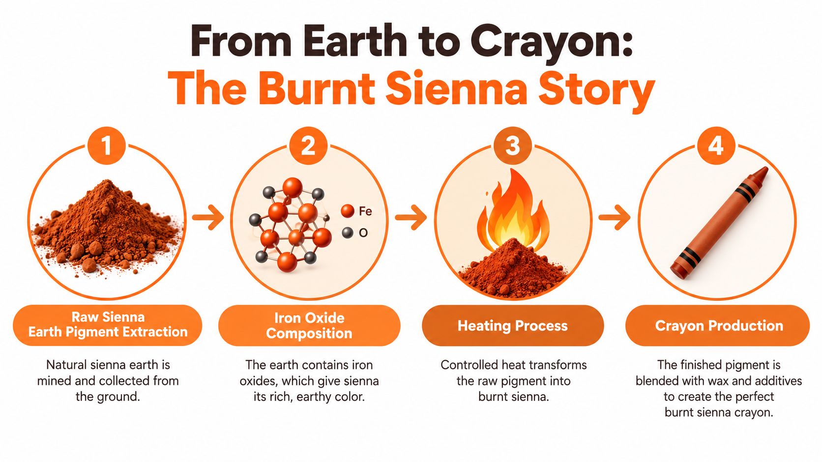
The “burnt” in burnt sienna describes a pigment transformation, not a styling adjective. Raw sienna is an iron-bearing earth pigment. Heating it shifts its yellowish-brown appearance toward a warmer reddish brown.
The Natural Pigments explanation of burnt sienna describes dehydration of iron-oxide minerals such as limonite and goethite, with partial conversion toward hematite. In plain terms, heating changes the mineral composition responsible for the color.
The production sequence below provides a useful reference for discussing that origin with nontechnical colleagues.
Read pigment codes as ingredient information
Artist-material references commonly identify natural burnt sienna as Pigment Brown 7, abbreviated PBr 7, or Pigment Red 102, abbreviated PR 102. Related references include Colour Index 77491/77492. These classifications describe pigment identity more usefully than an evocative shade name, but they still aren't a complete finished-product color specification.
Think of roasting coffee as an analogy for the distinction between a starting material and a heat-altered result. The comparison makes the process intuitive, but it doesn't establish a predictable shade from a name alone.
For a product development lead, the practical distinction is between:
- Pigment origin. What material produces the color?
- Formulation. What else has the manufacturer combined with it?
- Finished appearance. What does the resulting product look like in its intended application?
A pigment specification helps explain why a color behaves as it does. A finished swatch tells the team whether it belongs in the collection.
Burnt sienna describes a family of thermally altered iron-oxide earth colors, not a universal recipe for every crayon, textile, or coating carrying the name.
Don't request a pigment change because a screen rendering looks wrong. First establish whether the disagreement concerns the ingredient, the finished surface, or the visual representation. Those are different problems, and they require different decisions.
Reading Hex, RGB, and CIELAB Values Together
Hex and RGB describe a screen-color reference. CIELAB provides a way to discuss lightness and color direction. Neither becomes a reliable production instruction without identifying what was measured and under which conditions.
The important mistake to avoid is treating every published burnt sienna coordinate as an equivalent description of the same specimen. A bright digital reference and a darker pigment measurement can both carry the name without matching each other.
Burnt Sienna Color Reference at a Glance
| Measure | Value | What it means |
|---|---|---|
| Common digital hex | #E97451 | A starting point for screen-based palette work, not a universal physical standard |
| Common digital RGB | 233 red, 116 green, 81 blue | The component values underlying that screen reference |
| Published example CIELAB | L* 33.67, a* 16.86, b* 12.58 | A separate, relatively dark, red-biased and moderately yellow burnt sienna reference |
| Approval reference | Controlled physical drawdown | The actual appearance selected for a particular material and application |
The digital entries refer to the screen reference cited earlier. The example L 33.67, a 16.86, b* 12.58** accompanies the burnt sienna specification reference in the ASTM artist-color material; it should not be presented as a conversion of the hex value.
Read L* as lightness, a* as the red-green direction, and b* as the yellow-blue direction. For that example, the positive color coordinates indicate red and yellow components. The relatively dark lightness reading helps explain why this reference shouldn't be substituted blindly for a brighter mood-board swatch.
Keep image adjustment separate from color selection
Wax concentration, surface gloss, paper tooth, and lighting can change the perceived result. Record those conditions when comparing drawdowns, rather than adjusting each photograph until everything looks alike.
For teams preparing sample photography, MerchLoom's resource on how color correction differs from grading is useful context for separating reference-oriented image adjustment from a creative treatment. A pleasing image isn't automatically an accurate approval image.
- For exploration. Use the digital reference to establish a consistent starting palette.
- For review. Compare photographs with the physical samples present.
- For sign-off. Preserve the approved material reference and its measurement context.
When building a softer companion palette, use the pink blush color guide as a separate design reference. Don't assume a neighboring color will compensate for an inaccurate burnt sienna image.
Why Two Burnt Sienna Crayons Can Look Different
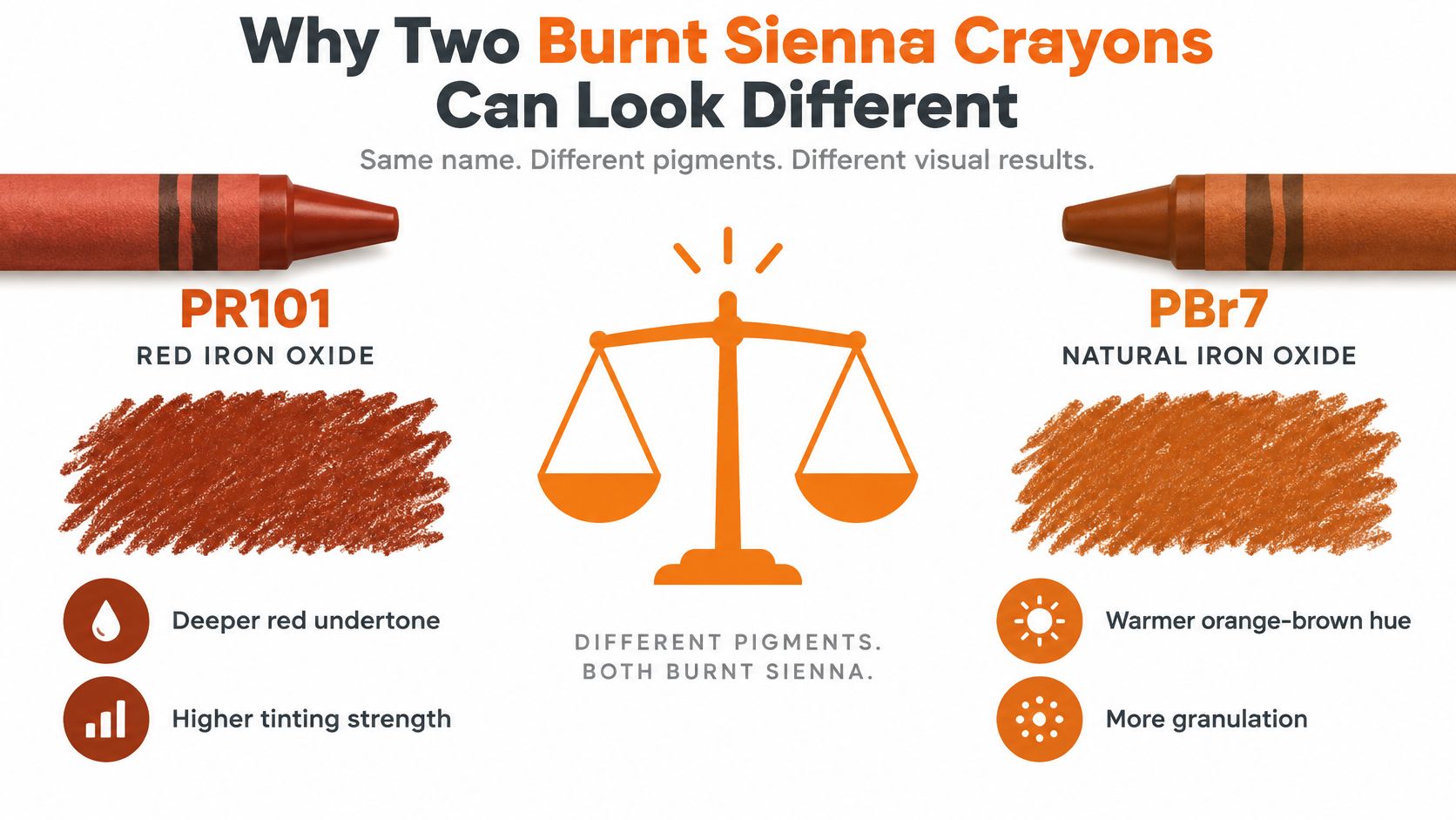
Matching names don't guarantee matching ingredients. A Caran d'Ache Neocolor I Burnt Sienna listing identifies a formulation using PR101 red iron oxide and PBk7 lamp black. That differs from treating burnt sienna as an unmodified calcined earth pigment.
The distinction matters when designers use a burnt sienna crayon to establish a product direction. A black-modified mixture and a natural earth formulation may differ in undertone and mixing behavior even before the product developer translates the sketch into another material.
Use the comparison graphic as a formulation discussion aid, not a substitute for testing the specific products.
Test substitutions against the intended effect
For exploratory drawing, the following mixing directions are useful starting points, not guaranteed cross-brand recipes:
- With white. Explore a softer reddish tint when the original swatch feels too dense.
- With yellow ocher. Move toward warmer orange territory while retaining an earthy direction.
- With blue. Explore deep browns or near-blacks rather than reaching immediately for a separate black.
Test those combinations on the surface used for the actual sketch or presentation. Don't prescribe fixed mixing proportions without checking the materials. A recipe that works for one formulation shouldn't become an undocumented standard for another.
Record the version that was approved
Keep supplier, product name, pigment composition when available, digital reference, and physical sample identification together. Also record whether the sample represents a concept direction or an approved production appearance.
That distinction prevents a familiar problem: a team replaces a discontinued art material, keeps the color name, and unknowingly changes the visual starting point for the next collection.
Approval note: A substitute is acceptable when it achieves the intended result, not merely when its label says burnt sienna.
For assortment visualization, treat the shade as a color family and workflow variable. Preserve the exact reference behind the approved expression so colleagues don't have to reconstruct the decision from a presentation thumbnail.
Complementary Palettes That Work With Burnt Sienna
Choose a palette according to the role burnt sienna needs to play. A cool partner makes its warmth more prominent; a pale neutral gives it space; a related earth tone supports a quieter, tonal collection.
These are editorial palette directions, not measured matches or claims about customer preference. Start with named color families and approve their physical expressions together.
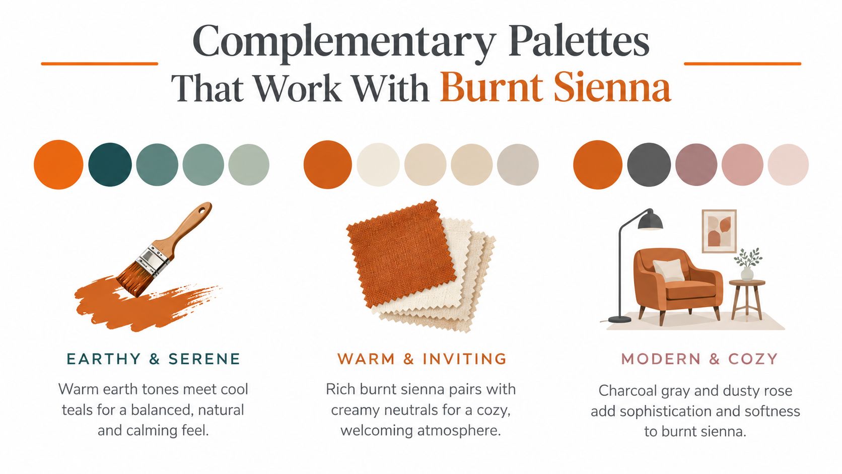
Compare the merchandising effect
| Partner family | Suggested use | Trade-off to review |
|---|---|---|
| Deep teal and muted blue-green | Cool counterpoint for an accent-led collection | Strong opposition may compete with the product silhouette |
| Cream and warm off-white | A neutral foundation that leaves burnt sienna prominent | Similar warmth can make the overall presentation feel too uniform |
| Terracotta and clay | Tonal coordination across related products | Adjacent earth tones may be hard to distinguish in small thumbnails |
| Charcoal and dusty rose | A restrained palette with both depth and softness | Dark elements need careful separation in buyer-facing images |
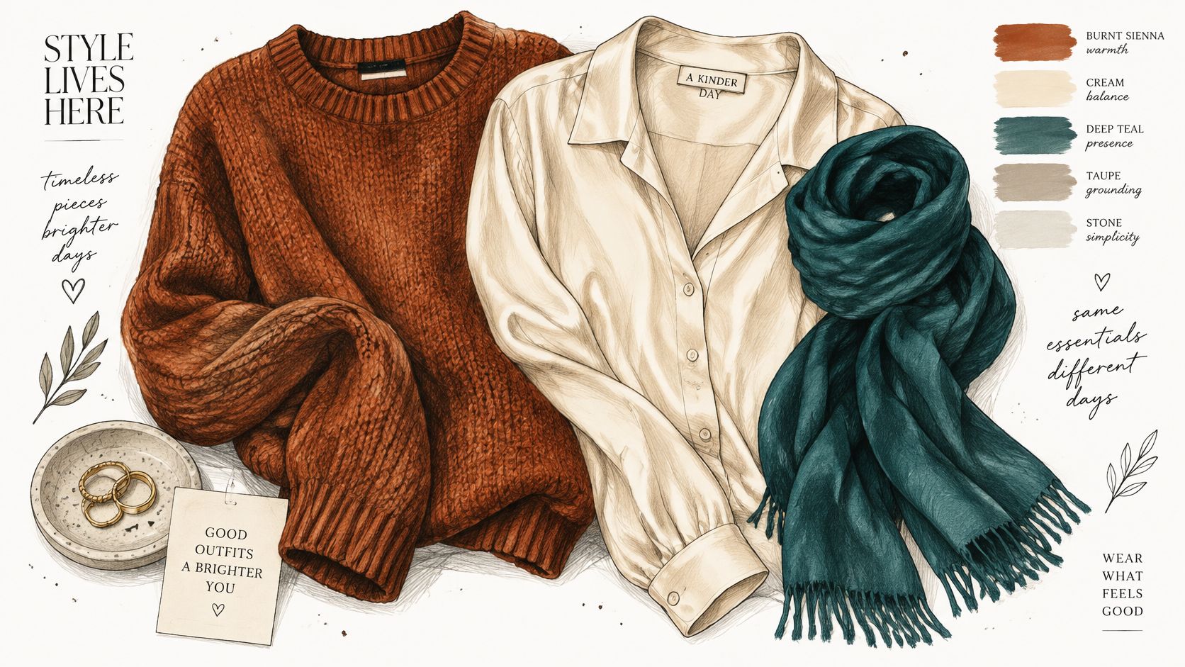
For a teal pairing, give the team a clear hierarchy. A burnt sienna knit with a teal accessory is a different proposition from a teal garment with a small rust detail. Approve the relationship at the intended product scale, not only as equal-sized color chips.
Cream is a useful starting point when the team wants burnt sienna to remain the focal color. For a richer tonal direction, the dark brown with red guide provides a related reference for exploring the deeper end of the palette.
Separate harmony from legibility
Packaging copy and product labels need their own review. A harmonious pairing isn't proof that small text will be readable.
- Check actual placement. Evaluate the label, carton, or line-sheet layout rather than isolated swatches.
- Test contrast. Run an appropriate contrast check for digital text and inspect physical proofs for printed applications.
- Preserve product distinctions. Confirm that neighboring colorways remain distinguishable at buyer-viewing size.
Don't lighten the entire product image to rescue a label. Fix the label treatment separately so the product color remains useful for evaluation.
Styling Burnt Sienna Across Fashion, Beauty, and Home
Use burnt sienna as a collection relationship, not a requirement that every material look identical. The stronger review question is whether the products share an intentional warmth and hierarchy.
For apparel, this pairing provides a straightforward starting direction.
Fashion and beauty decisions
Fashion and apparel. Compare the knit and smooth woven as separate material expressions. Anchor the line sheet with cream or charcoal, then review whether the burnt sienna pieces coordinate when shown together. Don't force a textured sweater image to resemble a flat CAD by removing all visible surface variation.
Beauty and cosmetics. Keep lipstick and blush references distinct from packaging approvals. A matte product surface and a glass container shouldn't be expected to reproduce the same screen chip identically. Use cosmetic products as the material references for cosmetic development, never the art crayon itself.
For visual context alongside the physical review, the embedded video is available below.
Jewelry and home decisions
For jewelry and accessories, propose brass, bronze, and cognac leather as styling partners rather than automatic matches. Decide whether the metal should echo the warm palette or provide a visible change in finish. Review the leather beside the actual hardware before approving the combination.
For home and lifestyle, build a small grouping around a burnt sienna cushion, a cream textile, and a teal or charcoal ceramic. Let the materials retain their own surface character while keeping the overall relationship deliberate.
- Line-review outcome. Identify which item leads the color story and which products support it.
- Sample-review outcome. Mark material differences as intentional or unresolved.
- Buyer-facing outcome. Present coordinated products without implying that visibly different surfaces are exact color matches.
The objective is a believable collection. A uniform set of digital chips can't make that decision for the team.
Building Buyer-Ready Palettes in Sprello
Sprello is an AI workflow canvas for product development and merchandising, built to carry a concept through to a buyer-ready collection. Sprello is our product; the comparison below describes complementary tool categories, not a ranking.
| Tool or reference | Best role | Boundary |
|---|---|---|
| Physical swatches and measurement tools | Material evaluation and color approval | Don't provide collection-wide visual storytelling |
| Design and CAD tools | Detailed design work and colorway documentation | Their files aren't automatically buyer-ready assortments |
| Sprello | Canvas visuals, shared product catalog, line review, wholesale line sheets, and separate buyer assortments per account or channel | Complements PLM and planning suites |
| PLM and planning suites | Their established product-management and planning workflows | Remain separate from visual exploration and presentation |
Treat burnt sienna as a family rather than a fixed SKU. I build three working variants of it, a lighter take, the core standard, and a deeper cast, so buyers see a palette with range instead of one chip they're asked to trust across every material. In Canvas, use sketches, CADs, materials, and references to generate photoreal visuals and colorways through saved workflows, and keep an image of the approved drawdown among the references while retaining the physical standard for sign-off.
From there, the shared catalog carries selected product visuals into line review and account-specific presentations. The season lineup guide works as a related planning resource for structuring those assortments.
Teams that tighten their product development workflow report shorter prototype-to-sample cycles and fewer commissioned market samples. That outcome reflects process change, not a burnt sienna color-matching benchmark, and results vary by team.
Frequently asked questions
Is burnt sienna the same as terracotta?
Treat them as neighboring design references, not interchangeable specifications. Compare the actual swatches before substituting.
Can a hex value approve a textile color?
No. Use it for digital direction and approve the intended physical material separately.
Should every material match exactly?
Only if exact matching is the design objective. A coordinated assortment can include deliberate differences in depth and finish.
Can Sprello replace physical color approval?
No. Use it to explore and present product visuals while retaining physical approval controls.
Does Sprello replace PLM or planning software?
No. It complements those systems by connecting product visualization with merchandising presentations.
Sprello connects AI product visuals to a shared catalog, line review, wholesale line sheets, and buyer-specific assortments. Bring your burnt sienna references and a collection you're developing, then visit Sprello to book a demo and review how that workflow could support your team.
Related
More to explore
Fresh reads

Neon Color Code Guide for Fashion and Beauty Brands
Neon Color Code. Get precise neon color hex, RGB, and CMYK codes for fashion and beauty. Learn glow effects, contrast rules, and print vs screen alternatives.

Product Concept Generation: Methods, Workflows, and Scale
Practical product concept generation methods for fashion and beauty teams, covering AI workflows, evaluation criteria, and how to scale concepts into SKU-ready
Season Lineup Planning for Visual Merchandising Teams
Plan a season lineup with clear architecture, colorways, size runs, regional variations, and visual workflows that align merchandising and buyers.