November 15, 2026
How to Create Fashion Mood Board: A Step-by-Step Guide
Learn how to create fashion mood board files that guide design, merchandising and buying, with steps, a translation table and a review checklist.
Published 15 November 2026
You're two weeks from line review. The season's direction sits in a shared folder as a pile of loose images, a few fabric photos taken on someone's phone, and a color story that lives only in the head of the designer who assembled it. Merchandising reads it one way, the factory prices it another, and the first prototype comes back in a mood nobody signed off on.
You create a fashion mood board by defining the brief first, collecting more references than you need, clustering them into two or three themes, annotating each kept image with the design attribute it implies, composing the board with the important images largest, and scoring it with design, merchandising and brand stakeholders before it touches a product decision. The board's job isn't to look good on a wall. It's to make three different teams derive the same next actions from it. That's the test I'd apply to any board, and it's the test Sprello's canvas is built around, because a direction only earns its keep when it stays attached to the styles, colorways and buyer assortments it describes.
Most guidance stops at "collect images that feel right." That's the easy half. The half that decides whether your season ships on time is what happens between a reference and a purchase order.
How Do You Create a Fashion Mood Board in Six Steps?
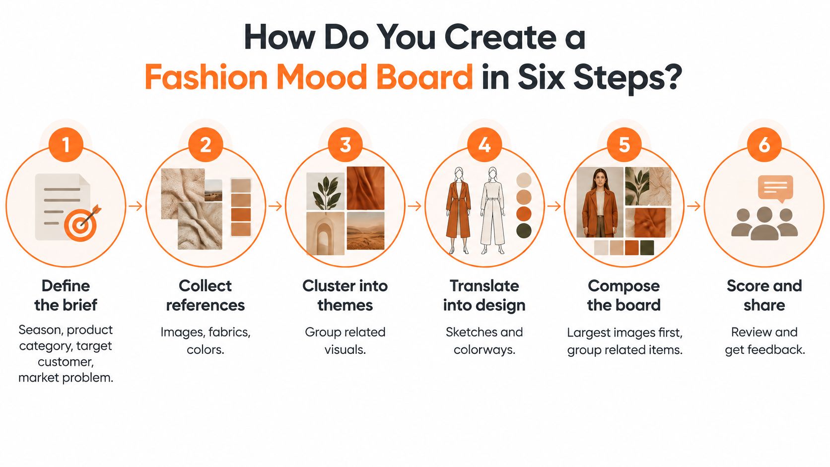
A board comes together in six moves, and each one ends with a decision rather than an image. Skip the first or the last and the rest of the work drifts.
The format has a longer history than the Pinterest version suggests. Mood boards grew out of trend-research and forecasting practice, where they organized fashion direction, production and consumer meaning. Contemporary design scholarship treats them as visual narratives assembled from images, keywords, objects, colors, textures and other iconographic elements that express a specific but open-ended direction. Trend-research teams historically built approximately three to four themes a season, illustrated each with keywords and images of objects, places and concepts, and prepared theme and color boards several weeks before review meetings, as research on futures-driven design education through moodboards describes. That cadence existed because a board is a scheduling artifact as much as a creative one.
1. Define the brief. Season, product category, target customer, price tier, channels and the board's purpose get written down before anyone opens a search bar. A concept with no price tier produces references nobody can afford to develop.
2. Collect more than you'll keep. Market, consumer, material and cultural research gives you a pool to cut from. Collecting exactly what you need guarantees you'll keep weak references because nothing better is on the table.
3. Cluster into two or three themes. Group references by recurring aesthetic features, not by source. A short keyword set per theme, five or six words, keeps the clusters from bleeding into each other.
4. Annotate every retained image. Name the attribute it implies: silhouette, material, color, pattern, styling or atmosphere. An unannotated image is a preference, not a direction.
5. Compose with hierarchy. The most important image is the largest, related items sit together, and the eye travels in a deliberate order. When everything is the same size, nothing leads.
6. Score and review. Design, merchandising and brand stakeholders assess the composed board against stated criteria before it guides assortment, product or campaign work. This is the step that converts a picture into a decision.
What you hold at the end
A board three teams can interpret identically, plus a record of which references were promoted and which were dropped. That record is what stops the same argument from reopening at the next prototype review.
What Must Be Decided Before You Collect Any Images?
The brief decides which board you're making. Without it, teams build a broad inspiration board and then try to use it for buying decisions, which is where the arguments start.
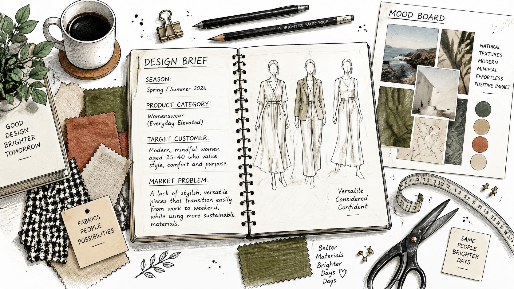
Write the brief fields down in one place: season, product category, target customer and persona, the market problem the collection solves, price tier, and the channels or regions it ships to. Then name the board's purpose in a single sentence. An apparel-industry workflow for building a mood board draws the same line between a broad inspiration board and a decision-oriented final board, and recommends defining the objective first, then researching, collecting more than needed, choosing one direction, arranging by importance, naming the concept, editing out off-topic material, and testing the result with another person, as this apparel entrepreneurship guide to mood boards sets out.
The weight this early phase deserves is easy to underestimate. A 2025 knitwear-design teaching methodology allocated 30% of its project phases to target-audience definition, persona development, mood board and collection concept, per that knitwear design study. Almost a third of the project sat before a single sketch.
| Board type | Question it answers | Typical contents | Main reader |
|---|---|---|---|
| Concept board | Which emotional and cultural direction does the season take? | Anchor images, keywords, atmosphere and typography | Design and creative leads |
| Material and color board | How does the direction become fabrics, trims and colorways? | Swatches, trim references, palette and finish samples | Product developers and technical designers |
| Merchandising board | Which styles, colorways and channels carry the story? | Silhouette groups, colorway counts, channel and region notes | Merchandisers and buyers |
Say a spring knitwear team is building for urban commuters at a mid price tier. That sentence gets written before the first reference is saved, and it kills half the moody editorial shots someone would otherwise paste in. The team needs a material and color board as the primary artifact, a short concept board above it for direction, and a merchandising board for channel conversations. A sample design brief is a useful template for capturing those fields in one document rather than across three chat threads.
The same reference discipline applies outside apparel. If the range includes accessories, how custom jewelry ordering works shows how a customer's reference images get converted into a specification with metal, stone and finish decisions attached, which is the same translation problem in a different category.
Here's the walkthrough on deciding what the board has to carry.
Before you build anything, decide which of the three boards this season needs and who signs off on each one. One name per board, written on the board itself.
How Do You Turn a Reference Into a Design Decision?
Most guidance on boards covers the same ground: choose a theme, gather imagery, pick colors, arrange the collage, share it. Category guides, including Adobe Express's fashion guidance, handle palettes, textures, silhouettes, fabrics and keywords competently and then stop, before price tier, SKU coverage, regional adaptation, channel use or approval criteria get defined.
That gap is where boards fail. A board should not be judged on cohesion alone. It should be judged on whether merchandising, design and marketing can independently derive the same next actions from it. The fix is a translation layer: every retained reference maps to a design principle, a downstream decision or asset, an owner, and an approval checkpoint.
| Reference | Design principle | Decision or asset | Owner and checkpoint |
|---|---|---|---|
| Oxidized metal texture | Aged finish without distress | Brushed-finish hardware on two core bag styles | Product developer; hardware sample approved before prototype |
| Architectural verticals | Long, uninterrupted lines | Elongated silhouette group: maxi shift and column dress | Design lead; silhouette review before line review |
| Dusty blue swatch under daylight | Muted cool blue as a core color | Core colorway for knit and woven tops | Merchandiser; palette checked against daylight-controlled samples |
| Heavy cotton slub photo | Visible texture and substantial weight | Fabric request for two styles with a weight target | Material developer; mill swatch confirmed before development |
Take the metal texture first. "Aged" is useless to a hardware supplier, so the principle becomes an aged finish without distress, and the decision is a brushed finish on two core bag styles. The product developer owns it and the hardware sample clears before prototype. The interpretation to rule out is written on the row: this does not license a distressed finish, and it does not extend to footwear.
The architectural verticals row is where design owns the call. Long, uninterrupted lines become an elongated silhouette group rather than a general preference for length, and it gets reviewed before line review so the buy sees one story rather than three competing ones. When the reference is a garment idea instead of a photograph, sketch it yourself before hunting for a matching image, and this t-shirt sketching guide covers how to get a silhouette down quickly.
Color rows need the most care. A dusty blue swatch photographed under whatever light was available becomes a muted cool blue core colorway for knit and woven tops, and the merchandiser checks it against daylight-controlled samples. When a textile image conflicts with the chosen palette, materials can be recolored digitally to test the combination before any yardage is ordered, a technique documented in the adaptive apparel designer's guide to mood boards/01:_Chapters/1.04:_The_Adaptive_Apparel_Designers_Guide_to_Creating_a_Mood_or_Inspiration_Board). If the concept depends on colors sitting close together on the wheel, an analogous color scheme is the structure to test before committing a full colorway.
The chain to write for every reference: image, design principle, decision or asset, owner, checkpoint. If any of the five is missing, the reference is decoration.
Scope each decision against target customer, price tier, SKU coverage, region and channel. A fabric with a weight target can scale from two styles to twelve. A vibe cannot.
How Do You Compose the Board and Score It Before Sharing?
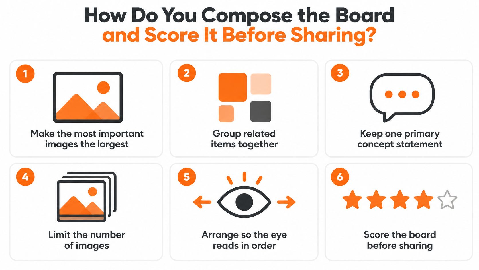
Arrange the board so the eye reads the direction in order. One primary concept statement, a limited set of anchor images, and supporting material at a secondary level.
The rules that do the most work are unglamorous:
- Size equals priority. The most important images are the largest. If your hero reference is the same size as a trim detail, the hero isn't a hero.
- Group by relationship. Related items sit together so a reader can see a cluster and understand a category of decision.
- One concept statement. A single line, in plain language, at the top. Keywords support it; they don't replace it.
- Limit the image count. Density signals indecision more often than richness.
- Read it in order. Walk the board left to right and top to bottom the way a stranger would. If the path is random, rebuild the layout.
- Include real material. Physical swatches, or accurately represented textile and trim references, because atmosphere alone doesn't tell a product developer anything about hand feel or weight.
Score the board before you share it
Run the composed board against explicit criteria: clarity of the central concept, consistency of palette and texture, relevance to the target market, distinctiveness, and whether each reference can be translated into a production decision. Then ask at least one design, one merchandising and one brand stakeholder to score it independently, and record which references were promoted and which were dropped.
Expert review adds signal that general viewers don't supply. In a study of 50 fashion mood boards rated by 88 non-expert and 10 expert raters, experts gave an average creativity score of 3.26 against 2.83 from non-experts, a statistically significant gap (t(99) = −6.71, p < .001), as reported in the digital consensual assessment study of mood board creativity. That doesn't mean only specialists can build a good board. It means expert observers consistently recognize stronger creative qualities than general viewers do, so the review panel matters.
Palette consistency is the criterion that fails most often in practice, and it usually fails downstream rather than on the board. If the same dusty blue reads differently on a knit and a woven, the problem sits in dye and light rather than in the reference, which is why fabric colour matching deserves a pass before a colorway is locked.
State the board's purpose before scoring starts. A board built for designers may legitimately prioritize exploration. One headed for merchandising and marketing has to show concrete product and customer direction.
What Goes Wrong With a Board and How Do You Fix It?
The most common failure is a board that dies at thumbnail size. Open the file at presentation scale, then shrink it to the size it will appear in a deck or a line sheet. If the concept disappears, the composition leans too heavily on detail, so cut to three anchor images and push the rest into a secondary tier.
| Symptom | Likely cause | Fix |
|---|---|---|
| Concept lost at thumbnail size | Too much detail in one composition | Keep three anchor images and move detail to a secondary tier |
| Teams read different directions | Mixed visual languages in one board | Keep one photographic style and remove outliers |
| Colors look wrong in review | Samples photographed under uncontrolled light | Approve color against physical swatches under controlled daylight |
| Generated images used as references | Unlabelled AI imagery | Label each image as a hypothesis and replace it with a sourced reference before production |
| Board looks good but drives no decisions | No annotation of intended translation | Annotate each reference with its design or commercial implication |
Digital boards carry a second set of obligations. Preserve source metadata, color references and usage rights for every sourced image, and build a dominant visual hierarchy rather than a flat field of pictures, as research on structuring a mood board for consistent direction sets out. Excessive image density and mixed incompatible visual languages are listed among the failures to avoid, alongside unlabelled AI imagery and color samples shown under uncontrolled lighting.
AI imagery is the newest version of an old problem. Treat generated images as hypotheses, not references: label each one, and replace any generated image with a sourced or sampled reference before it reaches production. A comparative study of 12 text-to-image tools found substantial variation in how well each followed the prompt, and the researchers emphasized iterative prompting combined with designer-led curation. The tool doesn't curate. Someone on your team does.
Fixing rule: change one thing, review it with the same stakeholders, and log what changed. Wholesale redesigns hide which fix worked.
That log is also the only honest record of why version four looks different from version one, which matters when a merchandiser asks in March why a colorway shifted in January.
Which Kind of Tool Fits Each Stage of Board Work?
Start with categories, because the category explains where the handoff breaks. Sprello is our product, and it's listed as its own row below.
| Tool category | Best use in board work | Where it stops | Fit for product and merchandising teams |
|---|---|---|---|
| General visual board tools | Collecting and sharing inspiration images quickly | No link to product data, SKUs or line sheets | Suits early concept work; limited after approval |
| Standalone AI image generators | Fast exploration of silhouettes, palettes and moods | Output needs curation, labelling and rights review | Useful for hypotheses; not a production record |
| PLM and planning suites | Product data, sampling records and planning decisions | Not built as a visual canvas for concept exploration | System of record; sits alongside Sprello |
| Sprello (our product) | Turns sketches, CADs, materials and references into photoreal visuals and colorways | Tech packs, BOMs, pattern making, demand forecasting and open-to-buy stay in PLM or planning suites | Connects visuals to one shared catalog, line review, line sheets and buyer assortments |
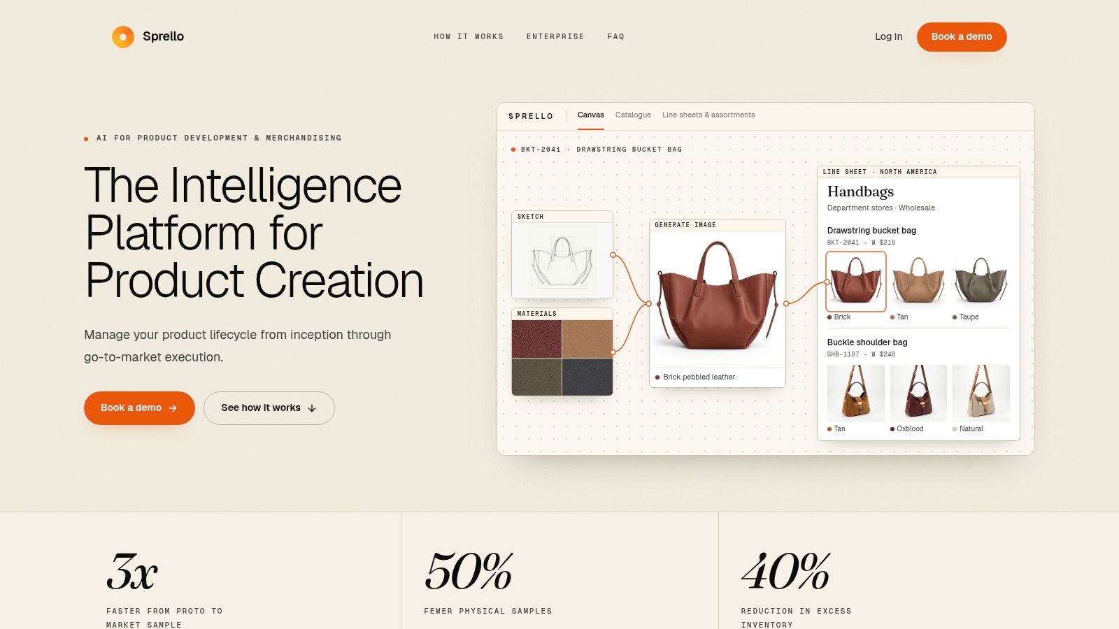
Sprello is AI for product development and merchandising, from product concept to buyer-ready collection. The canvas takes in the references you already collected and uses them to create and refine product visuals, then a saved workflow runs again on the next style. From there, approved visuals and product details flow into line sheets and buyer assortments, with each account or channel starting from the same product information. That's the piece most boards lack: the approved direction stays attached to the styles it produced.
It complements PLM and planning suites rather than replacing them. Tech packs, BOMs, pattern making, demand forecasting and open-to-buy stay in those systems. If you're mapping the broader ecosystem, how fashion design software fits together is worth reading before a tool decision lands on one vendor's shoulders.
The measurable version of this handoff, from a live deployment: a billion-dollar fashion brand cut prototype-to-market-sample lead time from 4 weeks to 2 and commissioned 20% fewer market samples.
For enterprise buyers, the controls matter as much as the visuals. Sprello holds SOC 2, supports SSO/SAML and role-based access, and customers' designs, sketches and uploads are never used to train our models or anyone else's. Access is sold through a demo rather than self-serve signup, and for fashion, beauty, jewelry, accessories, home and lifestyle brands alike, the walkthrough is built around your own workflows.
What Else Do Teams Ask Before They Finalize a Board?
Who owns the board?
The brand or creative lead owns the overall direction. Each stakeholder signs off on the layer that touches their decisions: design on silhouette and material intent, merchandising on colorway counts and channel fit, marketing on the atmosphere and the shots they can realistically produce. Ownership without a named sign-off per layer is how two teams end up with two boards.
How often should a board be reviewed?
Before each line review, each assortment decision and each production release, and again whenever the brief changes. A board reviewed once at kickoff and never revisited is a presentation, not a working document. The review doesn't need to be long. It needs the same three people in the room.
Is a mood board the same as a trend report?
No. A trend report gathers market observations across the season and presents many directions. A mood board selects a few of those observations and commits to one direction that designers can build from. The report widens; the board narrows.
Does a board replace PLM?
No. PLM and planning suites hold tech packs, BOMs, sampling records and open-to-buy, and Sprello complements those systems rather than replacing them. The board and its translations sit upstream of that data, defining what gets built before the records get created.
What does a demo show?
The catalog, canvas, line sheets and assortments running on one of your own product categories, not a generic sample. Our team asks for your catalog size and use case first so the walkthrough maps to how your merchandising and design teams hand work off.
Sprello keeps the board you've just built attached to everything downstream: product visuals generated in Canvas from your sketches, CADs, materials and references, one shared catalog holding each style and its approved visuals, then line review, wholesale line sheets and separate buyer assortments per account or channel. If your team is still rebuilding the same direction in three different tools, walk through it on your own product category and see where the handoff breaks down. Book a demo at Sprello.
Related
More to explore
Fresh reads
What Is SKU Rationalization? a Practical Guide for 2026
What is SKU rationalization? A structured review of every SKU to keep, modify, consolidate or exit it, with criteria for fashion, beauty and home brands.
What Is a Line Sheet for Wholesale Buyers
What is a line sheet? The wholesale fields, prices, minimums, and ship windows a buyer needs to order a seasonal line.
Creating a Workflow for Product Lines
Creating a workflow means named roles, triggers, templates, QA and iteration for fashion, beauty, jewelry and home lines, with Sprello beside PLM.