
Building your brand guidelines is about so much more than just picking pretty colors and a cool font. It’s about bottling up the very essence of your brand—its look, its voice, its personality—and creating a playbook that keeps everyone on the same page. This guide is what ensures your brand feels the same everywhere, from a billboard to a tweet.
Why Effective Brand Guidelines Are a Business Asset

It’s easy to dismiss brand guidelines as something only the design team needs. I’ve seen it happen. But in reality, they're a core business asset—a strategic tool that gets your entire company pulling in the same direction. When your marketing, sales, and customer service teams all know how the brand should look, feel, and talk, you deliver a unified experience that people remember.
This document acts as your single source of truth. It stops the brand from getting watered down over time by mixed messages or clashing visuals, which only confuses your audience and weakens your position in the market. More importantly, it empowers every single person on your team to act as a brand champion, giving them the confidence to create work that’s consistently, authentically you.
Building Trust Through Consistency
At its core, brand consistency builds trust. Think about it: when customers encounter the same logo, colors, and tone across every interaction, your brand starts to feel familiar and reliable. That predictability signals professionalism and stability.
Imagine a startup trying to make its mark. Without clear guidelines, a social media post might be full of jokes and emojis, while the website is buttoned-up and corporate. That kind of disconnect is jarring for a potential customer and makes the brand feel amateur. For new businesses, getting this right from the start is critical, which is something we touch on in our guide to https://sprello.ai/blog/digital-marketing-for-startups.
A well-defined brand guideline is more than a rulebook; it's a tool for empowerment. It gives your team the confidence to create, innovate, and communicate within a framework that protects and strengthens your brand's integrity.
The Financial Impact of a Strong Brand
The benefits of solid brand guidelines go straight to the bottom line. A cohesive brand experience doesn't just build trust; it makes your marketing more efficient and recognizable, which in turn drives growth.
And that’s not just a hunch—the numbers back it up. A recent report found that 68% of companies boosted their revenue by 10-20% just by keeping their brand presentation consistent. That’s a powerful connection between a unified brand and real financial results.
Ultimately, putting in the effort to create these guidelines is an investment that pays for itself. It streamlines workflows, cuts down on endless revisions, and builds long-term brand equity that turns first-time buyers into lifelong fans. If you want a full A-to-Z breakdown, this is a comprehensive guide on how to create brand guidelines worth checking out.
Establishing Your Brand’s Foundation
Before you even think about picking hex codes or debating serif vs. sans-serif, we need to talk about your brand's soul. So many people jump straight to the visuals, but a slick logo can't save a brand that doesn't know what it stands for. This foundational work is what makes every other decision—from your color palette to your social media posts—feel right.
Without this core identity, you're just decorating. With it, you're building something that actually connects with people. Let’s dig into what your brand is really all about.
Define Your Mission: Your Why
Your mission is your reason for getting out of bed in the morning. It’s the "why" behind all the late nights and endless meetings. This isn't just some fluffy sentence to stick on an "About Us" page; it's the North Star that guides every single decision your company makes. A great mission is clear, focused, and gets right to the impact you want to have.
To get to your real mission, you have to think bigger than what you sell. Ask yourself a few tough questions:
- What problem are we truly trying to solve here?
- Who are we helping, and what difference are we making in their lives?
- If we were gone tomorrow, what would people genuinely miss?
Take a company that makes sustainable packaging. They don't just sell boxes. Their mission might be something like, "To make single-use plastic in e-commerce a thing of the past." That one sentence immediately gives their work a purpose and their team a powerful reason to care.
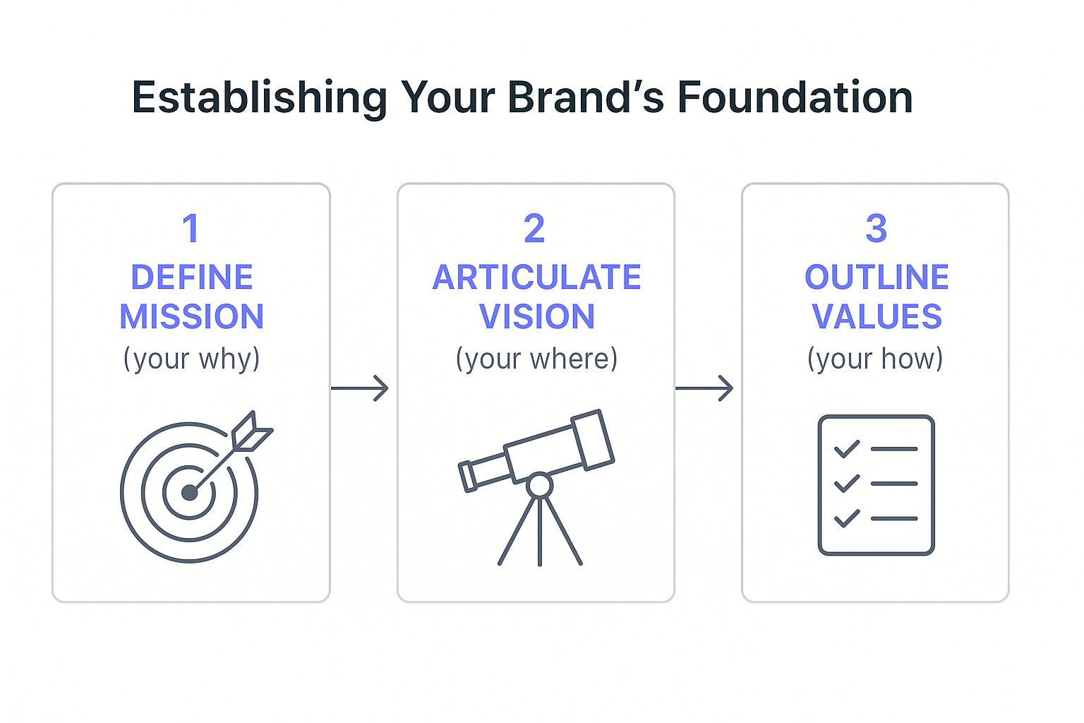
This process shows how everything flows together. Your mission (purpose) leads to your vision (future), and your values (behaviors) are how you get there.
Articulate Your Vision: Your Where
If the mission is your "why," the vision is your "where." It’s a snapshot of the future you’re working to create. A powerful vision statement inspires your team and gives your customers something to believe in—it should feel big, maybe even a little scary, but not impossible.
Your vision statement should answer one simple question: "What does the world look like once we've succeeded?" This isn't about hitting a revenue target; it's about the ultimate change you want to see.
A vision isn't just a goal; it's a destination. It pulls the entire organization forward, ensuring that every small task contributes to a much larger, shared ambition. When your team understands the destination, they can help you navigate the journey.
Think about a brand like Patagonia. Their mission is to "save our home planet." Their vision, then, is a world where people and nature thrive together, and businesses are a force for good. This vision dictates everything they do, from the materials they use to the causes they support. It’s a magnet for employees and customers who see the world the same way.
Outline Your Values: Your How
Finally, we have your values. These are the non-negotiable principles that shape your brand's behavior every single day. This is your "how"—how you hire, how you handle a customer complaint, how you build a product.
Please, don't just pick generic words like "integrity" or "innovation." They mean nothing without context. To make your values stick, you have to define what they look like in the real world. For each value, describe the specific actions and behaviors that bring it to life.
Here's how that might look:
| Value | What It Means in Action |
|---|---|
| Customer Obsession | We actively seek out customer feedback and use it to drive our roadmap. Every single person on the team spends time on support tickets. |
| Bold Simplicity | We always choose clarity over complexity, in our products and our words. We’d rather do one thing perfectly than five things pretty well. |
| Radical Transparency | We share our wins and our screw-ups openly with our team and our customers. Our pricing is dead simple, with no hidden fees. Ever. |
When you define your values like this, they stop being abstract ideas and become a practical code of conduct. They're the filter you run every decision through. This is the bedrock of a brand people can actually trust, because you consistently do what you say you're going to do. Get this part right, and you'll have everything you need to build brand guidelines that truly last.
Designing Your Visual Identity Toolkit

Once you've nailed down your brand's soul, it's time to give it a face. This is where your mission and values stop being abstract ideas and start becoming a tangible visual system people can actually see and connect with. This collection of design assets and rules—your visual identity toolkit—is what makes sure your brand looks like your brand, every single time.
Before you jump into picking colors and fonts, it's worth taking a moment to understand what is visual identity at its core. It’s so much more than a logo. Think of it as a complete visual language that tells your story through colors, fonts, and imagery, all working in harmony.
And it's not just about looking pretty; it’s about being recognized in a split second. People form an opinion about a brand in a staggering 0.05 seconds, and about 55% of that first impression comes down to visual cues like your logo and color scheme. Getting these details right builds trust from the very first glance.
Mastering Your Logo Usage
Your logo is the handshake of your brand—it’s usually the first thing people see. That’s why your guidelines need to be crystal clear about how it should and shouldn't be used. The goal is to eliminate any guesswork and prevent that cringey, stretched-out logo that screams "amateur."
First, define the clear space. This is a non-negotiable buffer zone of empty space around your logo. It stops other elements from crowding it and ensures it always has room to breathe. A simple way to set this is to use a part of the logo itself, like the height of a specific letter, as the measurement for the buffer.
Next, you have to set a minimum size. A logo that looks amazing on a giant banner might turn into an unrecognizable blob on a tiny social media icon. Specify the absolute smallest it can be in pixels for digital and in inches or millimeters for print. This keeps it legible everywhere.
Finally, and this is crucial, show people what not to do. Visual examples are your best friend here.
- Don't stretch or squash it. The proportions must stay locked.
- Don't recolor it with anything outside of the approved variations.
- Don't slap it on a busy background where it gets lost.
- Don't add cheesy effects like drop shadows or glows.
Honestly, the "don'ts" are often the most important part of this section. They prevent the most common and damaging branding mistakes.
Building Your Color Palette
Color is pure emotion. It sets the mood instantly. Your palette should not only capture your brand's personality but also be practical enough for all your marketing materials. The key here is to define the exact codes for every color so there's no room for "close enough."
I always recommend breaking the palette down into three simple tiers:
- Primary Colors: These are your headliners—the one or two main colors that people will associate with your brand. They should be used the most to build that instant recognition.
- Secondary Colors: Think of these as your supporting cast. A set of two to four colors that complement your primary ones. They’re perfect for things like buttons, pull quotes, and accents that add a little pop.
- Neutral Colors: This is your foundation. Include a few shades of gray, beige, or off-white for backgrounds and body text. They make sure your actual content is easy to read.
For every single color, you need to provide the specific codes for every possible use. This is non-negotiable.
| Color Use | Color Code Type | Example |
|---|---|---|
| Digital/Web | HEX | #1A2B3C |
| Digital/Web | RGB | R:26, G:43, B:60 |
| CMYK | C:89, M:73, Y:55, K:51 | |
| Pantone (PMS) | Pantone 2189 C |
This level of detail is the only way to guarantee your signature blue looks identical on a website, a business card, and a trade show banner.
Demystifying Your Typography
Typography is how your brand’s voice looks in print. The fonts you pick say a lot about you. Are you clean and modern? Traditional and trustworthy? Your guidelines need to create a simple hierarchy that anyone can follow.
A good starting point is to choose a primary and a secondary typeface. The primary typeface is for your big statements—headlines and titles. It should have personality. The secondary typeface is your workhorse for body copy and smaller text. Here, readability is king, especially on screens.
Then, lay out the ground rules for using them:
- Define which font weights to use (e.g., H1 headings are always Bold, body text is Regular).
- Provide clear sizing guidelines for headings (H1, H2, H3) and paragraph text.
- Specify rules for line spacing and letter spacing to keep things from feeling cramped or too airy.
Curating Your Visual Assets
The final piece of the puzzle is everything else—your photos, illustrations, and icons. These elements tie the whole visual system together. This also includes video, where a consistent look and feel is just as important. For a deeper dive on that, our article on https://sprello.ai/blog/video-asset-management has some great tips for keeping your video content on-brand.
Define the vibe for each of these categories:
- Photography: What's the mood? Are your photos bright, natural, and candid? Or are they moody, high-contrast, and staged? Be specific about the style and subject matter.
- Illustration: If you use illustrations, what's the style? Is it quirky and hand-drawn, or is it clean, geometric, and corporate?
- Iconography: Your icons should feel like they belong to the same family. Decide if they're simple line drawings or solid shapes, and stick to a consistent stroke weight and level of detail.
By putting together this complete visual toolkit, you're handing your team a playbook that empowers them to bring your brand to life correctly and confidently every single time.
Finding and Defining Your Brand Voice
https://www.youtube.com/embed/wwWY6NznDvw
If your visual identity is your brand's face, its voice is the personality that shines through. It’s in the words you choose and how you string them together. Without a defined voice, your messaging gets messy fast—you might sound clever and witty on Twitter, buttoned-up and formal on your website, then cold and robotic in a support email. That kind of inconsistency chips away at the trust you're working so hard to build.
Think of it like this: your brand voice is the consistent, unchanging personality. Your tone, on the other hand, is the emotional inflection that shifts with the situation. For instance, your voice might always be "helpful and clear," but your tone would be "celebratory" for a big product launch and "empathetic" when helping a customer through a tough spot.
Nailing this down is a non-negotiable step for creating brand guidelines that people will actually use. It ensures that everyone, from a marketer writing an ad to a developer writing error messages, sounds like they're part of the same team. A solid voice makes you memorable and, more importantly, relatable.
Moving Beyond Generic Adjectives
Just saying your brand voice is "friendly" or "professional" is a start, but it's not nearly enough. Honestly, those words mean different things to different people. The real trick is to make your voice tangible and actionable so anyone on your team can pick it up and run with it.
I've found that one of the best ways to do this is with a simple voice chart that shows, not just tells.
Instead of just dropping an adjective and calling it a day, you break down what it actually means in practice. This simple exercise turns a fuzzy concept into a concrete tool.
Here's a quick example of how you can build one out:
| We Are | We Are Not |
|---|---|
| Confident (We use direct, declarative sentences and don't hedge.) | Arrogant (We never talk down to our audience or act like we know it all.) |
| Witty (We'll use clever wordplay or a timely reference when it fits.) | Silly (We avoid cheesy puns or jokes that get in the way of the message.) |
| Helpful (We give clear, actionable steps and try to anticipate questions.) | Overly Technical (We skip the jargon and break down complex ideas into simple terms.) |
| Enthusiastic (We use exclamation points, but only for genuine excitement.) | Hypey (We stay away from marketing fluff and exaggerated claims.) |
This kind of chart gives your team an instant framework. When someone writes a piece of copy, they can hold it up against the chart and ask, "Does this feel more confident or arrogant? More witty or just plain silly?" It's a game-changer.
Adapting Tone for Different Channels
Once you’ve locked in your core voice, the next step is to map out how the tone should adapt across different platforms. A brand like Slack, for example, keeps its helpful and clear voice everywhere. But their tone shifts dramatically from a casual tweet to a detailed developer changelog or a sensitive customer support chat.
Documenting these nuances helps your team navigate each channel effectively.
- Social Media (like X/Twitter): Here, the tone can be much more conversational, punchy, and witty. Emojis might come into play, but they should still feel true to your brand's personality.
- Website & Blog Posts: This is where the tone gets a bit more informative and educational. The goal is to build authority and deliver real value, all while sounding like you.
- Customer Support Emails: The tone here needs to be empathetic, reassuring, and crystal clear. This is where a helpful voice really shines, using language that solves problems without sounding like an automated script.
- Case Studies & White Papers: In these formats, the tone naturally becomes more professional and results-focused. You're still using your core voice, but the emphasis is on data, credibility, and expertise.
A consistent voice builds brand recognition, but an adaptable tone builds relationships. Your audience needs to feel that you understand the context of your conversation with them, whether it's a fun social media exchange or a serious support ticket.
Creating a Brand Lexicon
A lexicon is a fancy word for a simple but incredibly useful tool: a list of words to use and words to avoid. It helps polish your messaging and steer clear of common verbal traps. This isn't about being a grammar cop; it’s about making deliberate choices that reinforce who you are.
A good lexicon should cover a few key areas:
- Preferred Terminology: Do you call them "users," "clients," or "partners"? Is the call to action "sign up" or "join now"? Settling these small details makes a huge difference in consistency.
- Words to Avoid: Make a list of terms that just don't feel right for your brand. This might include corporate jargon ("synergy," "leverage"), overly technical language, or words that sound too salesy ("unbeatable," "revolutionary").
- Grammar & Punctuation Rules: Go ahead and settle the big debates. Do you use the Oxford comma? How do you format titles? Periods in headlines: yes or no? A little consistency here adds a subtle layer of professionalism.
By providing these clear verbal guidelines, you're not just creating rules; you're empowering your whole team to communicate with confidence. It's the final piece of the puzzle that ties your brand's mission and visuals together into one complete, memorable experience for your audience. For those looking to bring this voice to life in video content, exploring the nuances of how to voice over is a great next step.
Putting Your Brand Guidelines Into Practice

You’ve poured a ton of effort into defining your brand’s visuals, voice, and core identity. But here’s the hard truth: a brilliant brand guide is completely useless if it just gathers digital dust on a server. The final, and arguably most important, step is bringing it to life across your entire company.
This is where your guide stops being a static document and becomes a living, breathing tool that truly empowers your team. Without a solid plan for getting it into people's hands and workflows, even the most meticulous guidelines will fail.
Choosing the Right Format for Your Team
How you package and share your guidelines seriously affects whether anyone actually uses them. The name of the game is making them accessible and easy to find. Your format really depends on your company's size, budget, and how quickly your brand needs to adapt.
For startups and smaller businesses, a well-designed, shareable PDF often hits the sweet spot. It's simple, portable, and easy for everyone to open. Just make sure it looks great—you want people to want to read it, not feel like it's a chore.
Larger companies, or those growing at a breakneck pace, usually get more mileage out of a dynamic, online brand hub. This could live on your intranet or be built using a dedicated brand management platform. An online portal is a breeze to update, can host all your downloadable assets, and becomes the one-stop shop for any brand question.
The best brand guide is the one that actually gets used. Prioritize accessibility and ease of use over complexity. If your team can't find it or understand it in under a minute, they'll default to guessing.
Whatever format you choose, make it scannable. A clear table of contents and clickable links are non-negotiable so people can jump straight to what they need, whether it's the right logo for a dark background or the approved email signature.
Launching Your Guidelines Internally
A successful rollout is so much more than firing off a company-wide email with an attachment. You need to build genuine buy-in and, dare I say, a little excitement. Frame the launch as a moment of clarity and empowerment for the team, not the arrival of a new rulebook to memorize.
Get everyone together for a meeting or a series of workshops to walk them through the new guide. But don't just read the rules aloud; explain the "why" behind them. When your team understands the strategic thinking that led to these choices, they’re far more likely to get on board.
Here are a few tactics I’ve seen work wonders:
- Appoint Brand Champions: Pick a few enthusiastic people from different departments to be the go-to experts for brand questions. They can offer friendly pointers and keep the momentum going long after the launch.
- Show, Don't Just Tell: Create some "before and after" examples of presentations or social posts. Visually demonstrating the impact of the new guidelines makes the benefits click instantly.
- Provide Practical Tools: Make it easy to do the right thing. Equip your team with ready-to-use templates for slide decks, documents, and social media graphics that already have the new branding baked in.
Ensuring Long-Term Adoption and Consistency
Creating the guide is one thing; making sure it sticks is the real challenge. It's a bit shocking, but while 85-95% of companies have brand guidelines, estimates suggest only about 25-30% actively enforce them to keep inconsistent content from going live. You can dig into this enforcement gap and other eye-opening top branding statistics on DigitalSilk.com.
To avoid becoming another statistic, weave the guidelines into your daily work. Make brand alignment a standard checkpoint in project kickoffs and creative reviews. Most importantly, lead by example. When leadership and senior team members consistently follow the guidelines, it sends a clear message that brand integrity is everyone's responsibility.
Still Have Questions About Brand Guidelines?
Even with a solid plan, creating and rolling out brand guidelines can feel a bit daunting. I've seen teams run into the same hurdles time and time again, whether they're a tiny startup finding their feet or a big company hitting the refresh button. Let's tackle some of the most common questions I hear.
Think of this as your final gut check. Sorting these things out now will save you a ton of headaches down the line and make sure your guidelines are actually used, not just admired.
How Often Should We Update Our Brand Guidelines?
Your brand guidelines should be a living, breathing document, not something you carve in stone and forget about. A good rhythm is to schedule a formal, deep-dive review at least once a year. This is your chance to step back and ask, "Does this still feel like us? Is this still where we're headed?"
Of course, major business changes should trigger an immediate review. I'm talking about things like:
- Launching a major new product
- Pivoting to a new audience
- A merger or acquisition
Little tweaks, on the other hand, should happen whenever they're needed. Maybe you need a new logo format for TikTok or want to add a fresh accent color to your palette. The goal is to always have a single source of truth. Keeping your guidelines on a cloud-based platform makes these small updates a breeze and ensures everyone is always working from the latest version.
Can We Create Brand Guidelines Ourselves, or Do We Need an Agency?
This is the classic question, and honestly, the best answer is usually a bit of both.
You absolutely should lead the foundational work in-house. Defining your company's mission, vision, and core values is something that needs to come from the heart of your team. No one knows your "why" better than you do.
But when it's time to translate that soul into a visual system—logo, colors, typography—bringing in a professional designer or a specialized agency is a smart move. This is their craft. They build cohesive, scalable systems that are not just beautiful but also incredibly functional, and they understand the technical details that keep your brand looking sharp everywhere.
The strongest brand guidelines almost always come from a partnership. Your internal team brings the brand's soul and strategy. External experts bring the visual craftsmanship to make that soul visible.
By setting the strategy yourself and hiring an expert for the visual execution, you get the best of both worlds: a brand that’s genuinely you and is professionally designed to stand out.
What's the Difference Between a Style Guide and a Brand Guide?
People often use these terms interchangeably, but there's a real difference, and it's an important one. Knowing it helps you understand the scope of what you’re building.
A style guide is all about the tactical, nuts-and-bolts rules. Think of it as the "how-to" manual for your brand's look and feel.
- You'll find things like: Logo spacing rules, specific color codes (HEX, RGB, CMYK), typography hierarchy, and grammar preferences.
A brand guide, on the other hand, is the whole story. It contains everything in a style guide but wraps it in the strategic foundation of your brand.
- You'll find things like: Everything in a style guide, plus your mission statement, vision, company values, brand personality, and principles for your voice and tone.
Put simply, a style guide tells you how to use the brand assets. A brand guide tells you how and, crucially, why. It connects the rules to a bigger purpose, which makes it much easier for people to get it right. For a truly robust playbook, you're aiming to create a full brand guide.
How Do We Get Our Team to Actually Use the Guidelines?
This is the million-dollar question. A beautiful guide that nobody uses is just a fancy PDF. Getting your team on board requires a proactive, human-centered approach.
First, make the guidelines impossible to miss. Put them somewhere central and obvious, like your company intranet, a shared Google Drive folder, or a dedicated brand portal like Miro. Don't make people dig through old emails to find them.
Next, launch them properly. Don't just send a memo. Hold a team meeting or a workshop to walk everyone through the new guide. Explain the thinking behind the choices and show them how it makes their jobs easier. Frame it as a tool that empowers them, not a rulebook that restricts them.
Finally, you have to build a culture of brand stewardship. Here’s how:
- Lead by Example: All official company materials, especially from leadership, have to be perfectly on-brand. No exceptions.
- Provide Practical Tools: Create pre-branded templates for PowerPoint, Google Docs, and social media posts. Make doing the right thing the easiest thing.
- Appoint a Brand Champion: Designate a go-to person who can answer questions and offer friendly, helpful feedback when things get a little off-brand.
When you make the guidelines easy to find, explain the "why," and give people the tools they need, they stop being a document and start becoming part of your company's DNA.
Ready to bring your brand's story to life with video? Sprello helps you create high-converting video ads and social content in minutes using AI, without any filming or complex editing. Centralize your production and ship more videos that capture your unique brand identity. Start creating today at https://sprello.ai.


