September 21, 2026
Product and Concept Guide for Fashion Development
Learn how product and concept workflows turn sketches and materials into production-ready apparel briefs with scalable, brand-consistent processes.
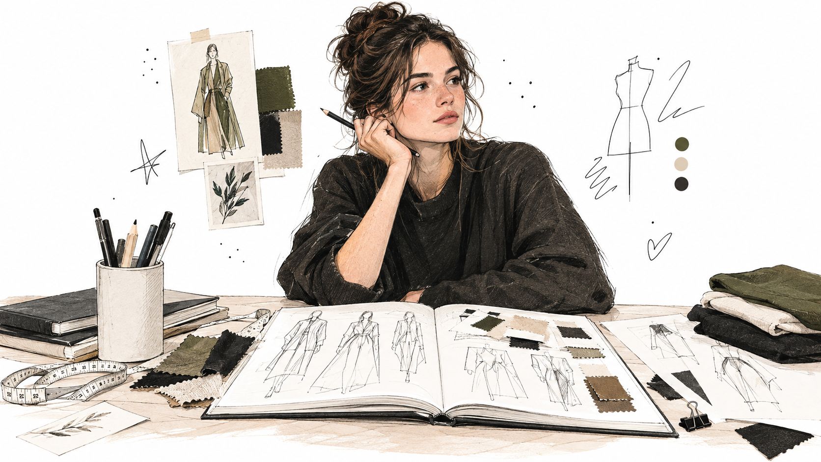
You're probably sitting with a promising board right now. There's a sketch you like, a few fabric swatches pinned beside it, maybe a color story that feels fresh. Everyone in the room can see the vibe. Nobody can yet say what, exactly, gets produced.
That stall happens more often than admitted. A design can feel obvious in the studio and still fall apart the moment merchandising asks how many options belong in the line, development asks for specs, or marketing asks what story carries across product pages, lookbooks, and regional launches. The problem usually isn't a lack of creativity. It's a lack of translation.
Introduction to Product and Concept Thinking in Fashion
A junior designer once showed me a strong outerwear sketch. The proportion was right. The attitude was right. The references were clear. But when I asked five ordinary development questions, the room went quiet.
Was this meant to be a statement hero or a volume driver? Was the fabric meant to hold shape or collapse softly? Did the color story need to anchor a broader collection? Was the intended customer layering this over tailoring or denim? Did the design need to support one core body with several colorways, or multiple bodies with tighter depth?
None of those questions were “extra.” They were the bridge between an exciting idea and a producible line.
Where teams usually get stuck
Most early product conversations stay too visual for too long. Teams collect references, react emotionally, and say things like “make it refined” or “push the silhouette.” That language is useful at the start, but it won't survive a handoff.
A product and concept workflow gives shape to those instincts. It turns loose taste into decisions. It helps a design team explain not only what they want to make, but also why this item belongs in the range, how it should behave, and what constraints matter before sampling begins.
A concept isn't the pretty part of development. It's the part that prevents expensive ambiguity later.
Why this matters more than people think
Fashion is not a small creative niche. One industry report values the global fashion market at about USD 2.5 trillion in 2025, with a projection of roughly USD 3.326 trillion by 2031 at a 4.87% CAGR according to Ken Research. At that scale, even modest improvements in concept-to-campaign efficiency matter across seasons, regions, channels, and SKU counts.
That's why strong brands don't treat concepting as a mood board exercise. They treat it as an operating layer.
If you work in apparel or accessories, think of this as learning to write a better brief before the brief exists. Start with the sketch, yes. But don't stop there. Work is turning a visual hunch into something the whole team can build, buy, shoot, and sell.
What Product and Concept Really Means Beyond the Mood Board
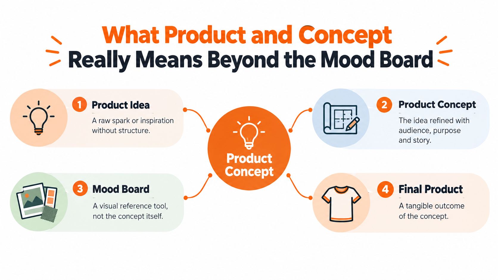
A mood board is helpful. It sets tone, texture, attitude, and cultural context. But it's not the concept.
A product idea is a spark. “Modern utility jacket.” “Soft evening bag with hardware focus.” “Minimal knit set for travel.” Those are useful starting points, but they're still broad enough that five people could interpret them five different ways.
A product concept narrows that possibility space.
Think of it like architecture, not decoration
If a product idea is “build a calm house,” the concept is the blueprint that says how calm gets expressed. Is it small or expansive? Warm or monastic? Built for family life or retreat? What materials carry the mood? What can't be compromised?
Fashion works the same way.
A jacket concept becomes clearer when you define:
- Silhouette intent so the team knows whether shape leads or detail leads
- Material logic so drape, weight, and finish support the same story
- Color role so shades work as a system rather than random favorites
- Wearer context so styling, price logic, and use case stay grounded
That's the difference between “we like this direction” and “we know what this product is.”
What the mood board can't do alone
Mood boards collect references. Concepts filter decisions.
When teams confuse the two, they keep adding inspiration instead of making choices. The board grows. The product gets blurrier. Development then has to reverse-engineer intention from images, which is where rework begins.
Working rule: If your concept can't help someone reject the wrong fabric, wrong trim, or wrong colorway, it isn't finished yet.
For teams exploring visual workflows with AI, this distinction matters even more. Tools can generate many attractive directions very quickly, but that speed only helps if the team knows what they're selecting for. A useful reference point is this guide on AI for fashion design, which shows how assisted exploration can support concepting when the brief is grounded.
The concept as a decision filter
A mature concept does three jobs at once:
It protects intent.
The original idea stays recognizable as more people touch the product.It sets boundaries.
Teams know what belongs and what doesn't.It creates continuity.
Design, merchandising, development, and marketing can all work from the same logic.
That's why the strongest concept documents often look less glamorous than the early collage. They have notes, eliminations, qualifiers, and trade-offs. They answer the practical questions that mood imagery can't.
The board inspires. The concept translates.
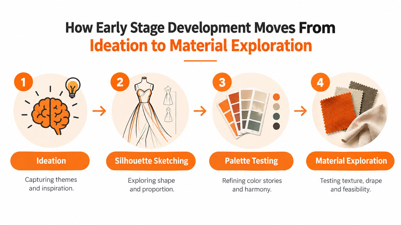
How Early Stage Development Moves From Ideation to Material Exploration
Early development should feel open at first, then narrower with each pass. If it stays open too long, you get drift. If it narrows too early, you get safe products.
The trick is to widen and tighten in sequence.
Start broad, but name the lane
At ideation, don't ask for finished answers. Ask for useful options.
For apparel, that might mean exploring multiple starting points for one category: one shape-led, one fabric-led, one function-led. For accessories, it could mean testing whether the collection anchor is closure, proportion, handle treatment, or material contrast.
The goal isn't volume for its own sake. It's contrast. Teams need to see several distinct interpretations before they can decide what feels most ownable.
A simple way to keep ideation productive:
- Anchor the brief in use by stating where the item lives in the customer's life
- Define one essential attribute such as softness, structure, packability, polish, or lightness
- Leave one variable open so there's room for discovery
Silhouette tells you what the product wants to be
Once the idea lane is clearer, silhouette should come next. Many concepts reveal whether they're coherent.
A tote can't be “slouchy and architectural” in equal measure without careful resolution. A dress can't be “body-skimming” and “heavily layered” without trade-offs. Shape exposes contradictions quickly.
Review silhouette in plain language:
- Does it lead with volume, line, or movement?
- Does it layer easily with the rest of the range?
- Does it read as hero, core, or support?
- Does it still make sense without styling tricks?
That last question matters. If a sketch only works because it's pinned, clipped, or photographed from one flattering angle, the concept still needs work.
To make that stage more concrete, it helps to watch how visual direction gets translated into forms and iterations over time:
Color and material narrow the idea into reality
Palette testing isn't decorating. It changes the product. The same shirt drawn in chalk, rust, or black can move from romantic to utility to sharp minimalism.
Material does even more. Fabric decides whether volume holds, collapses, reflects light, or feels heavy in the hand. In accessories, material choice can change whether an item feels crafted, technical, precious, or everyday.
Don't ask whether a fabric is “good.” Ask whether it behaves the way the concept promised.
At this point, AI-assisted exploration can help teams move faster through combinations of shape, surface, and color. But speed only helps if references are controlled and brand intent stays visible. The strongest teams use assisted exploration to compare options, not to replace judgment.
A useful habit is to keep one page or board that shows elimination logic. Not just what made the cut, but why other directions were removed. That record helps later when someone asks to revive a dropped option that already failed the concept test.
Key Aspects of Assortment Architecture and SKU Level Thinking
Many beautiful concepts meet retail reality.
A line doesn't succeed because the hero image looks strong. It succeeds when the assortment works at the level people buy, allocate, replenish, and markdown. In fashion, that planning unit is often the SKU, which commonly encodes style, color, size, and fabric. Academic retail literature describes assortment planning through three technical levers: variety, depth, and SKU-level inventory allocation in this assortment planning reference.
Brand vision is broad, but buying happens in units
A collection can feel balanced in presentation and still be weak in architecture. That happens when teams review categories in aggregate rather than checking the line as a matrix.
You might say, “We have enough knitwear.” But that tells you very little. Do you have too many black options in one gauge? Is one body carrying all the size depth while another has shallow support? Are there color gaps between the core top and the matching accessory story?
These aren't minor details. They're assortment decisions.
Assortment levers at SKU level
| Lever | What It Controls | Risk If Mismanaged |
|---|---|---|
| Variety | Breadth across categories, functions, silhouettes, and stories | The line feels repetitive or misses key customer needs |
| Depth | Strength within a category or style family | Best sellers run too shallow, or weak options take up space |
| SKU allocation | Units assigned to each style, color, size, and fabric combination | Stockouts, overstocks, uneven size runs, and heavy markdown pressure |
Why visualization matters
A mood board is good at emotion. An assortment view is good at truth.
When you map products at SKU level, gaps become visible fast. The team can see where one colorway is overextended, where size architecture is inconsistent, or where accessory options don't support the apparel story.
For teams building that discipline, an assortment planning template can help structure line reviews around category breadth, variant depth, and allocation choices instead of broad opinions.
A collection review should answer two different questions. “Do we love it?” and “Can we support it at SKU level?” If you only answer the first one, the second one will answer itself later, usually painfully.
A practical way to review the line
When I mentor merchandising teams, I ask them to review assortments in this order:
- First check breadth. Are the categories and use cases present?
- Then check depth. Which items deserve repetition through colorways or sizes?
- Only then check visual rhythm. Don't let presentation polish hide allocation problems.
This is the point where product and concept work becomes operational. The concept has to survive not only as a design story, but also as a lineup of specific options that can be bought intelligently.
Translating Concepts Into Production Ready Briefs Without Losing Intent
The most overlooked failure point in fashion development isn't ideation. It's the handoff.
Industry coverage has noted a split between visible AI uses such as image creation and copywriting versus harder design, buying, and merchandising workflows. The same reporting points out that technical design still requires turning vision into flats, patterns, measurements, and specs, while a 2026 white paper describes product development as fractured and inefficient, with wasted time, higher development costs, and poor capture of process data as discussed in this workflow analysis.
That gap is where many strong concepts lose their shape.
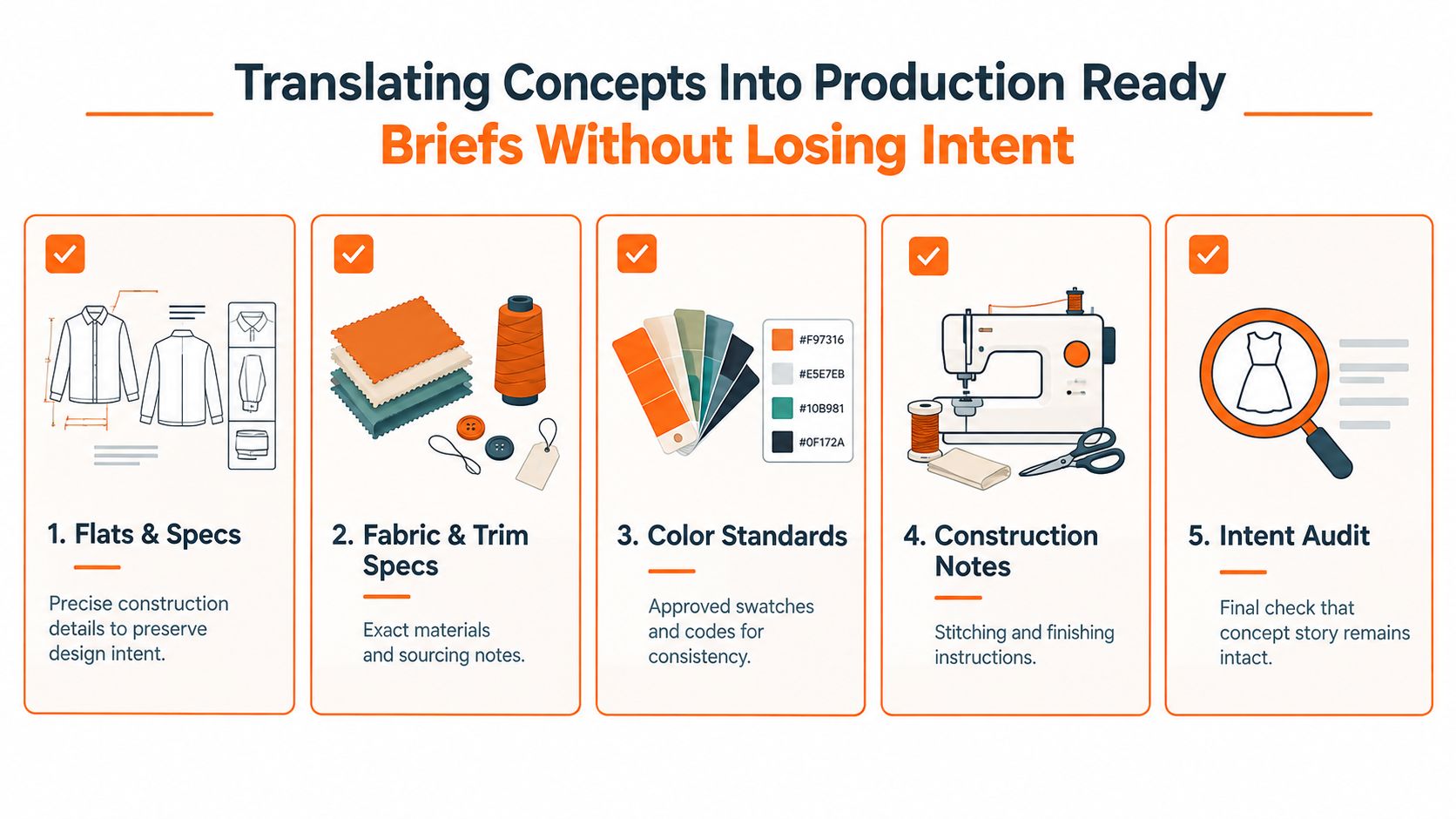
What a production-ready brief needs
A brief is production-ready when another team can act on it without guessing. Not just admire it. Act on it.
That usually means the brief includes:
- Flats and construction direction so shape and details don't depend on styled imagery
- Measurements and fit intent so proportion survives beyond the original sketch
- Fabric and trim specifications so the tactile logic stays intact
- Color standards so one “soft olive” doesn't become three different olives
- Brand guardrails so every derivative asset still feels like the same product world
If any of those are missing, someone downstream starts interpreting. Interpretation is where drift enters.
Preserve intent with acceptance criteria
The concept handoff doesn't stop at product development. It continues into image production, campaign rollout, and e-commerce.
This is especially important when teams need assets at catalog scale. Industry guidance on AI product photography notes that a 50-SKU catalog with 5 images per SKU produces 250 final images, and recommends evaluating systems on a controlled 20-to-50-image test set while scoring product fidelity, marketplace compliance, consistency, editing control, batch behavior, and total cost in this product photography workflow benchmark.
That lesson applies well beyond photography. Define approval rules before production starts.
A strong acceptance checklist often includes:
- Reference imagery for angle, crop, and product scale
- Color tolerance so approved shades stay consistent
- Logo and hardware legibility where branding matters
- Background and styling rules for channel compliance
- Prohibited alterations so the product itself isn't “improved” into inaccuracy
Practical rule: If two reviewers can approve different outputs using the same brief, the brief still contains ambiguity.
One pipeline, not separate islands
The healthiest teams treat concept, technical design, and campaign execution as one continuous system. That's value in resources about concept to factory using AI, which frame development as a connected path rather than isolated creative moments.
In day-to-day practice, that can be supported with structured workflow tools. For example, sample design brief references help teams standardize what must travel with a concept, and platforms like Sprello give fashion, beauty, and lifestyle teams a visual workflow canvas for organizing concepting, assortment visualization, and production-ready outputs around products and SKUs.
The key isn't the software alone. It's the discipline. A concept has done its job only when the finished brief still carries the original intent without forcing downstream teams to guess what the designer “meant.”
Real World Examples of Product and Concept Work in Apparel and Accessories
Let's make this practical.
Outerwear capsule with one idea and many consequences
A team starts with a simple direction: polished utility for early autumn. That's still too broad to develop, so they sharpen it. The wearer needs something city-friendly, layerable, and clean enough to sit beside tailoring.
From there, the concept starts making decisions for them. They reject overly washed fabrics because the finish undercuts polish. They narrow hardware choices because bright contrast makes the garment feel more rugged than refined. They keep one boxier silhouette as the statement shape, then support it with a simpler body that carries the same pocket logic in a quieter way.
The important part isn't that they designed two jackets. It's that the second jacket is clearly related to the first without copying it. The concept became a family resemblance system.
Accessory assortment that supports, not distracts
Accessories often drift when teams treat them as late add-ons. A stronger approach is to ask what role the accessory line plays in the collection.
Say the apparel collection leads with soft tailoring and muted color. The accessory concept might echo that with rounded forms, matte finishes, and a restrained hardware language. That doesn't mean every bag matches every jacket. It means the accessory line speaks the same design language.
A useful review question is: does this item extend the story or interrupt it?
For example:
- A belt might repeat the collection's closure language.
- A small leather good might carry the hero color in a safer entry point.
- A tote might provide the practical volume piece that balances more expressive apparel items.
That's concept work doing merchandising work.
E-commerce imagery for a large catalog
A third example is less glamorous, but just as important. A team has a broad seasonal range and needs channel-ready imagery across many products. If the concept and brief are weak, image production becomes inconsistent fast. Different crops, shifting color read, unclear scale, and uneven styling all make the assortment feel less coherent than it really is.
When the product concept is well translated, the image pipeline gets easier. Reviewers know what must stay true. Marketing doesn't improvise the product story from scratch. Merchandising can compare assets across the range and spot where one product is visually breaking the system.
Good concept work doesn't only create better products. It creates better alignment between the products and the way customers finally see them.
Bringing Your Product and Concept Workflow Together
The clearest way to think about product and concept work is this: it's a translation discipline.
You start with something loose. A feeling, a sketch, a cultural reference, a market instinct. Your job is to keep translating until that original spark can survive contact with real work. Materials. line plans. SKU choices. briefs. image production. regional execution.
The habits that keep concepts intact
The teams that do this well usually share a few habits:
- They name intent early. They don't wait for sampling to explain what the product is supposed to do.
- They use constraints on purpose. Limits around silhouette, material, color, and role make better decisions possible.
- They review at the right level. They don't stop at collection mood. They check SKU logic.
- They document handoffs clearly. They don't assume the next team will “get it.”
- They define approval standards before scale. That prevents inconsistency when one product becomes many assets.
A simple audit for your own team
If your workflow feels messy, ask three direct questions:
- Can someone outside design explain the concept in plain language?
- Can merchandising see the line clearly at SKU level?
- Can development and marketing execute without interpreting missing intent?
If the answer to any of those is no, the fix usually isn't more inspiration. It's better translation.
The sketch still matters. The swatch still matters. The mood board still matters. But none of them are the finish line. The win is a concept that stays recognizable all the way from first idea to final asset.
If your team is trying to make that handoff cleaner, Sprello offers an AI workflow canvas built for fashion, beauty, and lifestyle brands to organize concepting, assortment visualization, and campaign production around real products and SKUs. It's designed for teams that need production-ready creative workflows instead of loose inspiration boards. You can see how it works at Sprello.
Related
More to explore
Fresh reads
Dark Charcoal Grey Styling and Palette Guide for Brands
Discover dark charcoal grey codes, pairings, and styling tips for fashion and lifestyle. Learn when to use it over black with brand-ready palette guidance.
AI Fashion Photography Explained from Concept to Catalog
Learn what AI fashion photography is, how it works, and how brands scale catalog and campaign assets with quality, consistency, and governance.
Assortment Planning in Retail Explained for Growth
Learn assortment planning in retail from core process to SKU strategy, KPIs, and seasonal best practices for fashion and beauty teams.