October 24, 2026
Oxblood vs Burgundy: Color Differences and Use Cases
Oxblood vs burgundy explained with hex values, undertones, and material behavior. See which shade fits fashion, packaging, and campaign work.
Oxblood is the darker, warmer, brown-leaning red, commonly referenced as HEX #4A0000; burgundy is the lighter, cooler, more purple wine red, commonly referenced as HEX #800020. Neither name is a fixed digital value, so merchandisers and product teams should approve each shade against a swatch, material, and lighting condition rather than relying on the label alone.
The popular advice that oxblood and burgundy are interchangeable names for one deep red misses the commercial problem: each name carries different expectations, and the color can shift once it moves from a screen to leather, knitwear, packaging, or photography. A clear standard helps teams keep product data, assortments, and imagery aligned across channels and regions.
Published October 24, 2026
Oxblood vs Burgundy and Why the Difference Matters
The distinction between oxblood vs burgundy is useful, but it isn't an absolute rule. Oxblood generally leans darker, warmer, and browner; burgundy tends to retain more purple or blue and read more like wine. Both shades can shift with material, lighting, finish, and screen calibration, so a name alone can't guarantee a consistent color.
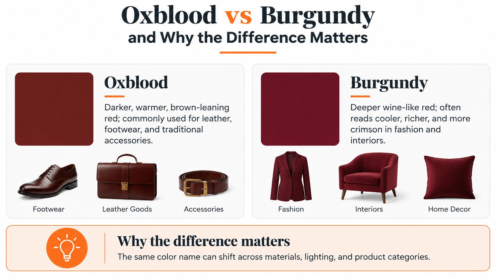
For merchandisers and product development leads, the distinction is less a matter of taste than assortment logic. Burgundy often supports wine, eveningwear, beauty, and refined seasonal stories. Oxblood more readily signals leather shoes, boots, handbags, and accessories. If a brand uses the terms interchangeably, a single color family may be split across product data, line reviews, photography, and regional catalogs as though it were several unrelated shades.
That mismatch affects what buyers expect to see. A shopper who selects a product described as burgundy may expect a visible, cool wine red; a shopper choosing oxblood may expect something deeper and more brown-backed. A studio image can muddy the distinction further if a dark oxblood item appears almost black, or if warm lighting makes burgundy look browner.
Practical rule: Treat the color name as a merchandising label, not as the specification. Pair it with a reference swatch and record the conditions that affect how it should appear.
A reliable approval compares undertone, luminance, material finish, and channel context together. That means checking whether the shade works on the actual material, how it reads in campaign lighting, and whether it remains recognizable in the e-commerce thumbnail. The names have distinct histories and common associations, but production teams still need a measurable standard to carry them into product.
Where the Names Oxblood and Burgundy Come From
Burgundy begins as geography before it becomes a product color. English usage recorded Burgundy for the wine in the 1670s and for the color in 1881; in specification work the name usually points to a deep wine red with a purple or cool cast. Pantone's Fashion, Home + Interiors system gives that expectation a shared reference in Burgundy 19-1617 TCX. Vetir's guide to wearing burgundy
Oxblood comes from a rougher observation: the dark look of oxidized ox blood, with English color-name use dated to about 1695–1705. The label carries a warmer brown-red reading and can sit near black under low light, so teams should treat it as a darker trade description with its own history.
Why the histories still matter
Footwear kept the oxblood label attached to leather. A 1897 Sears catalogue reportedly called it a “dark wine” color, and by the 1930s oxblood shoes were described as autumn fashion beside warm wools and tweeds. American Duchess's history of oxblood shoes
That split explains why the same near-red can fragment in regional catalogs: one market hears wine and evening polish, another hears leather and workwear. Keep the local commercial name, but bind it to one swatch code, the material finish, and the lighting condition used for approval so textiles, leather, packaging, and photography do not drift into separate shades.
Undertone and Luminance Differences in Practice
Two reds can sit on the same product page and behave like different products. Undertone and luminance separate them more reliably than hue family alone: burgundy retains a visible purple or blue influence, while oxblood shifts toward brown and drops in lightness until it can pass for black in low-light photography or on dark materials. Standard color references describe the shade the same way, which is exactly why regional teams left to interpret "deep red" on their own tend to drift apart.
The common display references make the gap concrete. Oxblood is often specified as HEX #4A0000, equivalent to sRGB RGB(74, 0, 0); burgundy as HEX #800020, or RGB(128, 0, 32). Against the burgundy reference, oxblood carries 54 fewer red-channel units and no blue component at all. Those values describe displays. A dyed hide or woven yard still needs its own sign-off.
| Shade | Common hex reference | sRGB reference | Undertone direction | Typical material behavior |
|---|---|---|---|---|
| Oxblood | #4A0000 | RGB(74, 0, 0) | Warmer, browner, less purple | Can approach black on dark or low-light materials, especially leather |
| Burgundy | #800020 | RGB(128, 0, 32) | Cooler, with more purple or blue influence | Often remains more visibly wine-like in color blocking, lining, and larger digital areas |
One published oxblood representation lists CIELChuv values of approximately L=12, C=41, and a hue angle of 12°, placing it among very dark, saturated reds. Oxblood's listed CIELChuv representation
What the difference means on screen
At product-page scale, burgundy still reads as a colored accent. Oxblood can fall below the threshold where viewers register red at all, photographing as black under one lighting setup and as dark brown under another. When one regional catalog tags the same shoe "oxblood" and a sister site lists it as "dark brown," the root cause is naming discipline, with the photography only exposing it.
A prompt like "deep red" gives an image workflow almost nothing to hold onto. Pair the commercial name with the hex and sRGB values and a physical swatch, then judge the output against that reference instead of accepting any plausible red. The name sells the product. The numbers keep it the same product across textiles, packaging, photography, and every regional channel that has to reproduce it.
How Material and Finish Change Each Shade
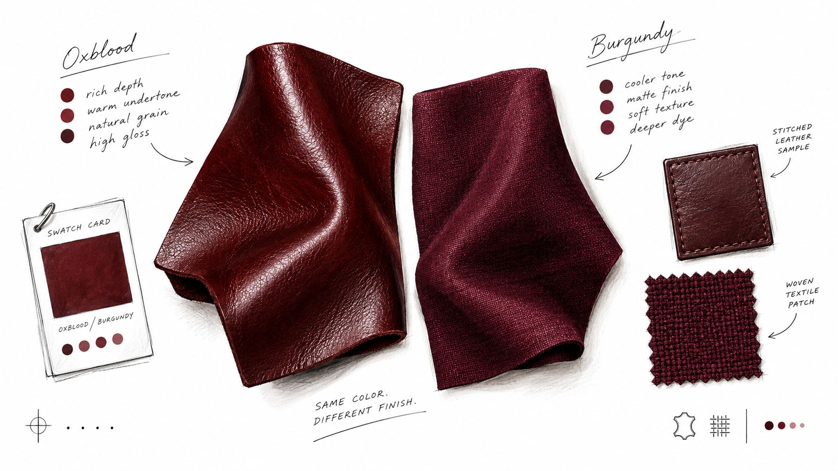
A display value can't predict exactly how a material will look. Leather grain, gloss, dye chemistry, lighting, and textile reflectance all affect perceived color. The hex references above are sRGB display values, not guaranteed matches for physical materials.
Leather is particularly sensitive to surface and finish. Grain breaks up reflections; a glossy finish creates stronger highlights; and dye behavior affects how much of the underlying material shows through. Knitwear presents a different challenge: fiber and structure influence reflectance, so the same nominal shade can look less uniform across a textured surface. Beauty packaging and accessories can also move visually across the oxblood–burgundy boundary under warm versus cool lighting.
Build the approval around the material
A production-ready color callout should state the target swatch, acceptable deviation, material finish, illumination, and background contrast. Each field prevents a different kind of guesswork: the swatch anchors the intended color, the deviation defines what can pass, and the finish and lighting describe how the team should evaluate it.
For textile teams assessing fiber behavior and fabric construction, a guide to viscose fabric can help clarify why the material itself matters alongside the shade name. The same principle applies across materials: an approved digital chip is only one part of sign-off.
Catalog teams should review both shades on calibrated displays under controlled lighting. For campaign and assortment QA, compare rendered pixels against the approved reference in a perceptual color space such as CIELAB, and flag large deviations rather than approving an image by color name alone. A practical checklist is simple: confirm the physical or standardized swatch, document the finish and lighting, inspect the product image against the reference, and check how the image reads at thumbnail size. For another example of color naming and visualization considerations, see burnt sienna color references.
Choosing Between Oxblood and Burgundy by Use Case
The key commercial question isn't only which shade is darker. It's whether the color should act as a neutral substitute or a statement color in the assortment. Oxblood can function much like brown or black in footwear, handbags, leather goods, and full-look styling. Burgundy is often a stronger choice when a team wants a visible wine-red accent, a distinct apparel color story, or a larger field of color in lining, packaging, or digital creative.
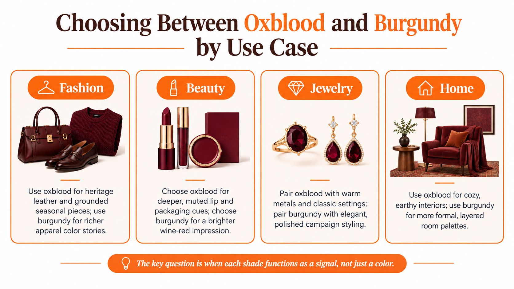
In fashion, use oxblood when the item needs to sit comfortably beside black and brown staples, especially in leather accessories or grounded seasonal pieces. Burgundy works when apparel needs a more visible color block or when the palette should communicate a wine-like red. For beauty, choose based on the impression the shade should make on the product and its packaging: a muted, deep red-brown reads differently from a cooler, more overtly wine-red shade.
Jewelry and home need their own context. Oxblood can support warm metals and classic accessory styling, while burgundy may suit polished campaign styling and more formal room palettes. In home goods, a large surface can make the color's undertone and lightness more prominent than a small trim detail. For leather accessories, material-care guidance such as care tips for green leather is a useful reminder to consider finish and upkeep as part of the product decision.
Decide the role before the name
The category isn't confined to autumn. Oxblood and burgundy appeared in Spring/Summer 2026 runway contexts, including COS's Seoul show, and Gucci's Spring/Summer 2026 collection used the color family beyond its traditional winter positioning. Design Your Way's burgundy color reference
That supports a broader assortment question: should oxblood be a core neutral, burgundy a seasonal fashion color, or should both appear as a coordinated tonal story? Decide by product category, material, contrast, and channel. If two nearly identical shades appear under different names or in disconnected parts of a line review, the assortment can look fragmented. If both are intentional, show their different roles together and label them consistently.
Tools and Approaches for Managing Color Decisions
Teams can manage color decisions with spreadsheets, static swatch libraries, PLM systems, digital asset management, standalone color specification tools, or AI-assisted product development workflows. Each approach serves a different purpose. A spreadsheet can document a small palette, while a PLM system supports broader product lifecycle records; a digital asset management system helps organize and distribute visual files. Color specification tools focus on reference values and communication.
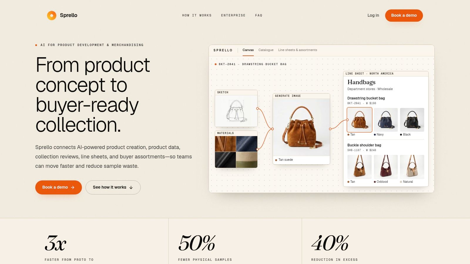
Sprello is our product, and it's AI for product development & merchandising. From product concept to buyer-ready collection. Its Canvas turns sketches, CADs, materials, and references into photoreal visuals and colorways, with saved workflows. Those visuals connect to one shared product catalog, line review, wholesale line sheets, and separate buyer assortments per account or channel.
Choose tools for the work they do
For teams comparing oxblood and burgundy across materials and channels, shared visuals can help keep a decision visible from concept through line review. A saved workflow can preserve the inputs used to explore colorways, while the catalog and buyer assortments give teams a shared place to review product choices. For related digital color references, see neon color codes.
Sprello complements PLM and planning suites; it doesn't replace them. It doesn't do tech packs, BOMs, pattern making, demand forecasting, or open-to-buy. Teams should keep those responsibilities with the tools and processes designed for them, and use a visual workflow where product imagery, colorway review, and merchandising decisions need to stay connected.
Building a Color Naming Standard That Holds Up
There's no stable, universal boundary between “oxblood” and “burgundy.” Commercial explanations commonly describe oxblood as browner and darker and burgundy as cooler or more purple, but lighting and fabric can blur that distinction. Adobe places oxblood between burgundy and maroon, while describing burgundy as cooler and more purple and oxblood as brown-backed. Adobe's oxblood color description
Retailers also use overlapping names such as burgundy, Bordeaux, wine, merlot, dark cherry, and oxblood for the same broad color family. That makes naming a merchandising and localization issue, not just a style preference. A product may have one approved physical swatch, but the name used in product data, regional catalogs, channel listings, and campaign assets still needs an explicit rule. Teams working on broader product labels can use this guide to product naming conventions.
Set the standard at SKU level
Create a naming hierarchy tied to measurable color references and approved physical samples. Record the commercial name alongside a machine-readable swatch value, then document the material finish, lighting conditions, acceptable deviation, and background contrast. Review the result in channel previews so a shade doesn't turn into near-black in a thumbnail or read as a different product color in regional photography.
The approval should connect each shade to its SKU, material, and intended merchandising role. Set localized naming rules before product information spreads into separate catalogs. That gives design, product development, merchandising, and creative teams a common reference when they're working with textiles, leather, beauty packaging, accessories, or home products.
For enterprise teams, the workflow needs appropriate controls. Sprello supports SOC 2, SSO/SAML, role-based access, and zero training on customer data. It's sold through a demo, where teams can assess whether its product visualization and merchandising workflows fit their process.
Sprello connects AI product visuals in Canvas to a shared product catalog, line review, wholesale line sheets, and buyer assortments, helping teams keep colorway decisions visible across the collection. If your team needs a clearer way to compare oxblood and burgundy across materials and channels, book a demo at Sprello.
Related
More to explore
Fresh reads

Burnt Sienna Crayon Color Guide for Designers
A practical burnt sienna crayon guide with hex and RGB values, pigment background, complementary palettes, and merchandising tips for fashion and beauty teams.

Neon Color Code Guide for Fashion and Beauty Brands
Neon Color Code. Get precise neon color hex, RGB, and CMYK codes for fashion and beauty. Learn glow effects, contrast rules, and print vs screen alternatives.

Product Concept Generation: Methods, Workflows, and Scale
Practical product concept generation methods for fashion and beauty teams, covering AI workflows, evaluation criteria, and how to scale concepts into SKU-ready